Banking clients review process
Due to NDAs I will present my work on this project using aliases.
The client is an European bank with corporate and governmental clients and my role in the UX team was to design the process in which the bankers and the risk officers would conduct the mandatory annual review of clients, review which would result in the client's probability of default (being unable to pay). This is a complex process with several banking and risk roles implied and with strict business requirements and complex integrations with legacy systems - as banking is.
Please find below some of my responsibilities and how I fulfilled them
Create surveys for research through various media platforms to gather feedback on user’s ease of use and conduct testing of functionalities, gather feedback from users, group and present the findings to stakeholders and asses the ease of design
One good example of these responsibilities is this FigJam screenshot. As a result of a 13 hour (1hour per user - 13 users) task based testing session I refined potential pain points of the process. This session was done midway thru the process development in an unstable testing environment and the purple cards stand for unavailable tasks at that moment. The green is for succes, red for failed steps of the task and yellow is for the ones where user hesitated.
Then presenting these I used the green ones to enforce that we are on the right path, the red ones to push back on pressure of development of new features, the yellow to elaborate refinements and the purple to argue to the stakeholders that we need a more stable testing medium.

The output of 13 task based user testing sessions.
Design user flows to validate the functionality in order to accurately convey project plans to stakeholders and peers and maintain a close relationship with the engineers and BAs and stakeholders alike to advocate the importance of UX in development
Keep in touch with the the other designers regarding UX standards and platform behaviour to keep consistency and develop and maintain the design library and design system to accommodate any additional needs of the platform a review process that consists of two parallel procedures that depend on each other in order for the whole process to move forward. The purple part shows the main part and the green one the secondary one.
Below is snapshot from a diagram that brings clarity to both stakeholders and engineers about the buttons in certain screens, so they understand when to use the primary action or the ghost button. Also the status tags are different in context.


Keep in touch with the the other designers regarding UX standards and platform behaviour to keep consistency and develop and maintain the design library and design system to accommodate any additional needs of the platform
One of my key improvements of the design system was to better differentiate between three types of UI controls, a horizontal navigation menu, a content tab, and a process stepper - that were by legacy treated with a generic "tab" like content (see left). The new elements make clear the different types of processes and more so they take into account overflowing menu issues that were highlighted by user testing. "Fun" fact - before the pandemic users and designers alike were accustomed to full HD screens but with Covid the bankers started working on 12'' laptops, much smaller in resolution (1.5 times smaller) and that really stressed UI elements (like horizontal navigation) to their limit.
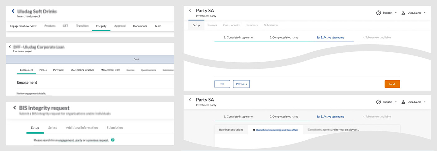
Also I provided the complete confluence documentation, states and animation for these UI controls

Thank you! 🙏🏼
