
“How can you visually summarize the final set
of the Table Tennis tournament at NID?”
During my first semester, we had a Table Tennis tournament organized in campus. What followed was an exciting day filled with fast paced matches, and the finalists were Upamanyu & Amal. This was a great chance to do my first data visualization project: record the scores, see how the match unfolds, and visualize it!
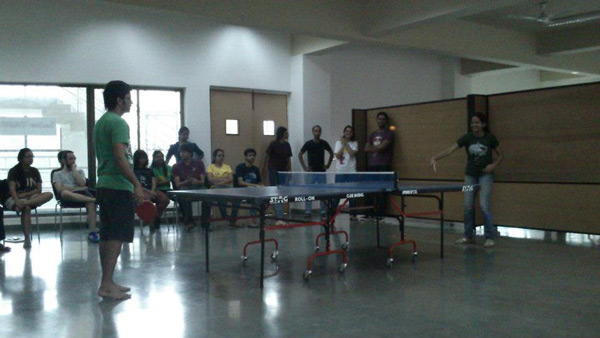
One of the matches during the tournament
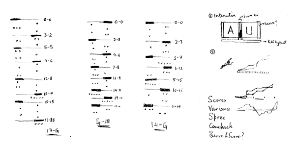
How the scores were recorded, and some rough ideas on how to visualize them
Digitizing the data in binary, and finding patterns in the three matches
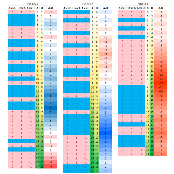
Exploring different ways of representing the data for one match
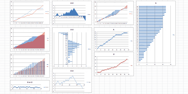
Having explored different styles of representing the data, I decided to stick with a line chart for the score of the two players, and a cumulative icon in the bottom to represent the lead. Based on the players' game style, I picked the Red-Blue pallete (Upamanyu, who has an aggresive style, in red, whereas Amal, a more calm player, in blue). I used Processing to visualize the scores over time, and finally created a poster in Illustrator.

Animation highlighting the key points of the first match.

Summary of three matches, as well as the important moments from the first match.

Final Poster explaining the context, legend and the three final matches.
As always, more details about the process and explanation can be found on my blog.
Update: This project was featured on Visual.ly Staff Picks!


