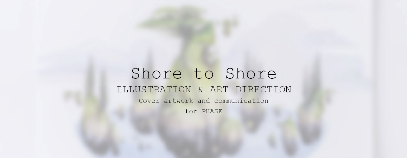
Shore to Shore
Illustartion & Art dierction
Illustartion & Art dierction
How do you make an album cover?
It may sound a bit obvious, but what you need is an eye for details, patience, the right blend of knowledge and passion, and so on…
I did say it was obvious, didn’t I? But I have to admit that among the many passions that have led me to work with images (people call it visual design), music album covers play an important role.
And so it happens that one day, Bram, a.k.a. Phase, drops me an email where he introduces himself and tells me he’d like me to work on his first album cover.
I’d say this has probably been one of the most inspiring experiences this goddamn beautiful job could have given me.
Read this article to know more about the birth and the behind the scenes of the record.
Here’s what he first told me when we were getting to know each other:
“The album is called “Shore To Shore”, which has various meanings:
– Travelling to an unknown island by boat and traversing this island until you reach the other shore. A journey that goes through all kinds of emotions, from despair & loneliness to epiphany and peacefulness. Overall, the vibe is mysterious.
– The track Shore To Shore itself has various chapters. The sparse lyrics “someday we’ll pay” is also a reference to Charon and the river Styx, the boatman which you have to pay when you want to traverse into the afterlife.
– A more straightforward meaning is the amount of traveling and emotions I went through in the last two years for love and music.”
But I still haven’t answered the main question: how do you make an album cover?


You start in the same old way: research and study.
I put together the information and suggestions I had with the feelings I got from talking with Phase and, most importantly, I listened to the record.
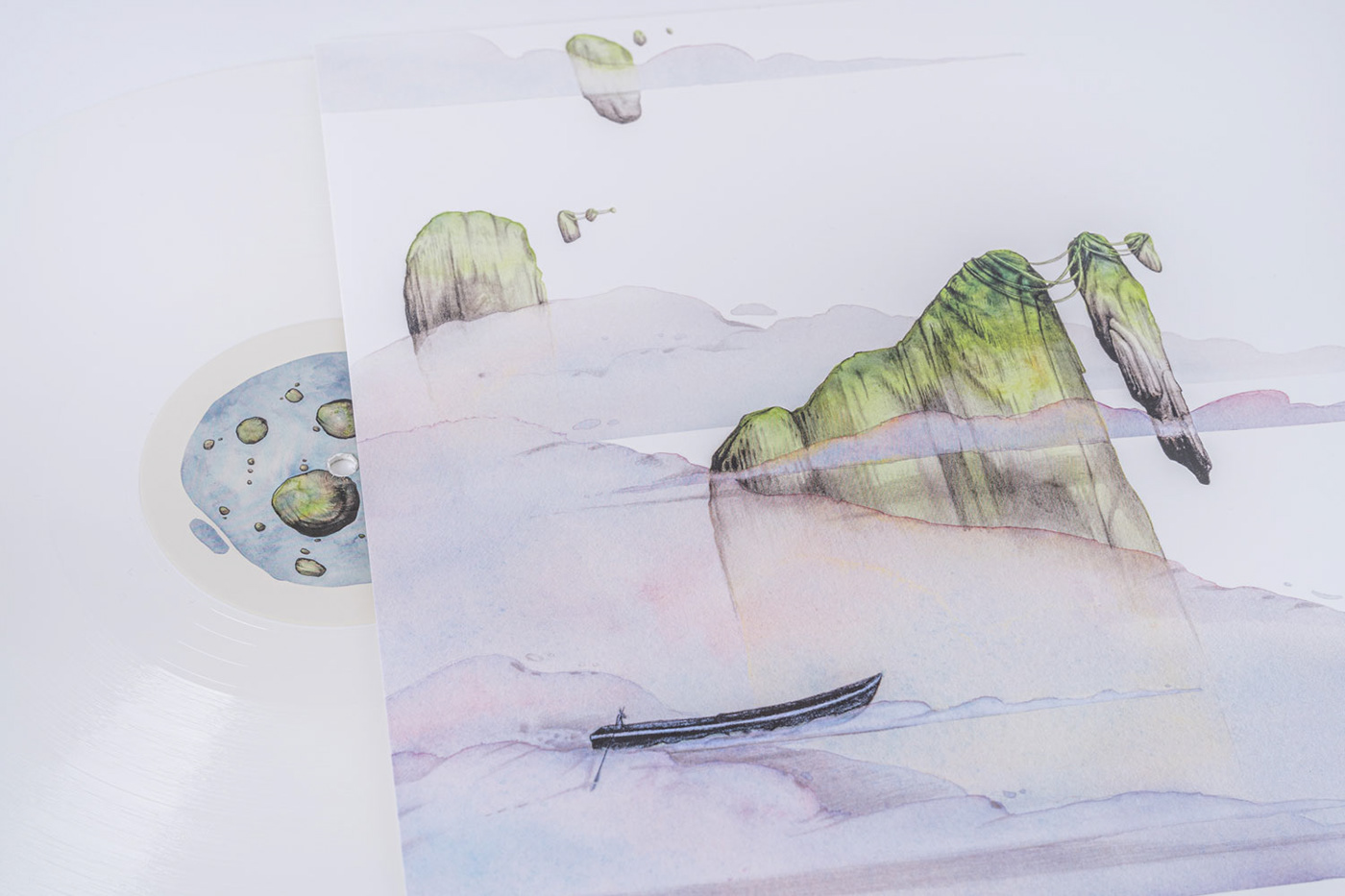
The listening step is fundamental, as it allows me to understand and discover the universe of the artist I’m working with. In this specific case, listening to the album allowed me to understand a few things. Most importantly, that combining Phase’s sound with my art would give birth to something comparatively different from anything else on the Drum and Bass scene: I honestly don’t think there are many album covers out there that feature pencil drawings and soft watercolours.
And there’s another teeny tiny detail. Phase’s record label is Metalheadz (an icon of that industry), so there’s this guy called Goldie who is kind of involved in his story (I doubt you don’t know him, but just in case, here’s a few info).
But these are just circumstantial factors. Let’s dive into the working process.
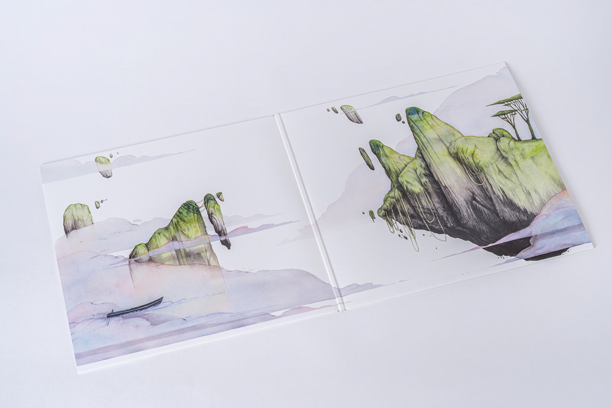
For this project, I used a hybrid approach where I combined illustrating a concept album with building a brand identity.
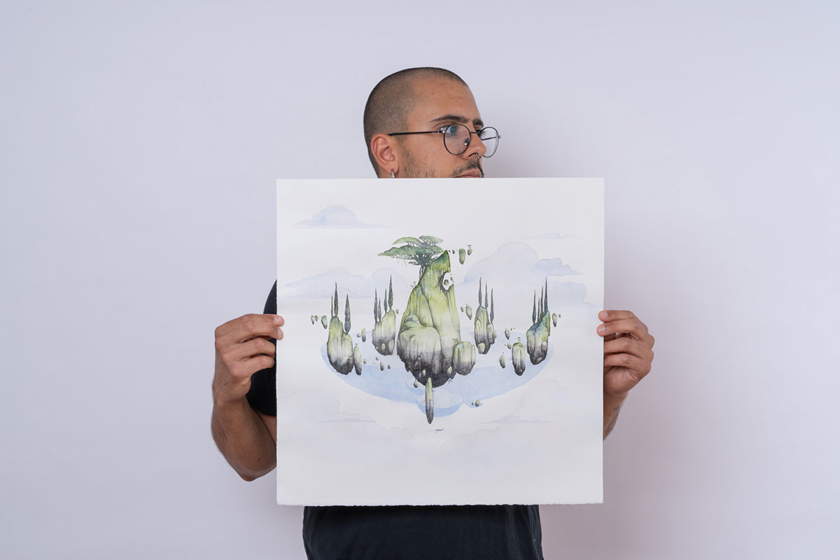
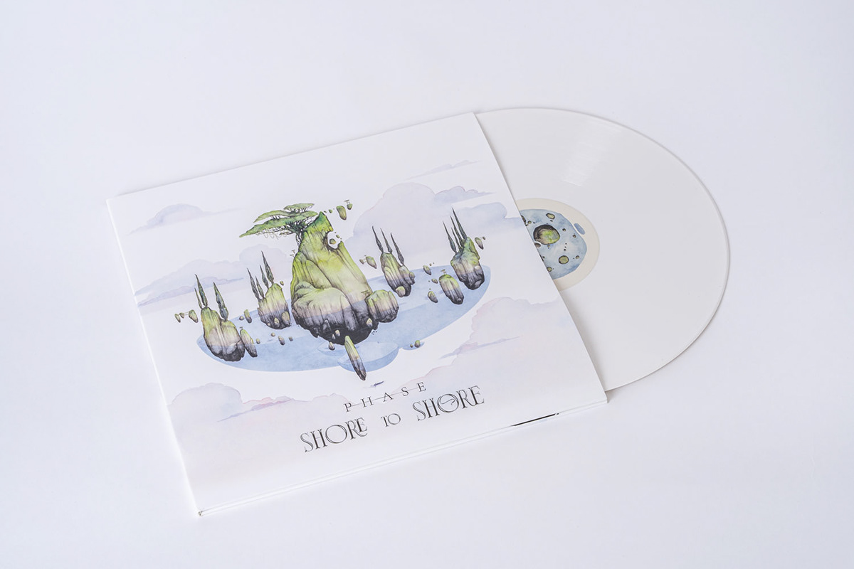
So I came up with the idea of creating one “main” drawing which would be used as the actual album cover and that would be the source of inspiration for every other visual element in the project.
Of course, during this phase, I took into great account Phase’s feelings as well as my “point of view” on the record. And let’s not forget about all the necessary considerations, and technical and communication features that make sure a drawing can turn into an album cover.
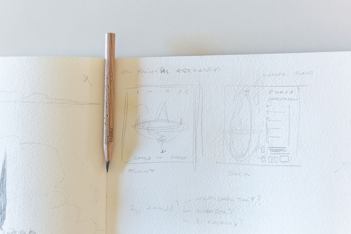
After all the thoughts and designing, it was time to move onto the sketching and drafting phase, which was quite intense and productive.
Eventually, the composition I was looking for finds its place on a page of my sketchbook. It was a 3×3 cm draft. All in all, a stamp.
I adapted the drawing to fit the size, I summed everything up with Phase, we exchanged a couple of emails, and that was it. The drafts were ready, it was time to get started on the actual work.


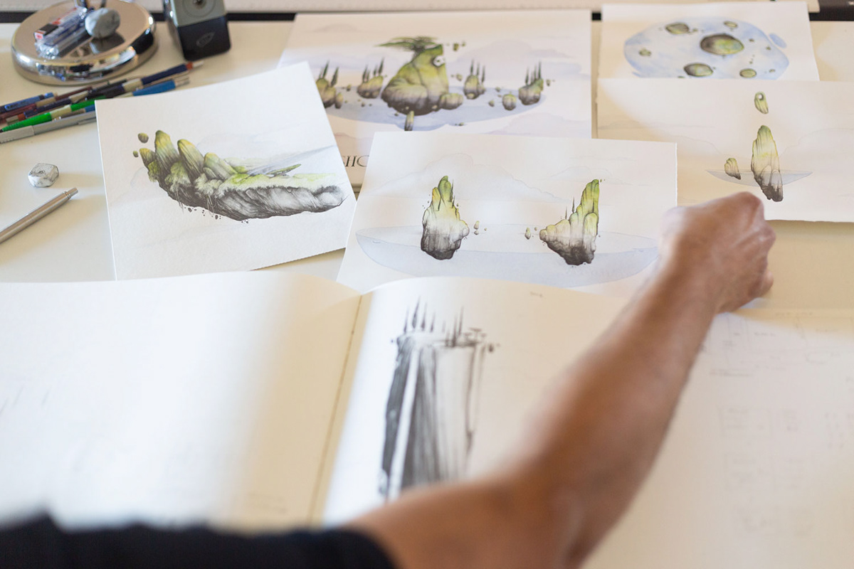
My ingredients to create an artboard are always (or nearly so) the same: paper, watercolours (few), ink, water and pencils (a lot).
This is the most beautiful of all steps, so relaxing, so zen. But it’s also the trickiest one. Water plays an important role, as well as your approach with the paper.
Then it was time to turn the artboards digital.
The process is easy enough with smaller formats, but this time I had several small artboards as well as 3 big ones with an irregular format. Let me tell you, it wasn’t a walk in the park.
But in the end all you need is time, patience and a fair amount of stubbornness and you can reach the goal, which in my case was to be able to work digitally on what was created with traditional techniques.
Yes, it’s a delicate, meticulous workflow, but still, paper gives you the best result by far.
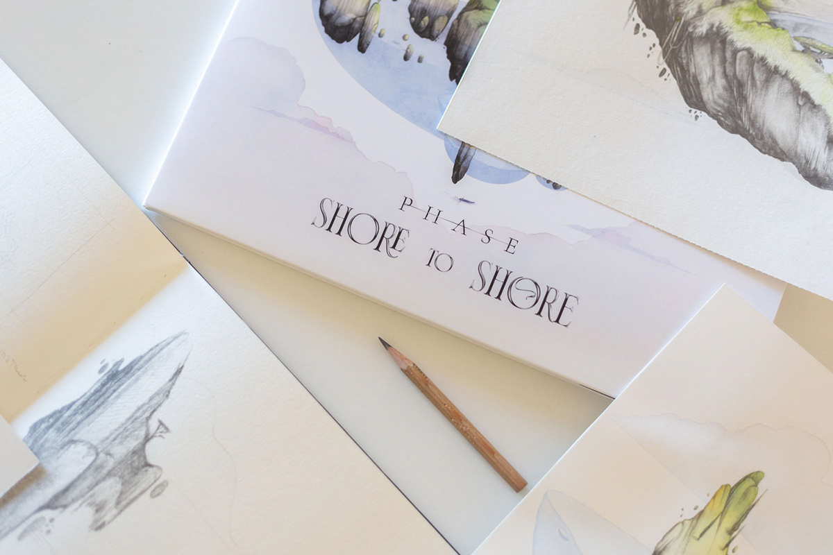
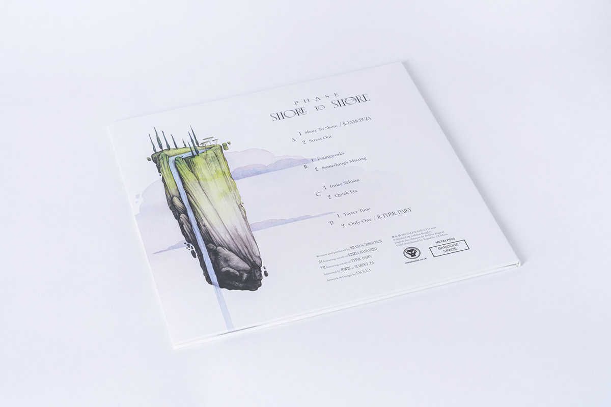
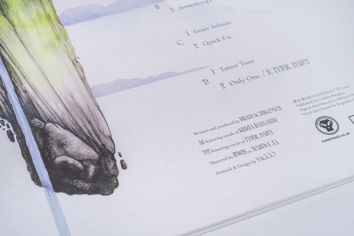
Finally, I worked on the details, post production, and typesetting, polished everything up and put all the components together. The visual design project was complete.
White spaces (there’s no room for horror vacui here), simple, concise information, and top-of-the-line typography are of the essence here.
The time spent researching typography is undoubtedly one of the small pleasures of being an art director.
Even though I already knew what I was looking for, I have to admit browsing through websites, archives and digital foundry shops was kind of relaxing.
We could say I basically stumbled across Resistenza Type Foundry quite by chance, when Giuseppe and Paco were guests on Marco Goran Romano‘s Youtube channel.
After opening their website, I quickly looked around and there it was: Norman. It was love at first sight and just about the perfect balance between content and form of the album cover.

The time had come to send my work to Metalheadz. I typed up the email and put Phase and everyone else from the label in CC, including Ant and Goldie. They were all excited and congratulated me for work done. A happy ending just like the one you get in fairy tales, only this time it was in the form of an email.
And that’s it. But is it really? That would be nice, wouldn’t it? Just do a little drawing, scan it and everyone’s happy… Not quite.
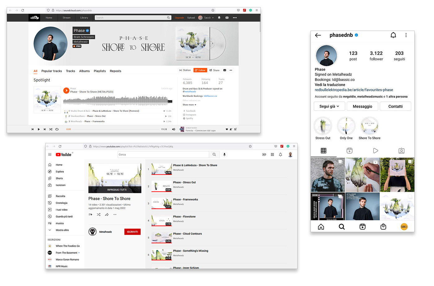
There were still Spotify Canvas, social content and pre-print checks to do.
The Spotify Canvas have actually been animated by none other than Phase who created a specific animation for each song with great creativity and eye for details.
Now, if this was a case study, I would have to dive deeper into topics like the need for perception, readability, awareness and identity, or how to come up with a cover that could work on both mobile devices and LP print.
But I’m not here to bore you nor brag about my pernicketiness care for details.
Let’s just say this is my account on how to create an album cover.

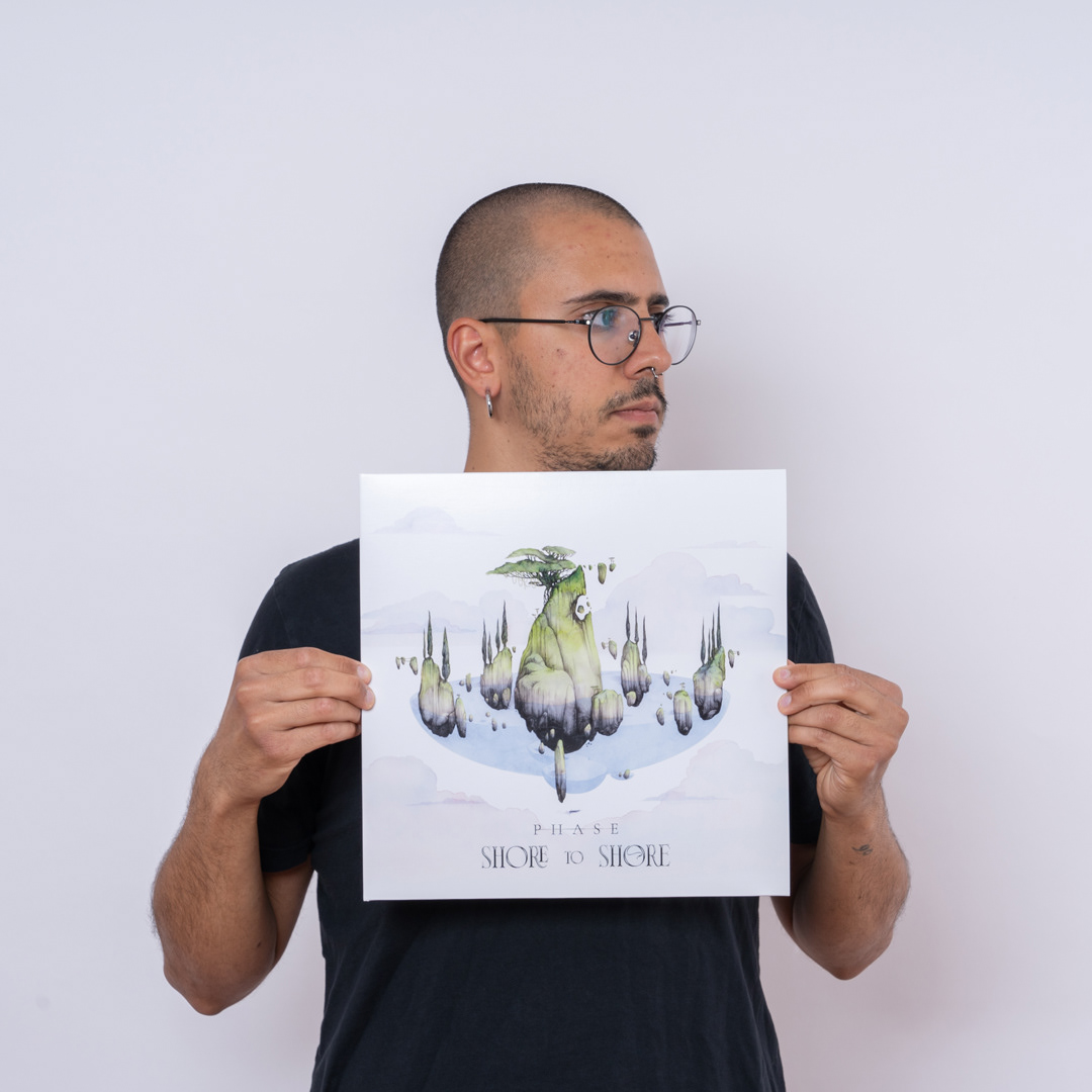
Photo by the incredible Chiara Martini
Photo by the phenomenal Marco Di Marcantonio
Translation by Noemi Petrini