
UI/UX improvement for medical video-call web browser
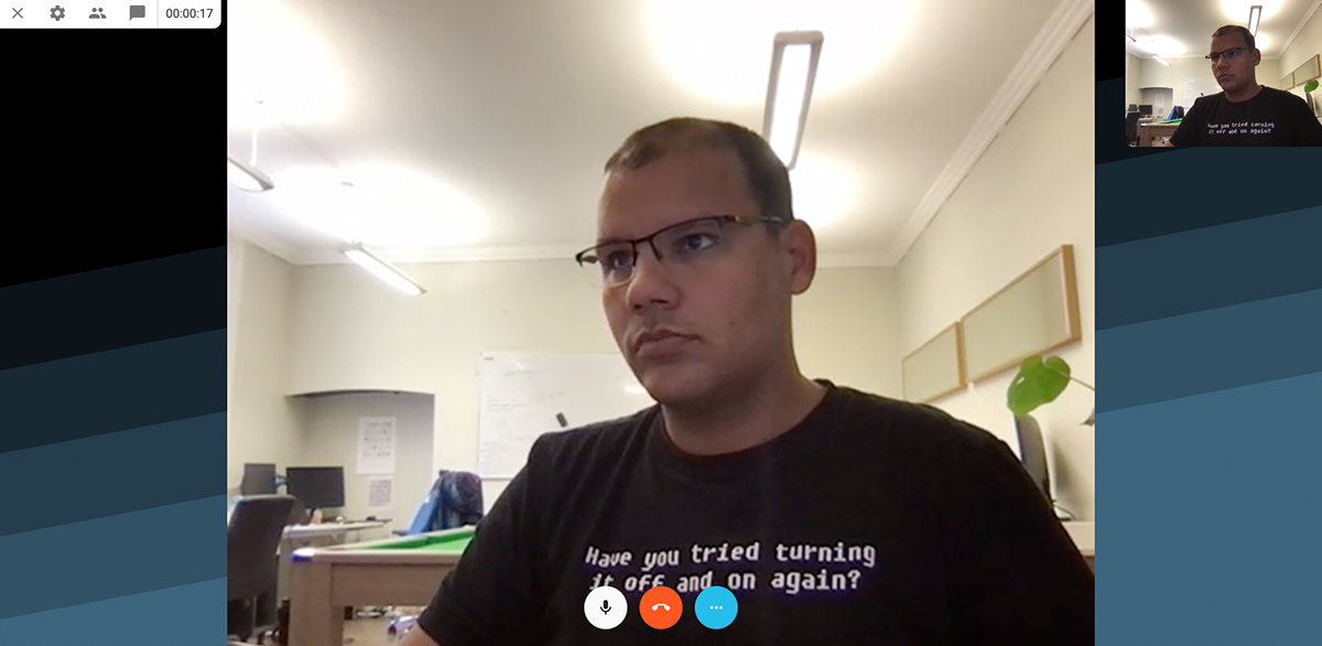
There weren't any settings for the user test camera and microphone

The call had a lot of functionalities, like live chat, video/audio settings and participants, but the were hidden in icons, creating a bad UX for user
A settings button to check video and audio were added to the waiting screen


With the new UI, the user can see all relevant information during a conversation with the patient
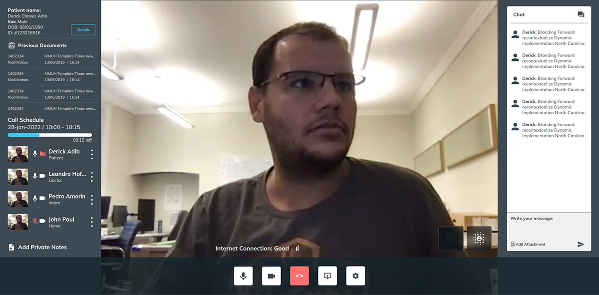
Also, after the call, the now can rate the call quality

No new functionality were added to the video call. They were hide on icons and menu buttons


