Intial Sketches
The earliest stage of this project to redesign the cover of The Cincinnati Enquirer played with a muted and earthy color scheme with a restrained use of more vibrant colors. The architecture was designed to give readers more story headlines above the fold than the previous version while giving the bulk of the page space to the cover story.

A new hat. The newspaper's flag was downsized to allow fresh content to stand out. More value was placed on objects whose news content changed day to day.
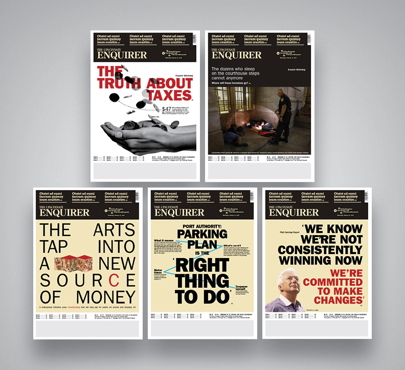
First prototypes. An ad hoc typographic poster-like appearance became the visual hook early on. The big, wide-open canvas below the flag was like a playground. But, because this product is displayed folded on racks any remaining headline or info chunk below a certain point would not be visible to single-copy buyers. A new approach would be needed.
Color, Personality Injection
The next round of sketching focused on color and headline count. A vibrant yellow box anchored in the fourth column becomes an identifying mark for the paper, allowing the newspaper's flag to be visually incorporated into the cover story zone. The typography of the flag was altered, lowercasing the 'i's in Cincinnati to give it some whimsy and to align it with the branding on Cincinnati.com.
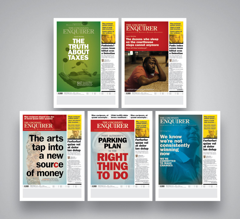
Color, color, color! A yellow box in the upper corner of the page holds headlines for other stories inside that day's newspaper and the flag gains a bright red background. Cincinnati is a colorful city ... its newspaper should reflect that.

Dot the 'i's. A similar technique is used on the newspaper's website. It's a little quirky but doesn't compromise the publication's credibility. (Others disagreed, however, and this idea was tossed).

Let's do this again! More prototypes were created using the new and vibrant scheme. Different mixes of refers and story types were played with to test out the design. As was the goal from the beginning, every headline and story refer had to make it above the fold; the only time it did not was for the result of a major local election, bottom center.
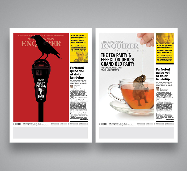
Just for funsies. It's always enjoybale to come back and redesign a cover story. Yep, there's definitely potential here :)
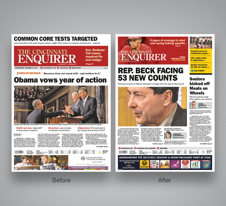
The end result
The final look lost the cover story approach and instead opted for a more tradition approach where every story started text on the cover. Cover stories will still happen from time to time but won't be a regular feature day to day. The result is a refreshed front page that retains the feel of the former version but gives more room for news content.
