FLAPPERS ▲ Learn to Fly
Branding / identidad e imagen / Fotografía / Publicidad digital / Packaging / Papelería comercial / Social media / Estrategia para Evento FLAPPERS 2013
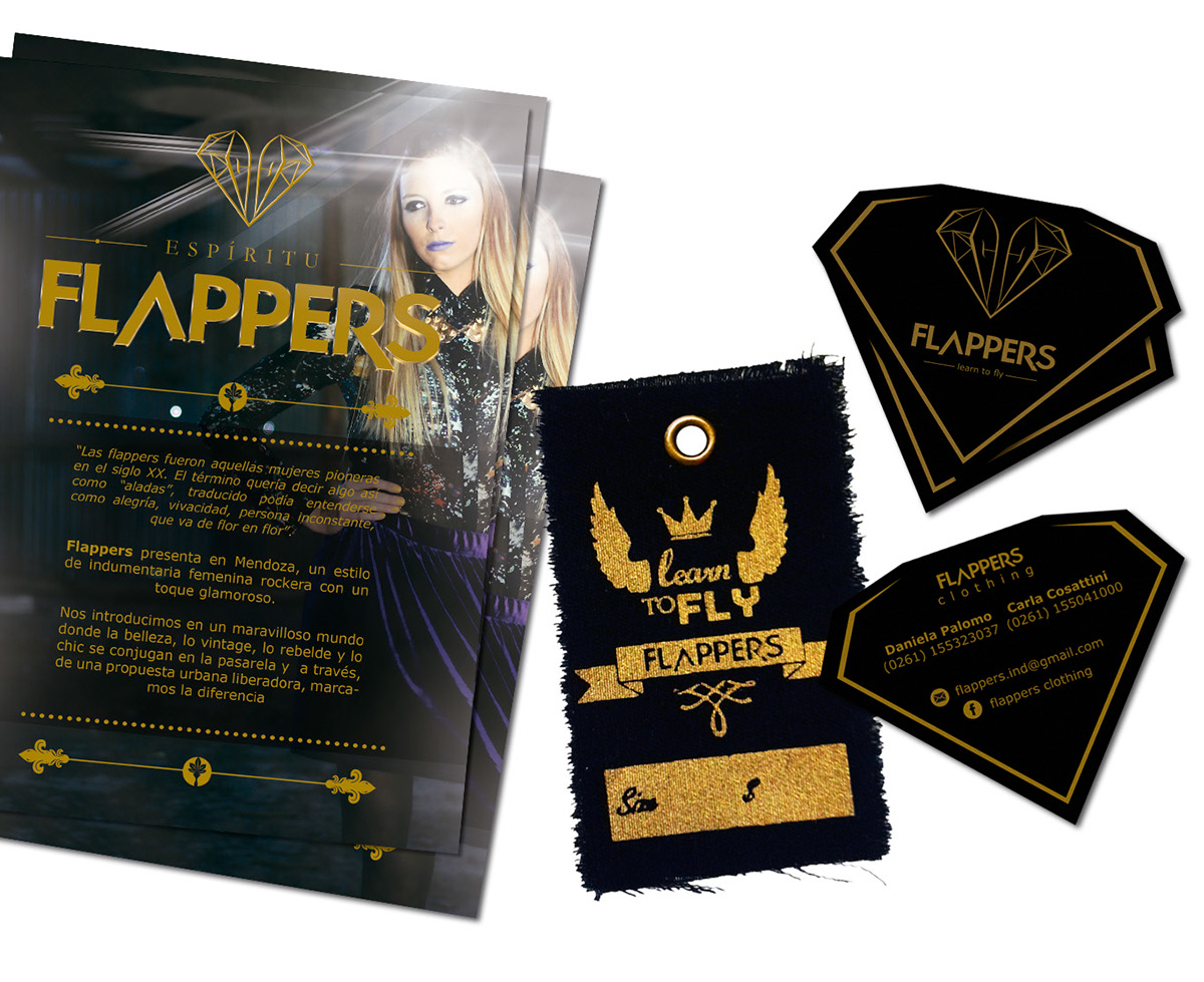
Proyecto comercial - Flappers ▲ Learn to Fly
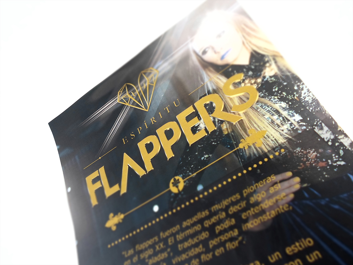
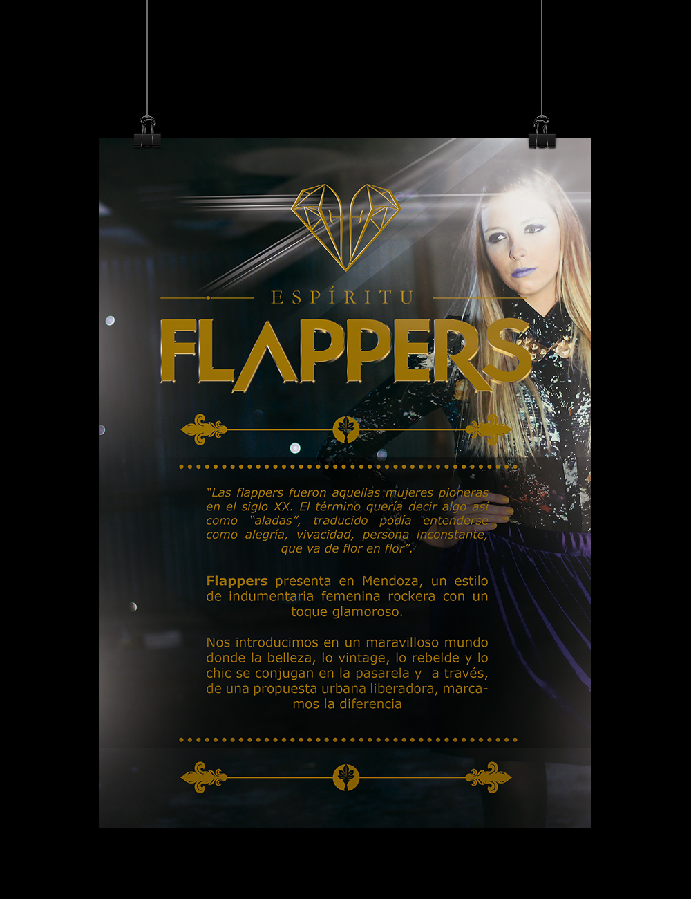
“Las FLAPPERS fueron aquellas mujeres pioneras en el siglo XX. El término quería decir algo así como “aladas”, traducido podía entenderse como alegría, vivacidad, persona inconstante, que va de flor en flor”.
Proyecto comercial - Flappers ▲ Learn to Fly
“Las FLAPPERS fueron aquellas mujeres pioneras en el siglo XX. El término quería decir algo así como “aladas”, traducido podía entenderse como alegría, vivacidad, persona inconstante, que va de flor en flor”.
("The FLAPPERS were those pioneering women of the early 20th century. The term meant something like "winged", which could be understood as joy, liveliness, irregular person, someone who goes from flower to flower")

IDENTIDAD E IMAGEN ▲ INSPIRACIÓN
inspiration
inspiration
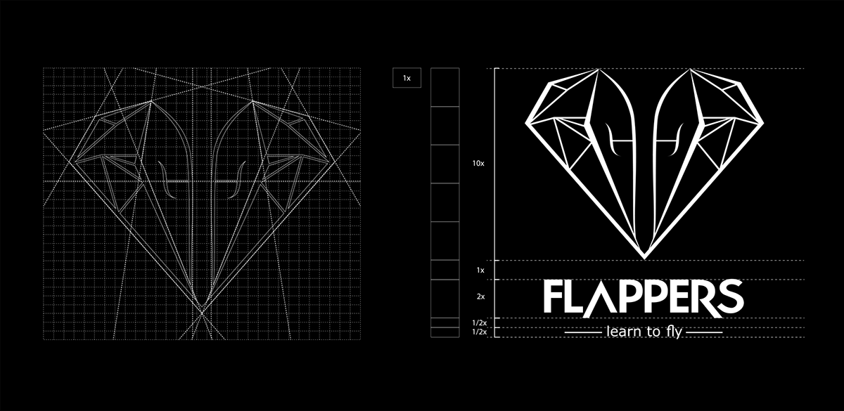
BRANDING ▲ CONSTRUCCIÓN
construction

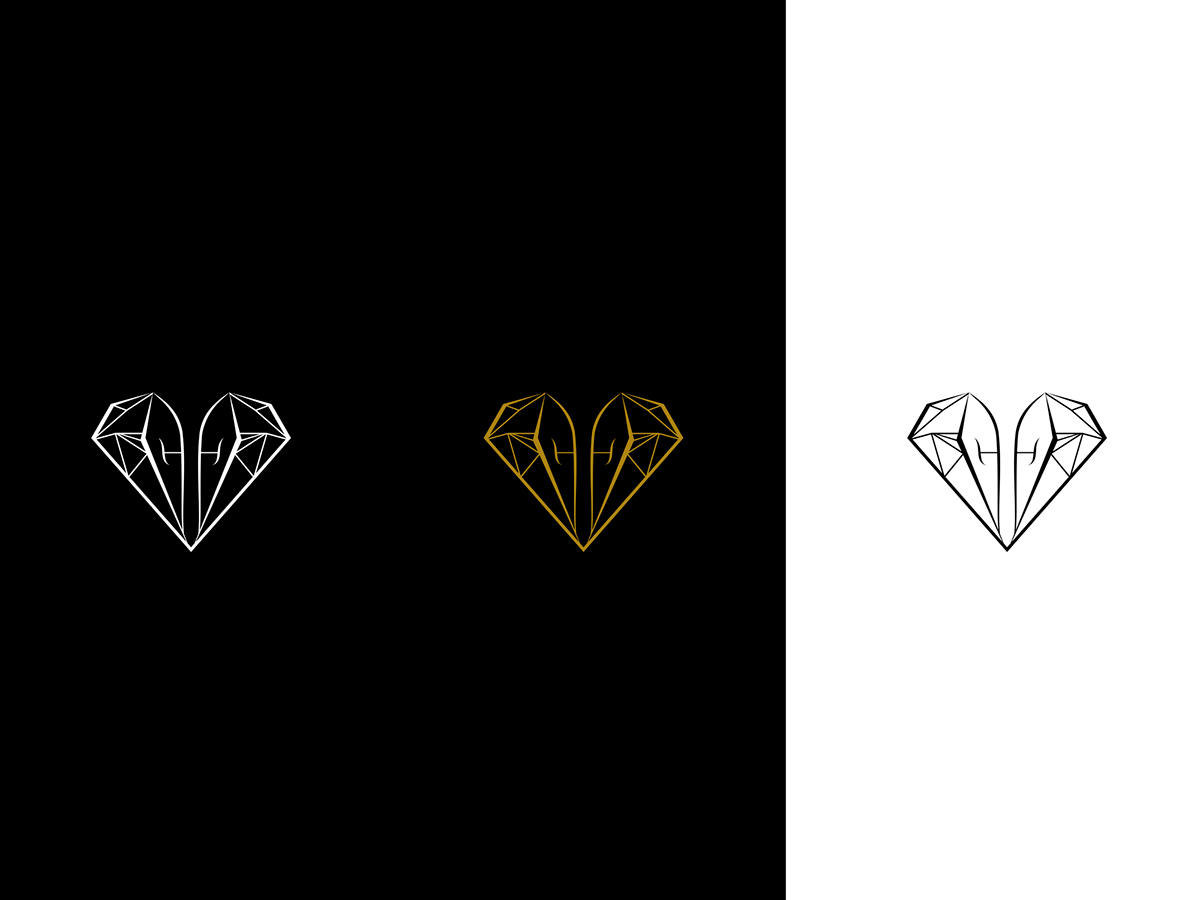
1.1 Semántica y Sintáctica
La presente marca tiene como objetivo estratégico representar y comunicar mediante un conjunto de signos visuales, una nueva tendencia glamorosa y rockera de la mujer que es admiradora del buen gusto, casual y juvenil. Como un icono para desafiar y contradecir las costumbres cotidianas de las mujeres modernas y despreocupadas por sus labores.
Transmitiendo formalidad, salvajismo, calidad y continuidad y de ésta manera luchar contra las competencias y desafiar las nuevas tendencias.
1.2 Elementos representativos
Diamante: proviene del griego adamas o adamantem, que significa “el invencible”, también transmite lujo, dinero, brillo.
Corazón: simboliza vida y la fortaleza, glamour y pasión en éste caso la pasión por el Diseño y la indumentaria.
Letra “f”: representa lo femenino y remarca la inicial de nuestro logotipo con la finalidad de ser pregnante y de esta manera recordado por el público objetivo, los receptores.
1.1 Semantic and syntactic
This brand has as strategic goal representing and communicating through a set of visual signs a glamorous and rocky trend of the woman who is an admirer of good taste, casual and youthful. Meant to be an icon for challenging and contradicting the everyday habits of modern women.
By transmitting formality, savagery, quality and continuity it seeks to challenge competence and new trends.
1.2 Representative elements
Diamond: comes from the Greek adamas or adamantem, which means "the invincible", it also conveys luxury, money and shine.
Heart: symbolizes life and strength, glamour and passion in this case the passion for design and fashion.
Letter "f": represents the feminine and emphasizes the initial letter of our logo in order to be pregnant and thus remembered by the target audience.
1.3 Technique
Path logo
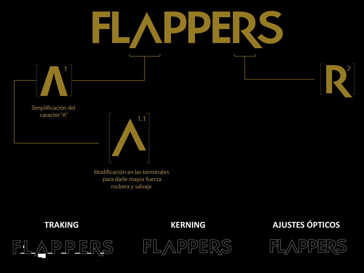
BRANDING ▲ TIPOGRAFÍA
construction type
construction type

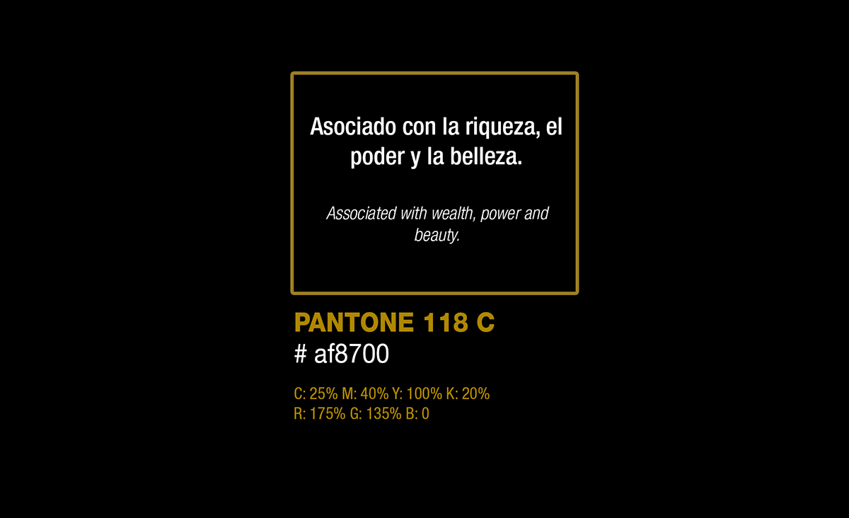
BRANDING ▲ PALETA CROMÁTICA
Chromatic palette
BRANDING ▲ MARCA
imagotipo

BRANDING ▲ VERSIONES
versions
APLICACIONES ▲ MARCA
Applications logo
Applications logo


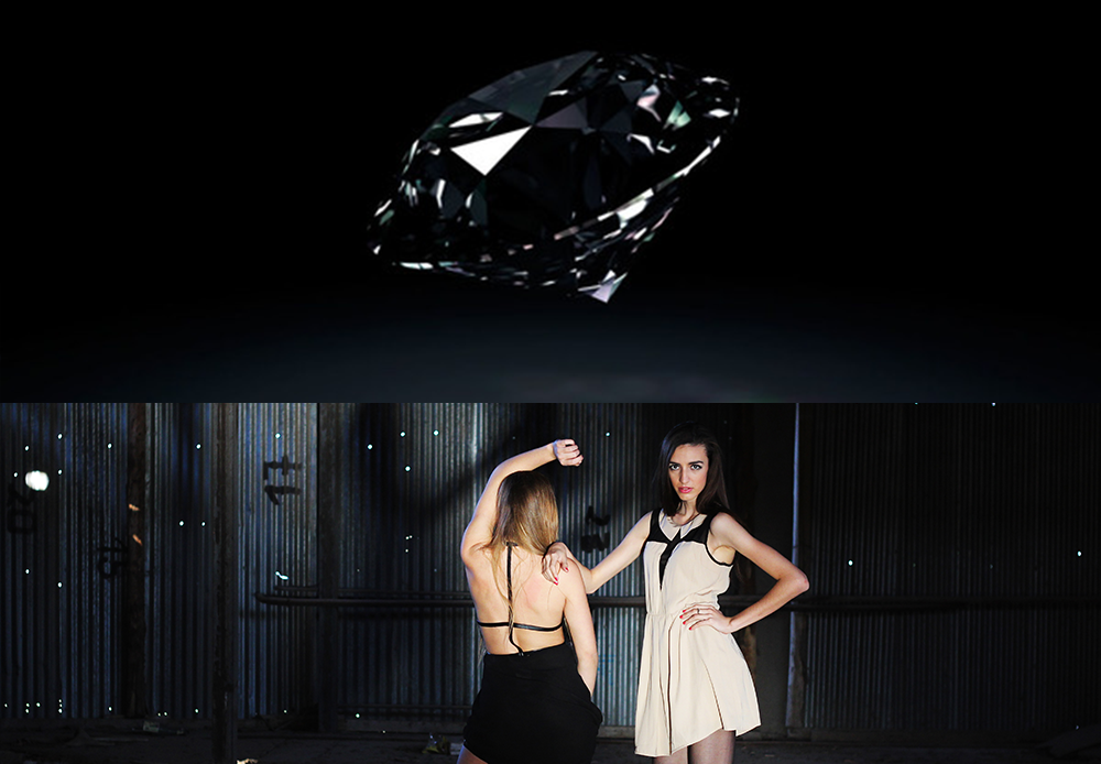
FOTOGRAFÍA ▲ MODELOS
for event photography


PUBLICIDAD ▲ IMPRESA Y DIGITAL
printed and digital advertising

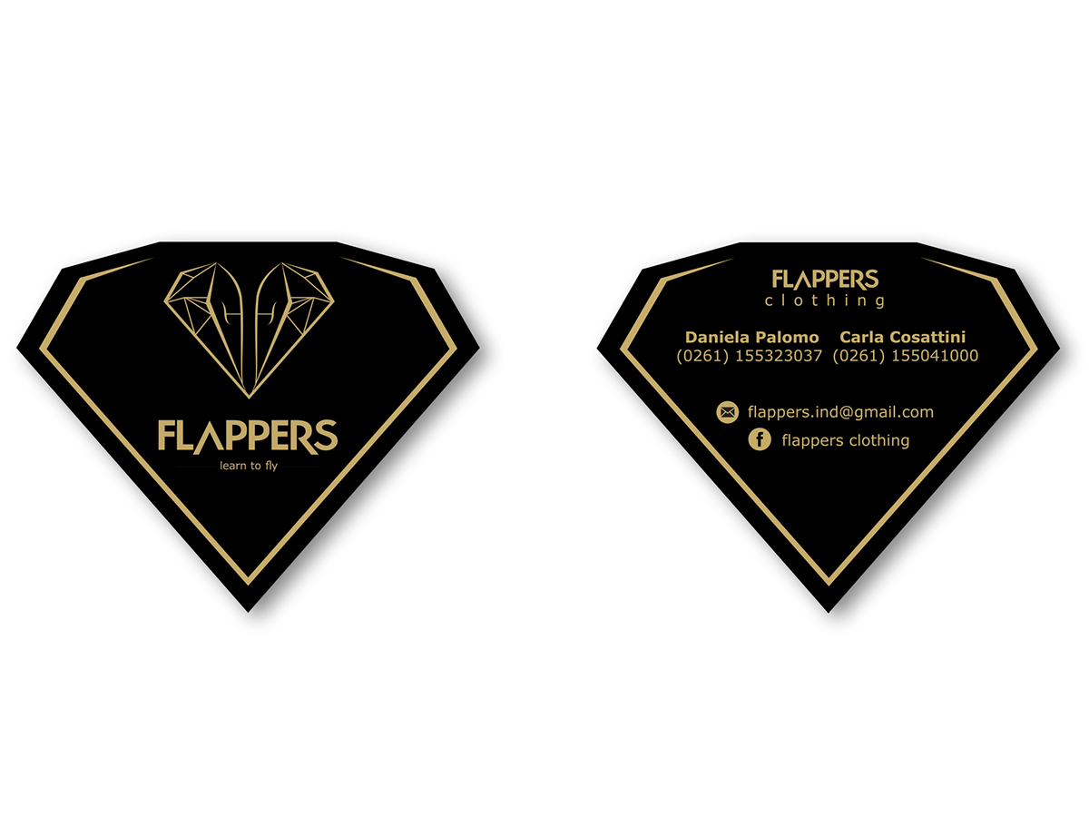
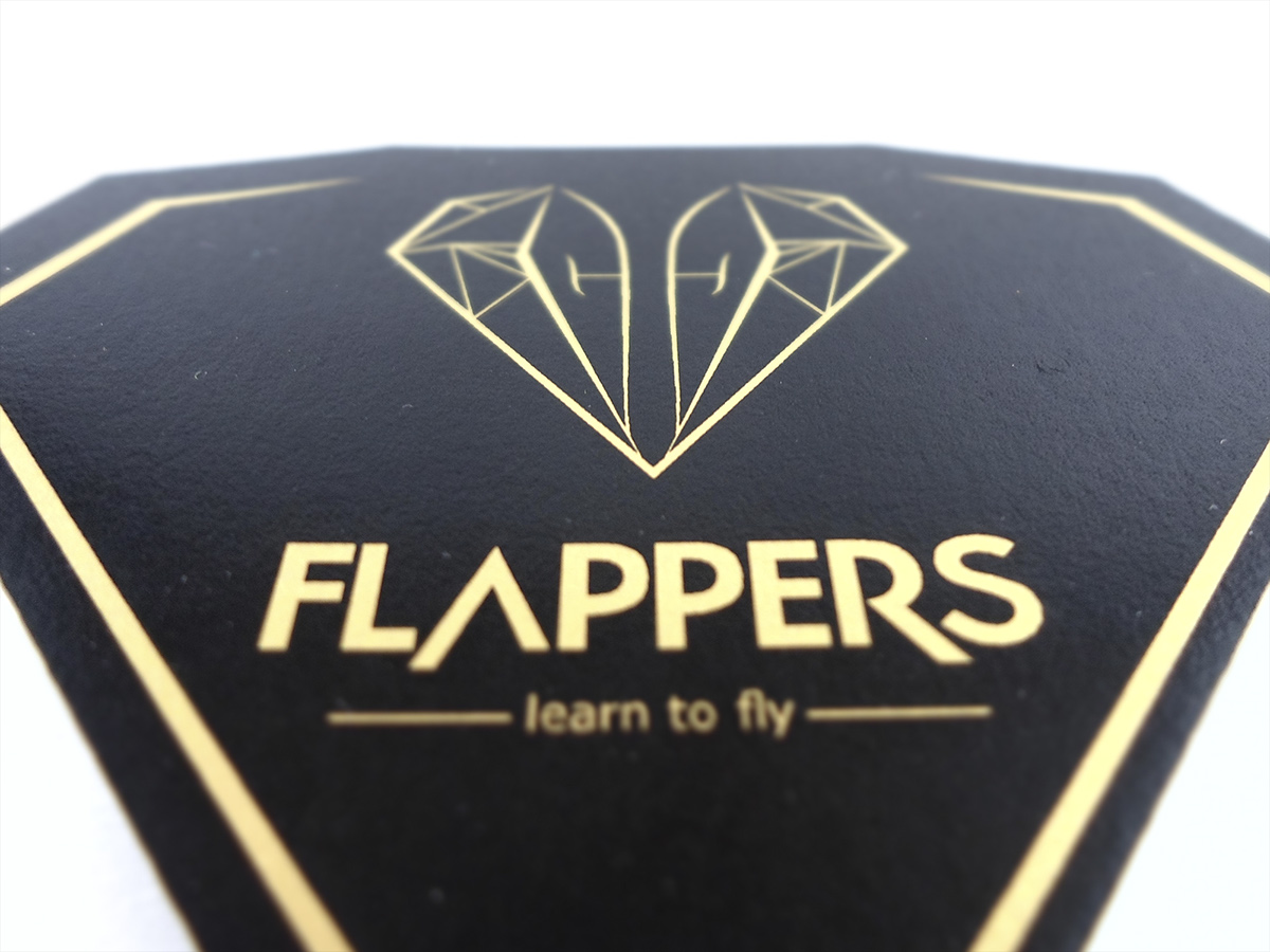
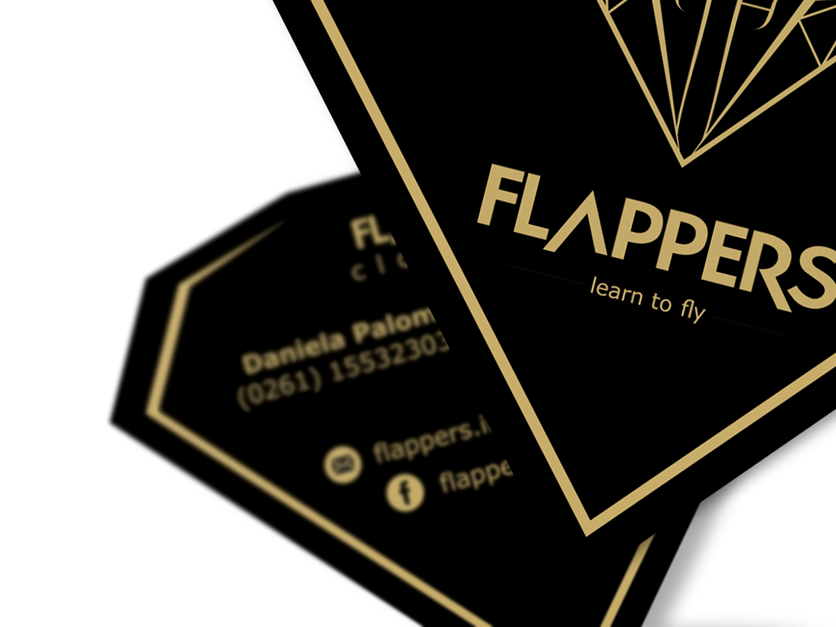
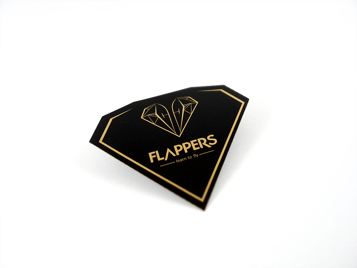
PAPELERÍA COMERCIAL ▲ TARJETAS COMERCIALES
business cards
business cards


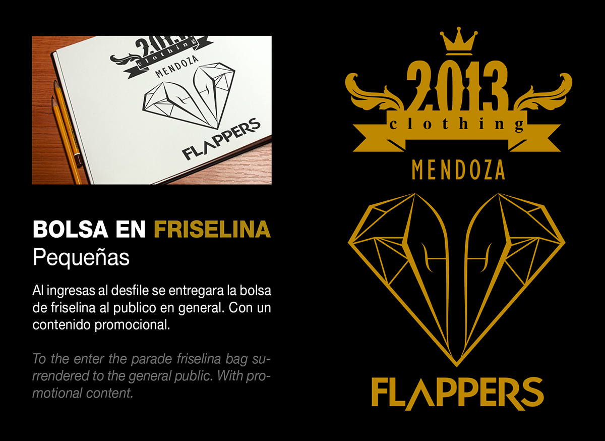
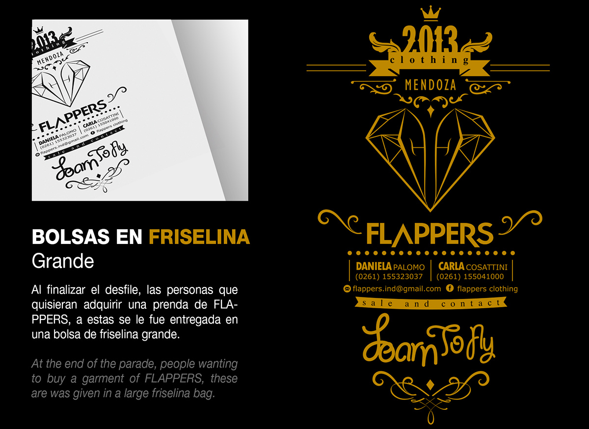
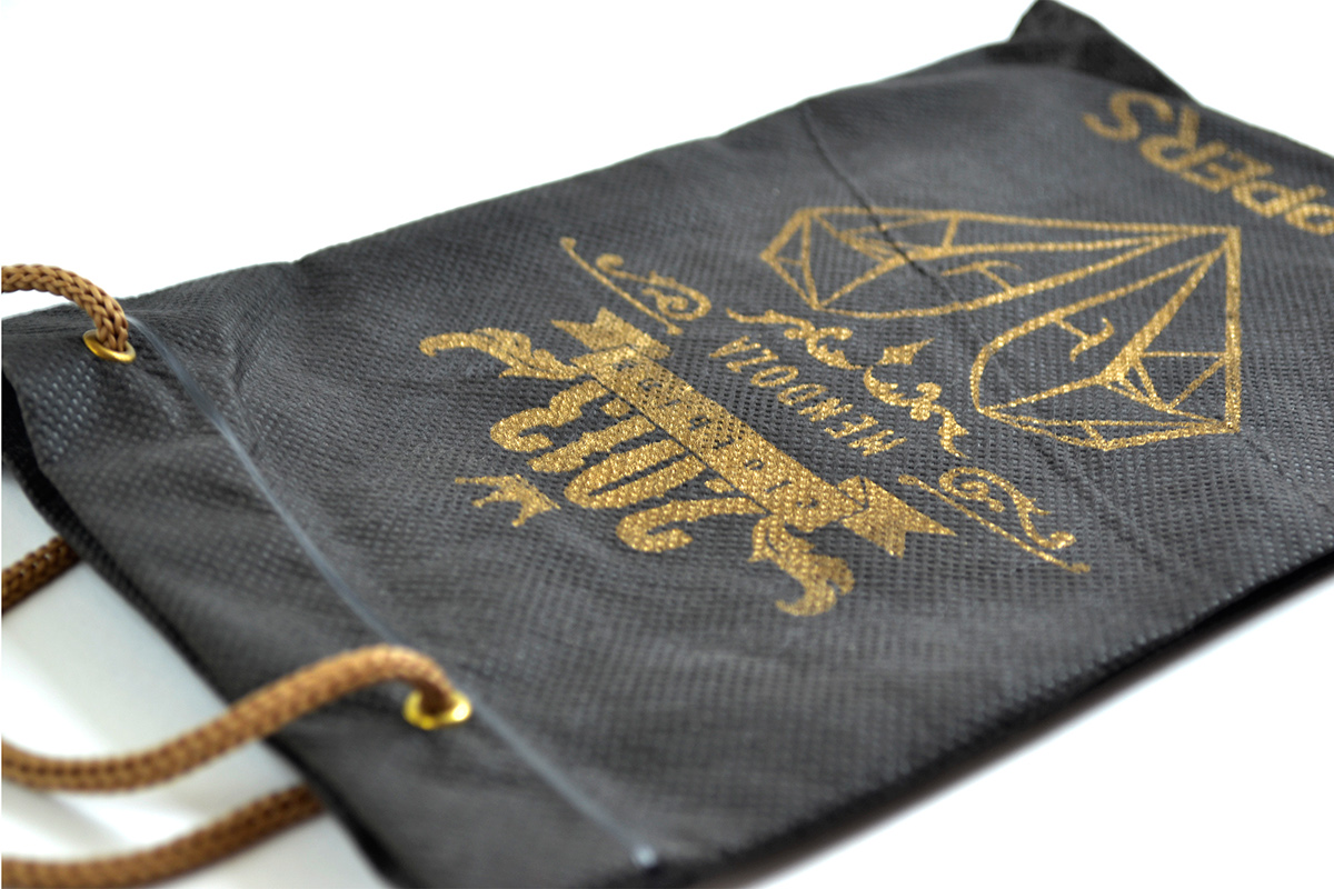
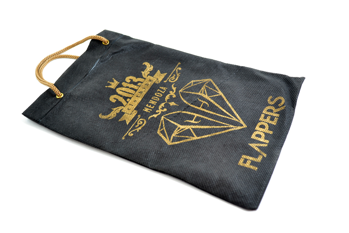
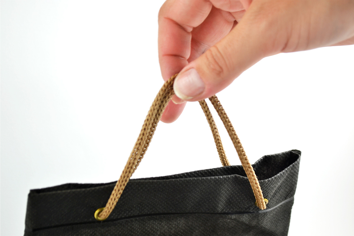
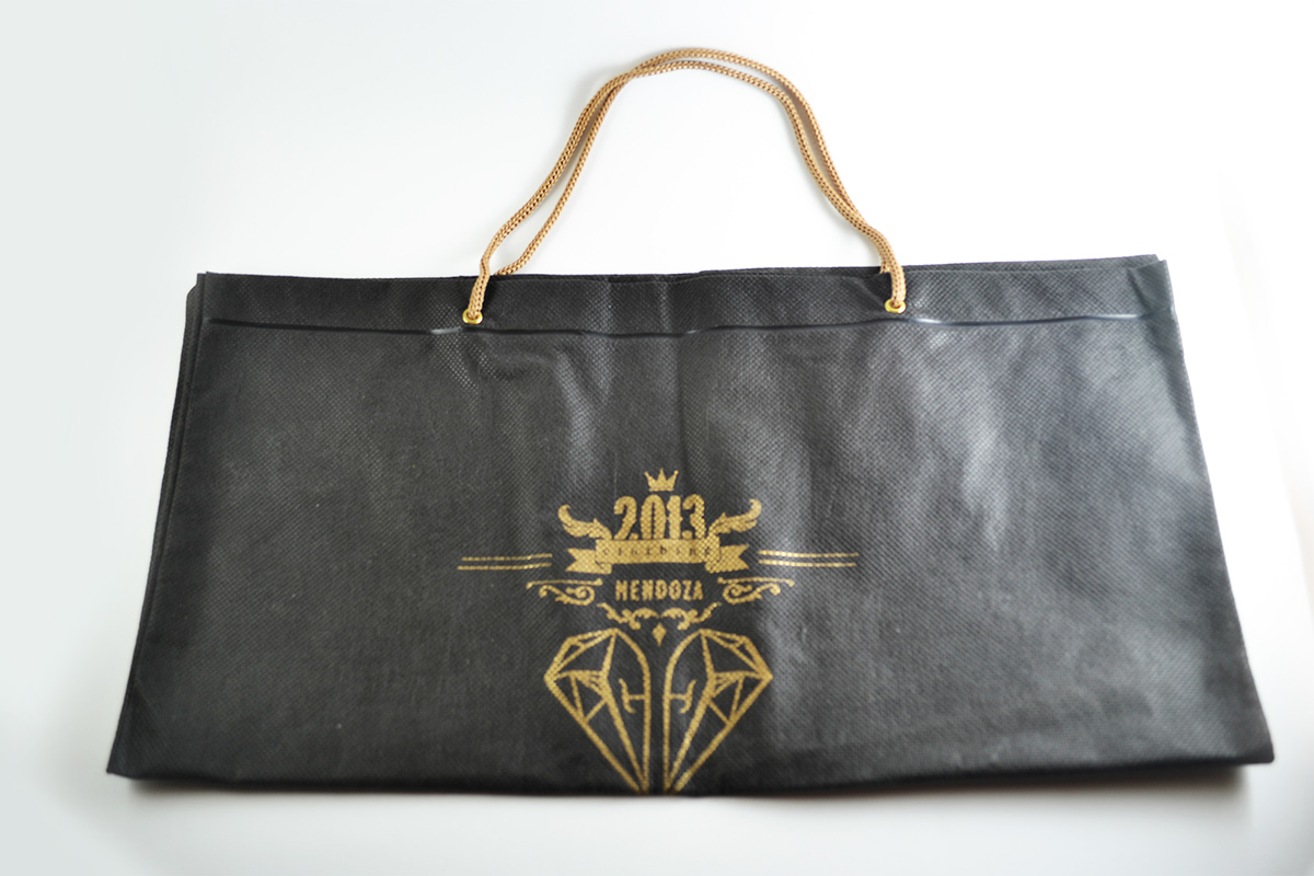
PACKAGING ▲ BOLSAS EN FRISELINA
friseline bag
friseline bag

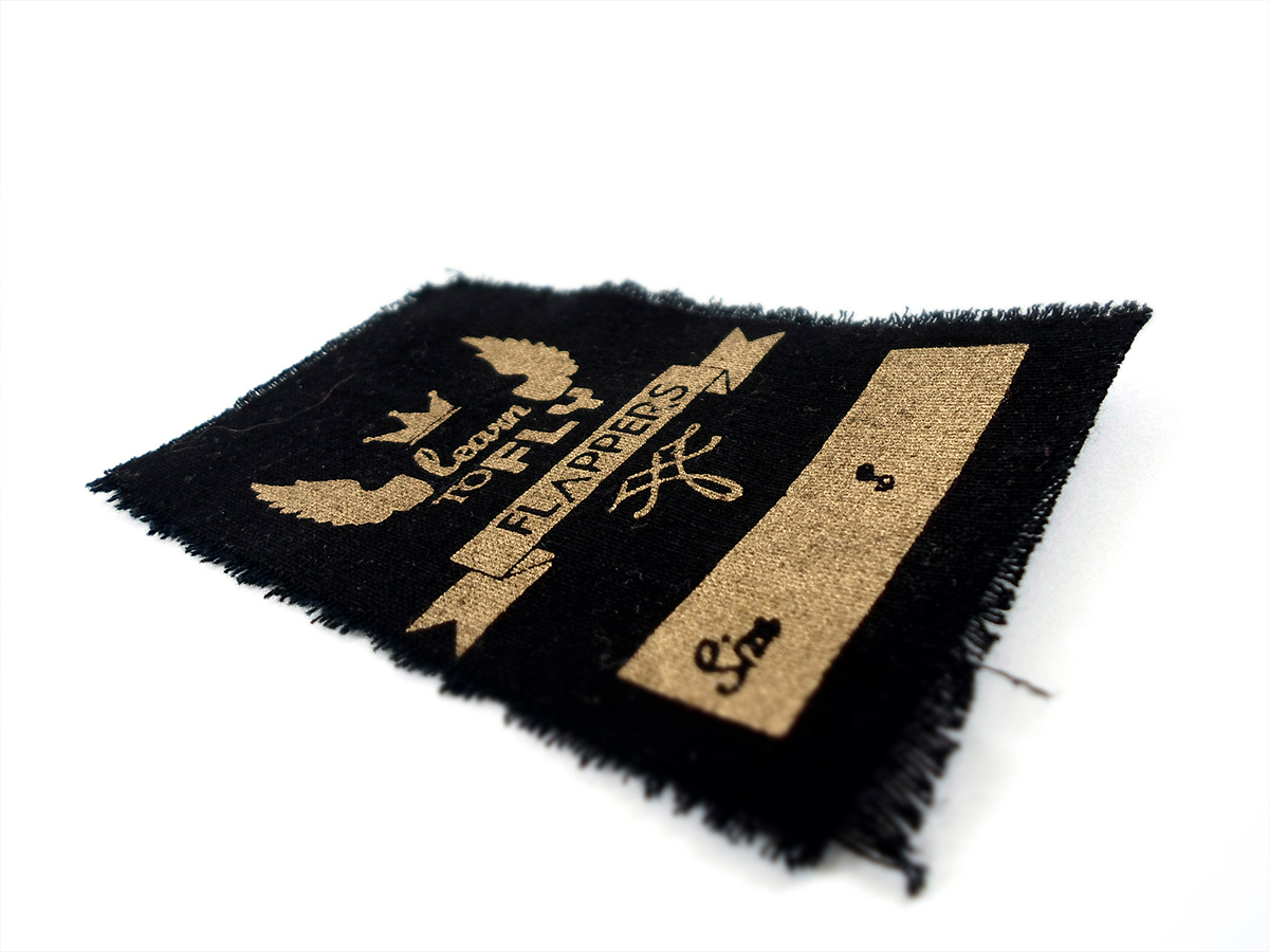

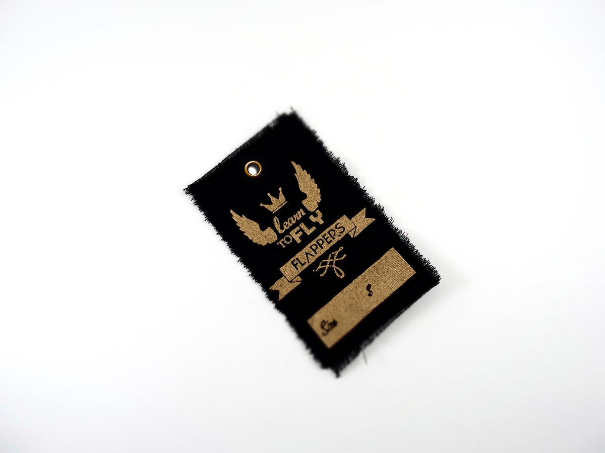
LETTERING ▲ LEARN TO FLY


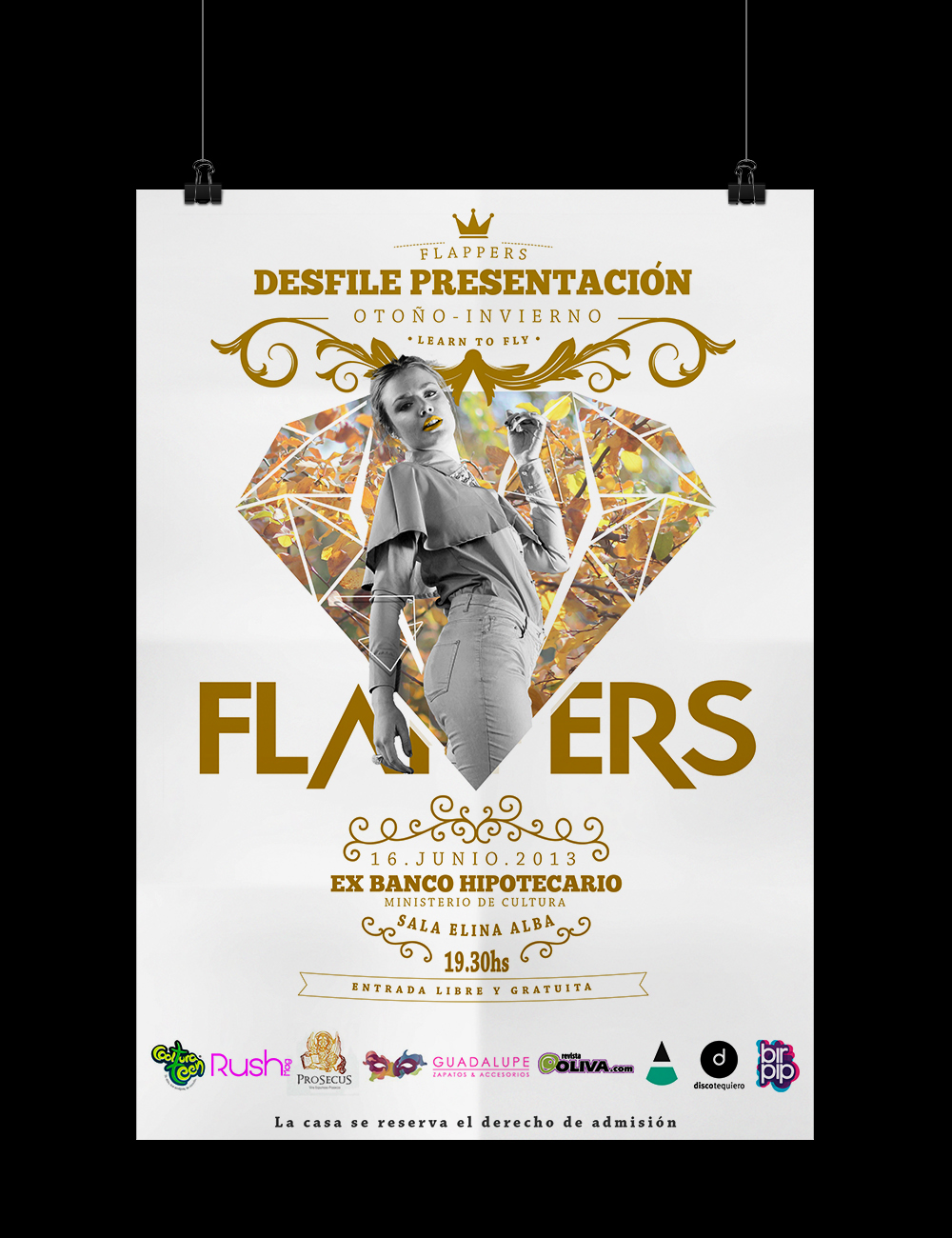
ESTRATEGIA▲ EVENTO PROMOCIONAL
Strategies for FLAPPERS' promotional event


CLIENTES ▲ CARLA COSATINI Y DANIELA PALOMO
PRODUCCIÓN/DISEÑO ▲ BIRPIP
FOTOGRAFIA ▲ JUAN IGLESIAS
MAQUILLAJE ▲ ROMINAZA
rush magenta - revista oliva - cultura teen - prosegur - contrapiel - guadalupe
--------------------------------------------------------------------------------------------------------------------------------------


