All Elite Wrestling (AEW) Rebrand exploration
This is a personal creative project exercise that sought to explore rebranding the current brand of All Elite Wrestling (AEW). My main intention was to rethink how the brand could be repackaged in a more contemporary & progressive way.
My main approach taken to create new AEW branding had to involve the following pillars:
- Think outside the box to differentiate branding that is outside of AEW’s core industry.
- Think outside the box to differentiate branding that is outside of AEW’s core industry.
- Create branding that is distinct & adaptable that can cross pollinate across different industries such as streetwear & sports apparel.
- Create an organic image with a recognizable silhouette that is distinct & can stand alone.
- Create an organic image with a recognizable silhouette that is distinct & can stand alone.
- Construct an image that goes against the grain of how one thinks of established promotions in AEW's principal industry (Professional Wrestling).
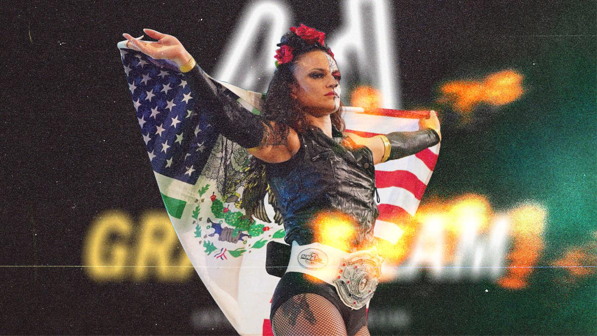
- Embrace the use of film grain on all photographs to establish a common thread that ties in the organic nature of the new logo to how the overall brand is visually represented.
- Embrace the use of film grain on all photographs to establish a common thread that ties in the organic nature of the new logo to how the overall brand is visually represented.


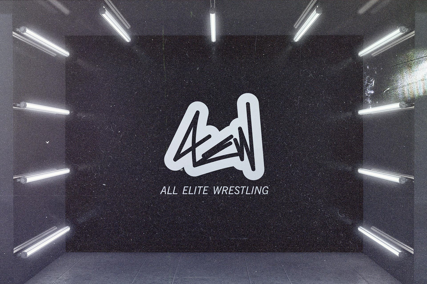
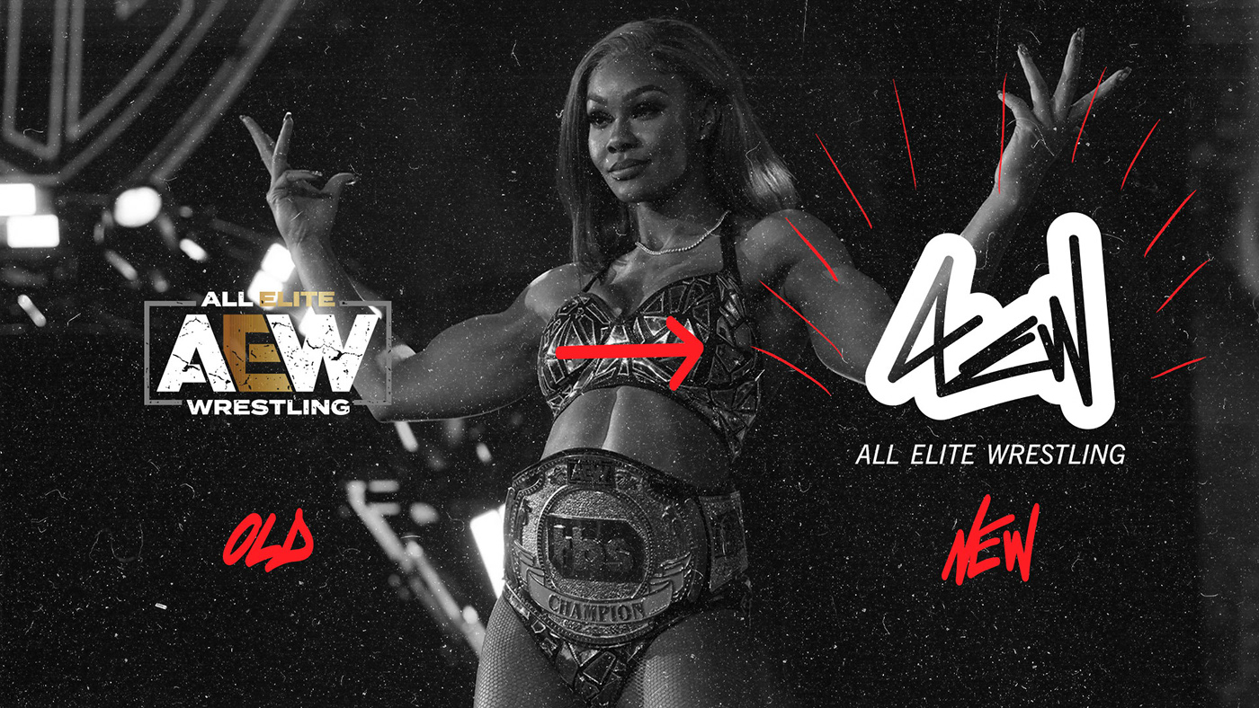
The new brand mark was created with use of a Wacom tablet and Adobe Illustrator to hand write the letters "AEW" in a fresh way. Writing the letters in a more scripted/hand style way served to meet the requirements I establish in my design pillars.
In Illustrator, I added a strong black outline to surround the script. Doing this creates a distinct silhouette for the logo.
Adding on, in order to represent the way the text "All Elite Wrestling" should pair with the organic brand mark, I chose to use Trade Gothic Next LT Pro. The italicized athletic sans serif is the perfect pair to the organic hand style mark.

Although the rebranded mark is intended to be no more than 2 colors, the primary colors are intended to be black and white. I chose to incorporate Pantone Yellow 012C as a complimentary secondary color. This is intentional to takes cues from the original AEW logo that uses a gradient of Gold/White/Gray as primary colors.
For fonts - both primary fonts & secondary fonts are intentionally sans serif. Trade Gothic Next LT Pro Italic embraces the athletic nature of AEW & Pathway Gothic One as the alternative primary font for web-use to ensure the same brand standards are met online.


In order to show the rebrand in application, I turned to Figma and layed out desktop & mobile user experiences to show what a potential new website could possibly look like for All Elite Wrestling. The focus of the new sites were designed with the following pillars in mind.
- Stay true to the overall established nature of the rebrand.
- Stay true to the overall established nature of the rebrand.
- Focus more on impactful imagery to tell the story.
- User friendly and interactive layout with key dynamic features such as click effects, auto scroll tickers, etc.
- Emphasize a sports feel.
- Art direction for apparel to compliment the rebrand.
- Show a common throughline from the new branding to established products.
- Emphasize their distribution channels by highlighting AEW's network partners (Warner Media: TNT & TBS).
See videos for quick website demos.