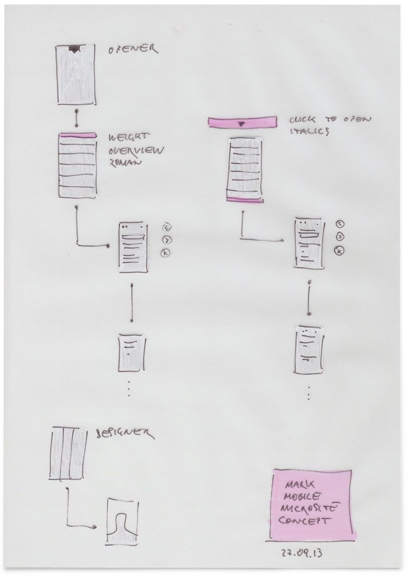
First sketches for the mobile version of FFMark.com
The CPU-intensive elements like the fullscreen video, live blur and the overlay feature were removed
in favour of a better perfomance on mobile devices.

We are pleased to announce that the Type Directors Club (TDC) have given recognition to the FFMark.com microsite with a “Certificate of Typographic Excellence” in the TDC Communication Design competition.
Both FF Mark and FFMark.com were, in many respects, unique ventures in the history of FontFont with each case taking a contemporary approach on established classic ideas.
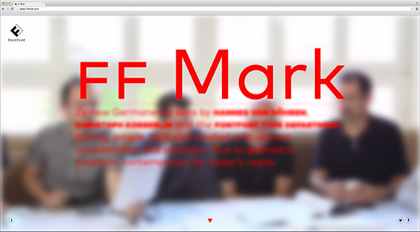
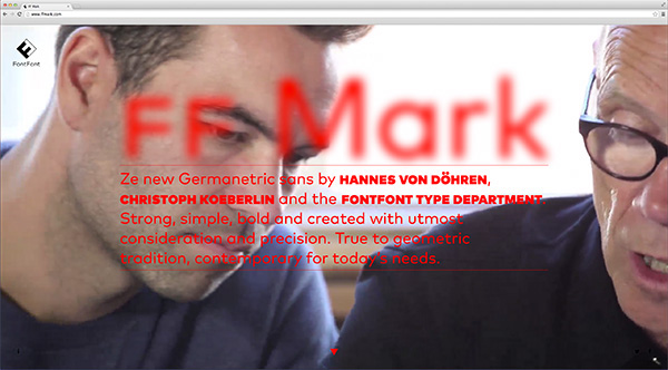
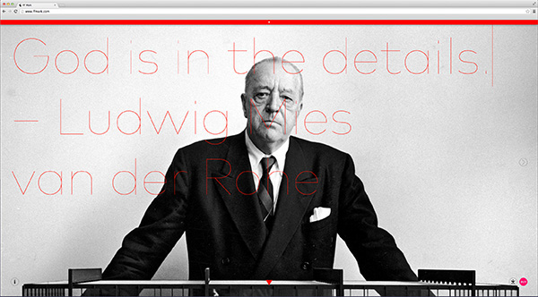
Whilst the new FF Mark was formed as a reinterpretation of a classic Geometric sans, FFmark.com was created as a modern design of a digital specimen. Created as part of the FF Mark release the idea behind the site was to replace a standard font sample with something deeper, more interactive, informative and playful.
Unlike a normal font sample FFMark.com provides a greater insight into the capabilities and background of FF Mark. Some of the key features on the site include:
- FreeFönt download
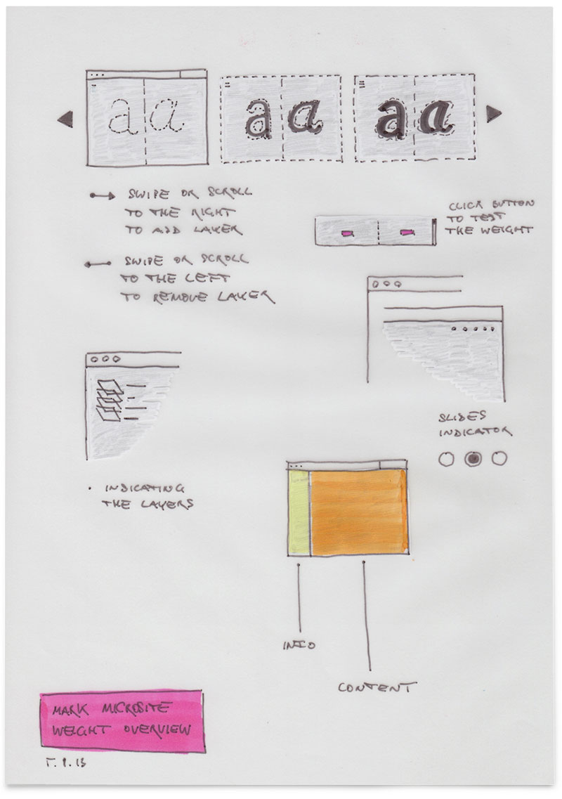
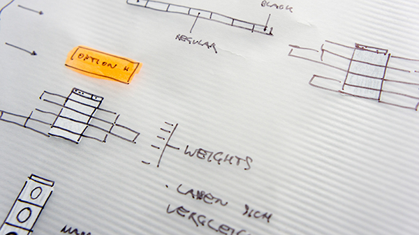
- A new way of comparing weights
- Interactive Type Sampler
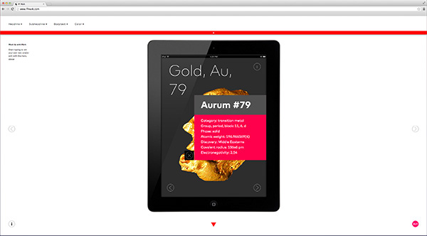
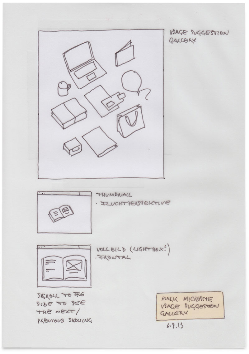
- Interactive mockup generator: Test and preview the typeface across
various different media formats and application
- A historical look into classic Geometric sans
World-renowned type designer Hannes von Döhren worked together with FontFont’s Christoph Koeberlin and the FontFont Type Department to create the new typeface in October 2013.
From here they went on to work with FontFont’s marketing team, fronted by Alexander Roth, to design FFMark.com, utilising an analogue approach of sketches as opposed to designing straight into digital format.
Once the final sketches were complete only then was the final artwork digitalised and passed to the development wizard, Rob Meek who created the site over a period of two weeks.
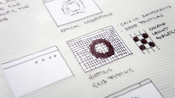
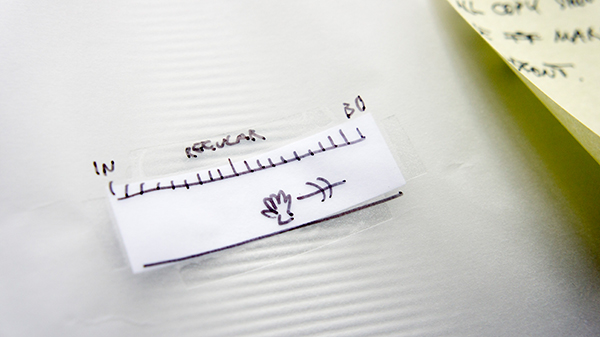
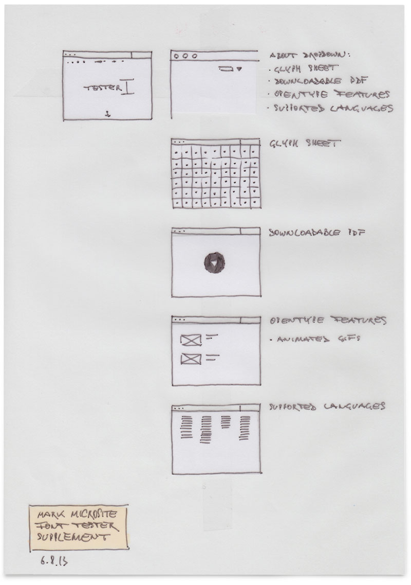
The sketches below from the early stages of the site design represent only the inventory of elements and features without any serious attempts to design them at this stage and so should be viewed as neither beautiful, nor ugly but simply useful.

Full screen video
Realtime blur/unblur while scrolling

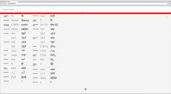
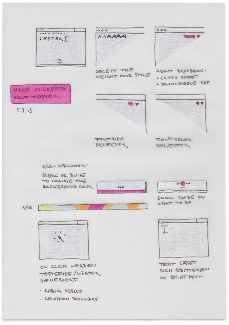
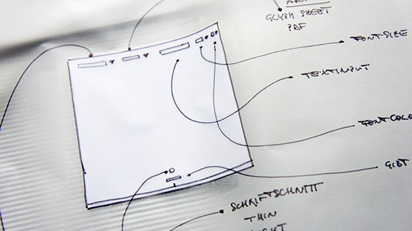
Type tester
Customisable background

Character set overview
Supported OpenType features
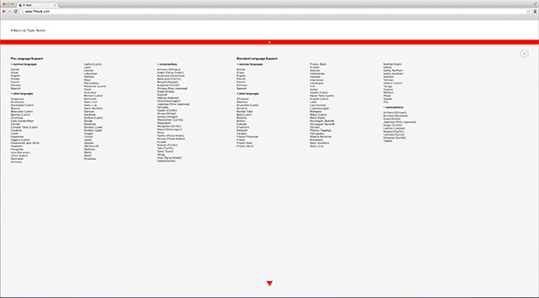
Language support
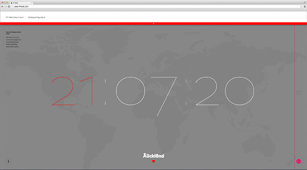
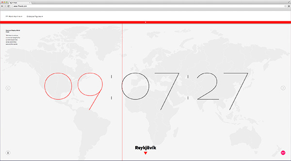
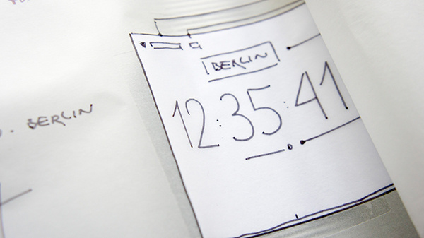
World clock adapts to day and night
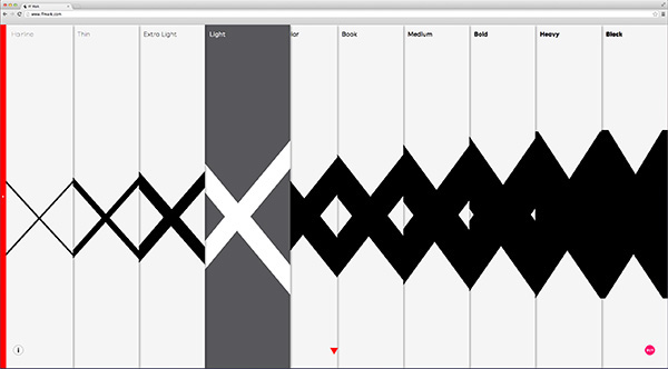
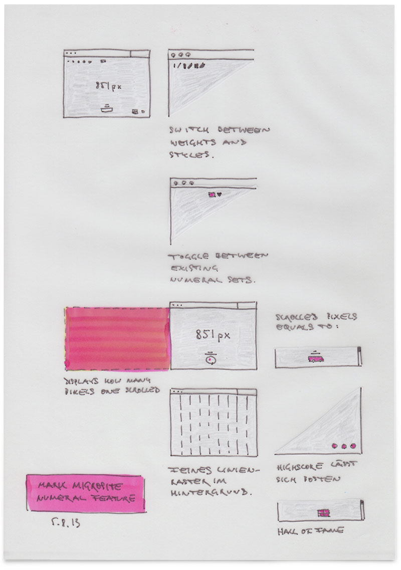
Weight overview
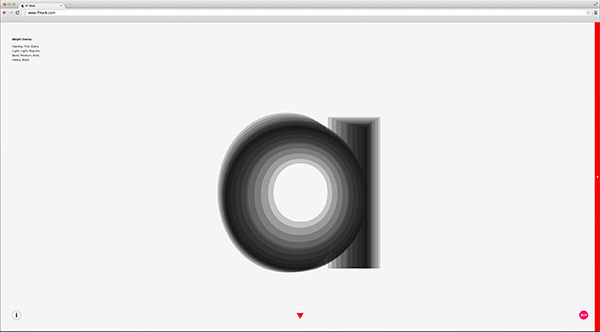
Overlay all weights at once
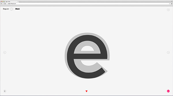
Compare weights
Interactive mock-up generator

Historical essay on geometric sans serifs
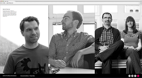
Designer Bios

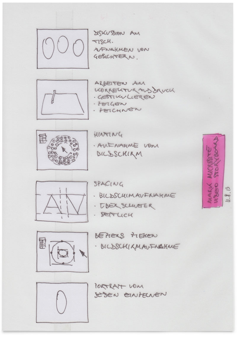
Development process sketches
Study of possible positions for navigational elements and ideas for interaction with the FF Mark font on the microsite.
Inventory of icons and their possible position.
Navigation is crucial. It took a while until we came up with a satisfactory solution.
Brainstorming about the interactive mock-up generator and the necessary elements
to allow the user the best possible testing experience

Thoughts on the functions of the mock-up chapter.

Overview of the featured elements such as bookjacket, poster, website and a mobile device.
The very first storyboard for the chapters of the microsite and their functions.
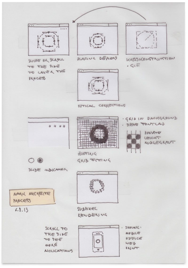
Navigation and chapters.

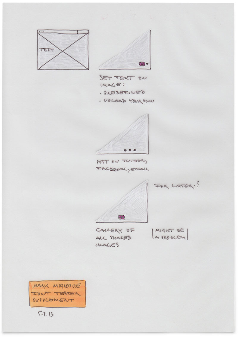
From the beginning it was clear that we wanted provide a powerful type tester which includes sliders for the font size and leading. As well as an image upload feature and a weight overlay functions to compare different individual weights or all at once.

Thoughts on how to present the numeral sets aside from sober overviews.


For people who are interested in using FF Mark on printed matter, a high quality downloadable PDF specimen was created. It provides an extensive overview of all weights and styles.
The type tester is a very important feature on the FFMark.com microsite.
Therefore a lot of effort was invested to make it as good as possible for testing the FF Mark typeface.
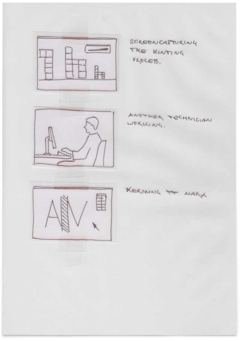
Ideas for the opening video.
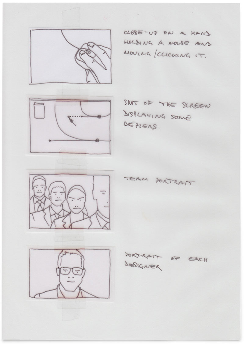
Storyboard for the opening video which was filmed by Max Zerrahn.