

Typeface design
Il carattere tipografico del logotipo è stato disegnato per risultare chiaro, lineare ed elegante. La sua alta leggibilità lo rende adatto alla stampa in piccole dimensioni. La risolutezza formale si identifica con un’azienda forte, decisa e determinata. La sua costruzione comunica stabilità ed affidabilità.
The logotype's typeface was designed in order to result clear, linear and elegant. Its high readability makes it suitable for the small-size printing. The formal decisiveness identifies with a strong, decisive and determined business. Its structure conveys steadfastness and reliability.
Characteristics of the typeface

L’azienda si occupa della realizzazione di pompe a trascinamento magnetico (1) ed alcuni punti di congiunzione delle aste (2) prendono spunto da una curva caratteristica presente nel prodotto. Questa caratteristica rende il carattere tipografico particolarmente riconoscibile ed unico.
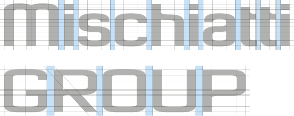
The company deals with the production of magnetical drive pumps (1) and some junction points of the stems (2) take the cue from a characteristic curve already present in the product. This characteristic makes the typeface particularly recognizable and unique.
Logo design

Colour

Colour combinations

Minimal dimension

Font to be used

Branding


Thank you for watching our work.


