Logo proposal for the Portuguese Institute of Blood (Instituto Português do Sangue)
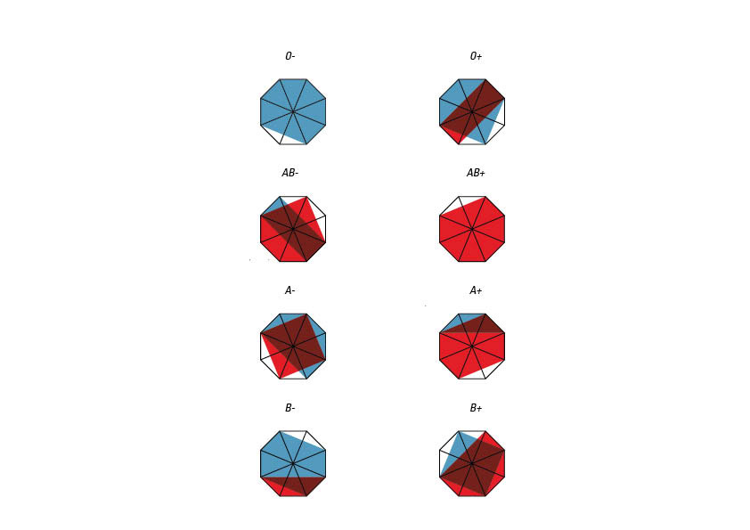
The main concept is that the icon could vary with blood compatibility and have informational purposes for blood donations: blue for receiving, red for giving;
However, after the graphic research, I realized that using the negative idea of compatibility was more effective, so the dots connected are the non-compatibility with each blood-type. That said, even though it has infographic purposes, the grid ends up functioning mainly to build a consistent image.
Take O+:
it is able to receive blood only from O- and O+, but can donate to all the positive types.


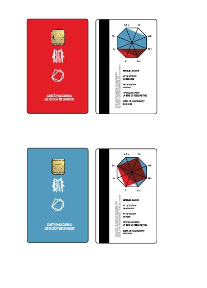


You can check the complete brand guidelines here.


