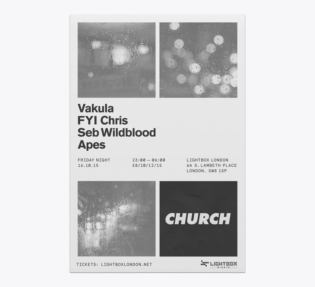
This poster series was developed as part of the visual identity for the London-based techno label Church.
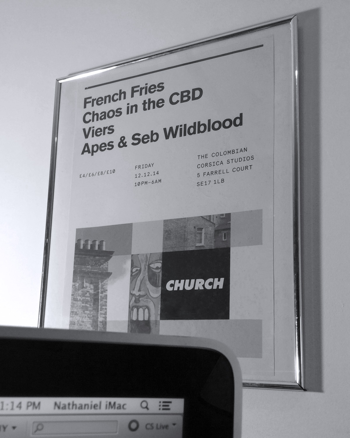
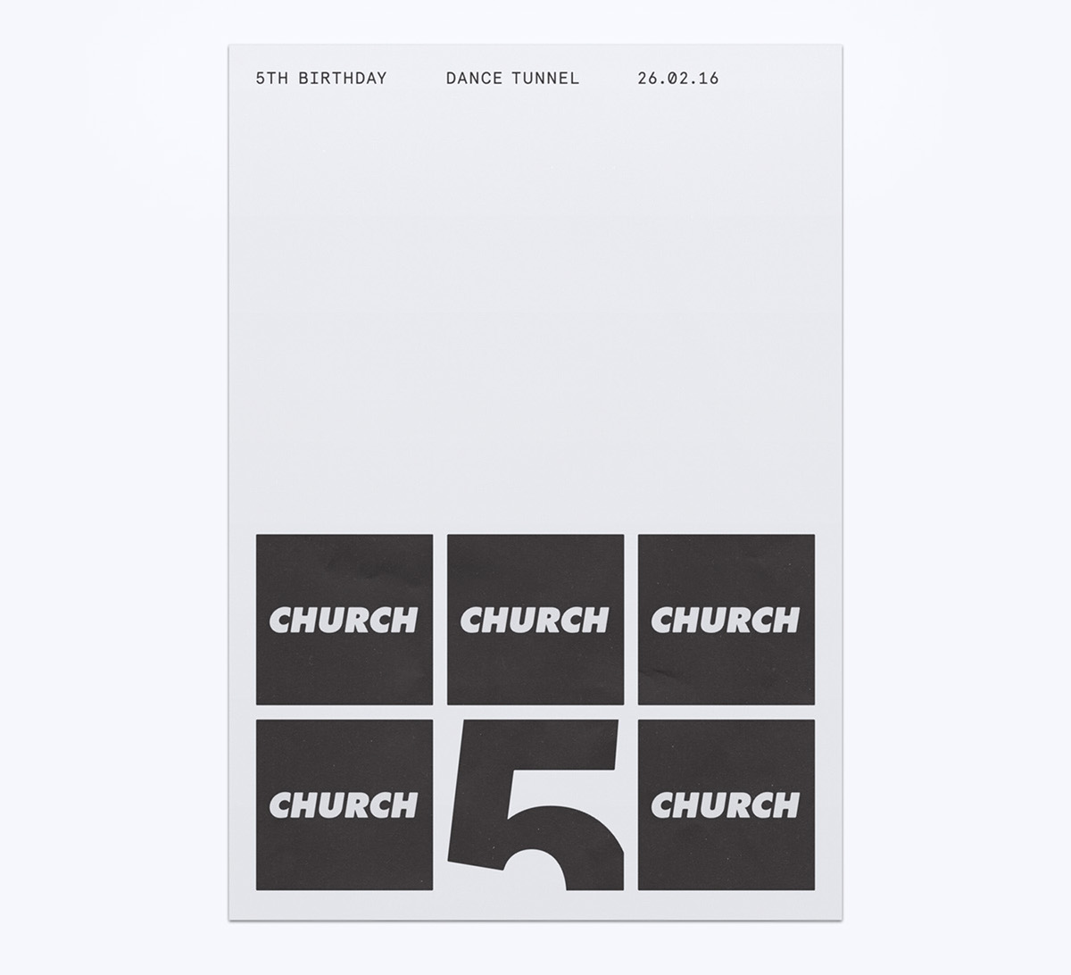
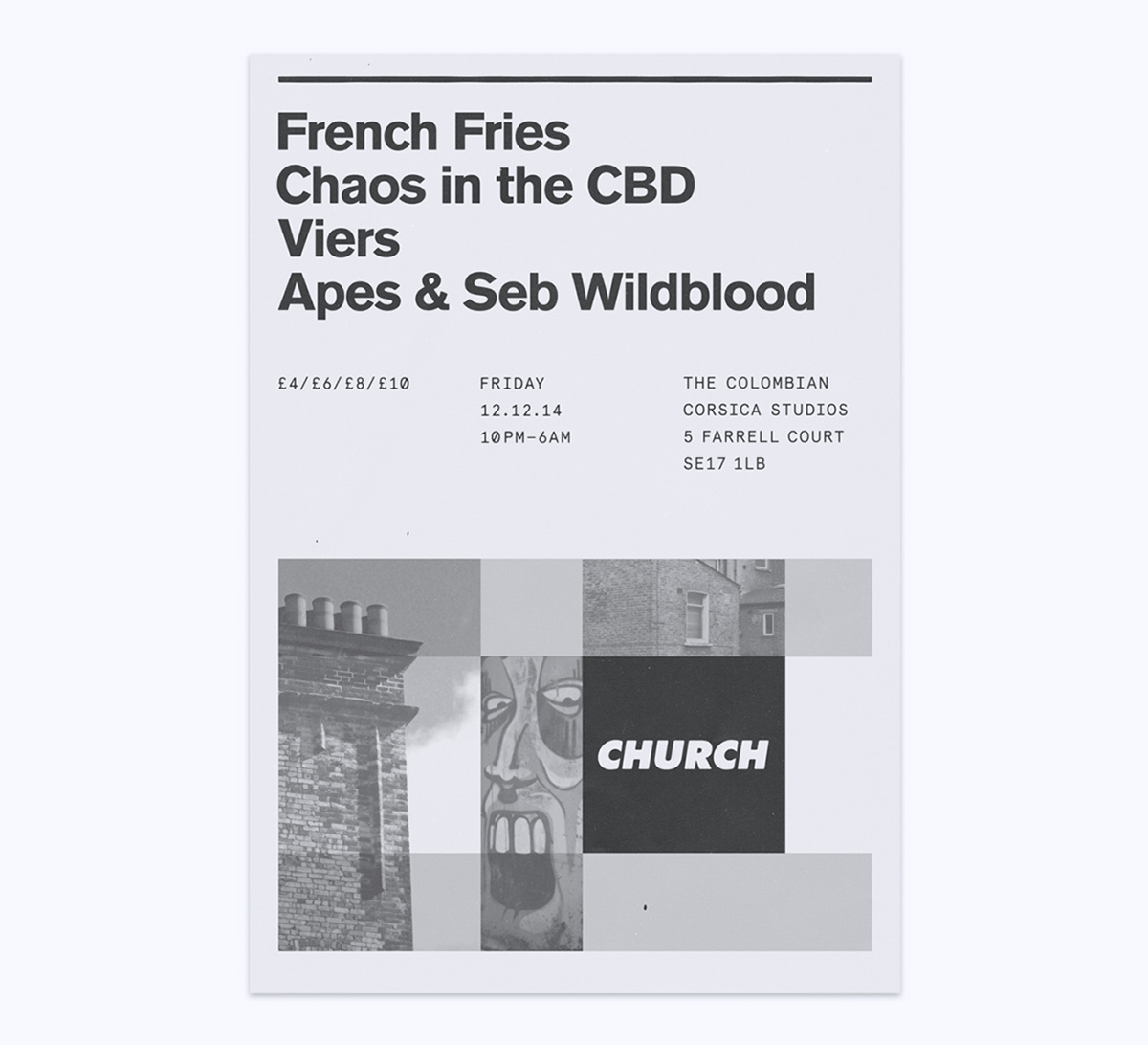
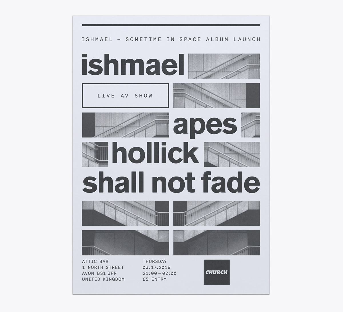
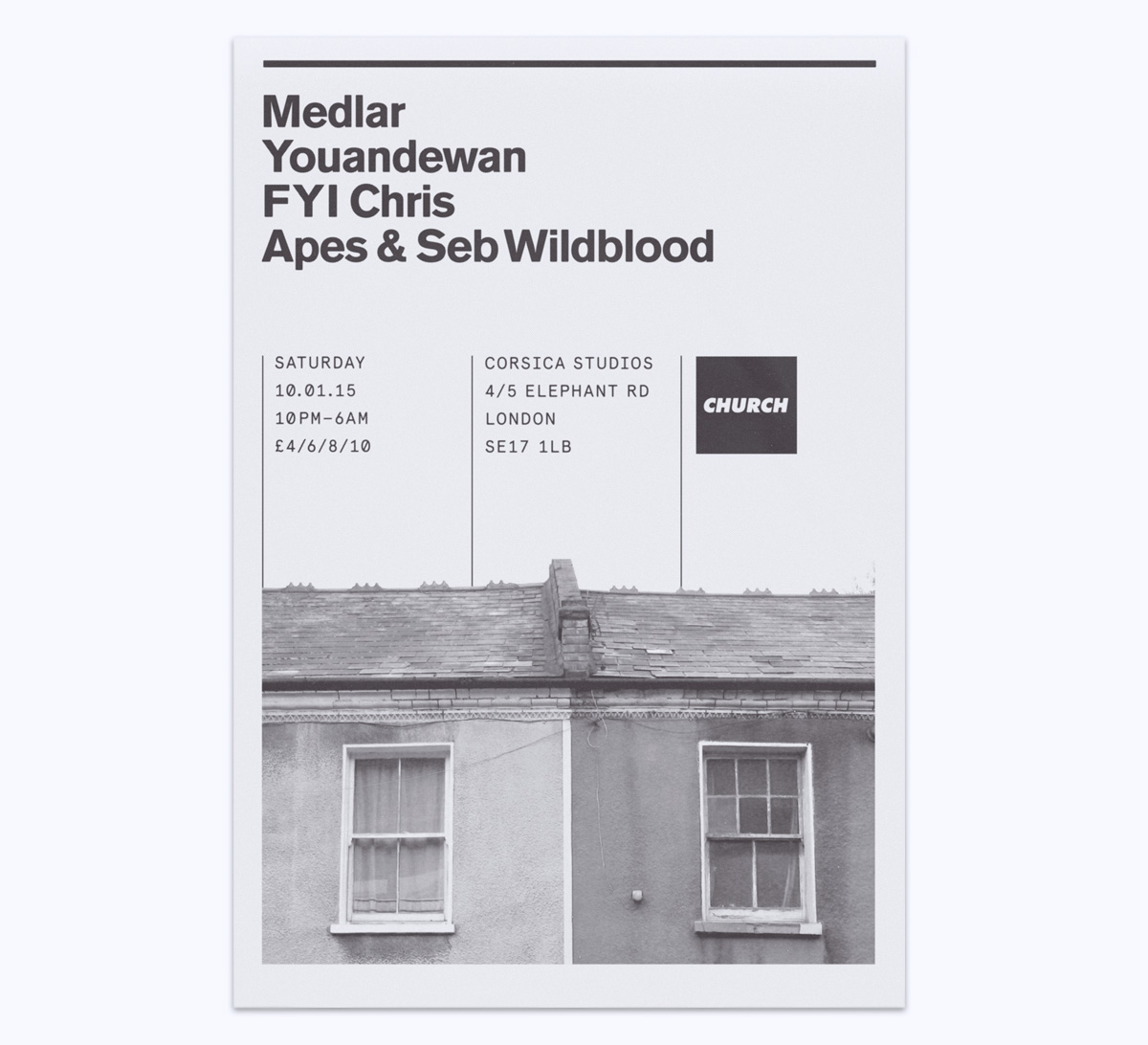
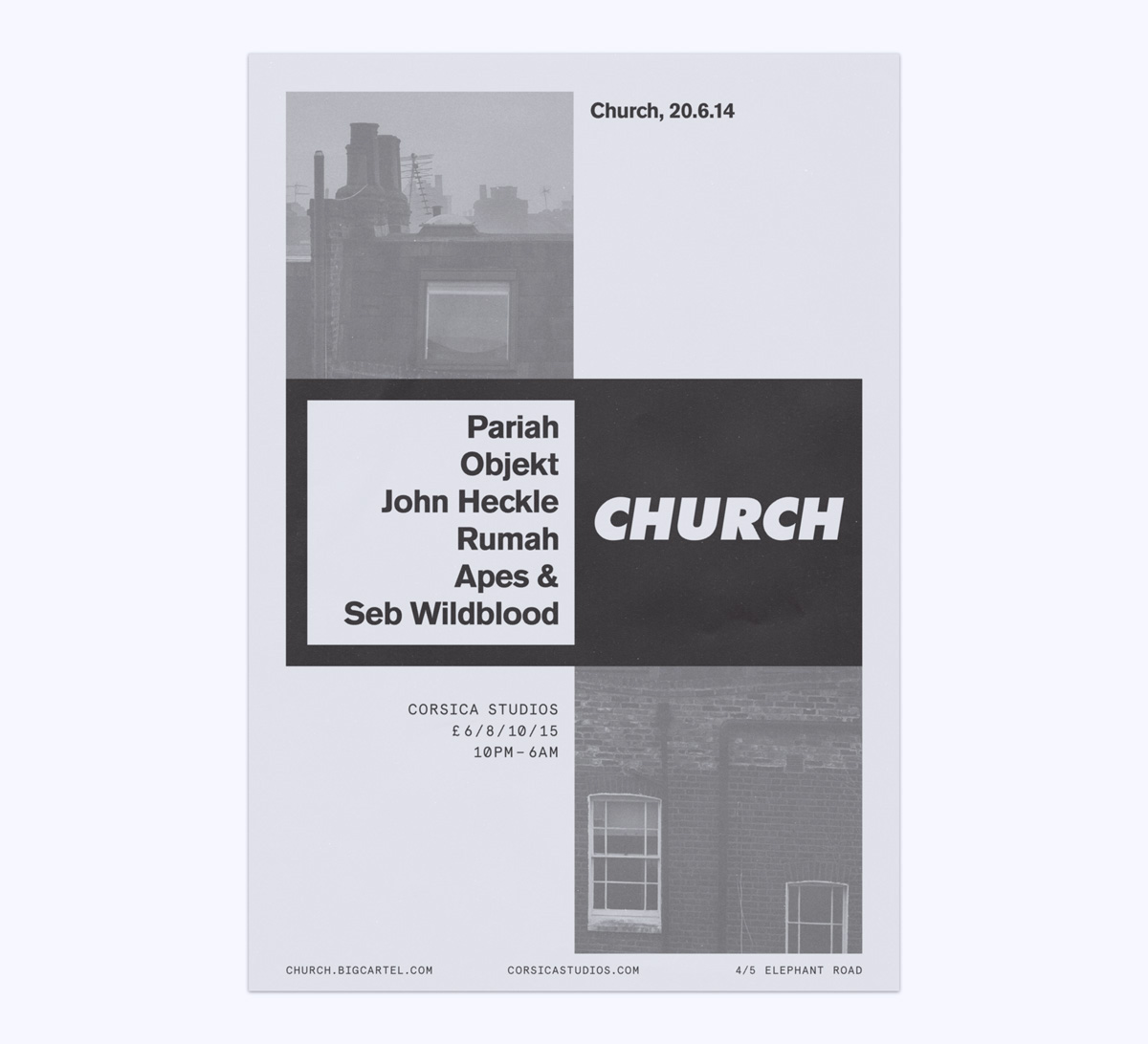
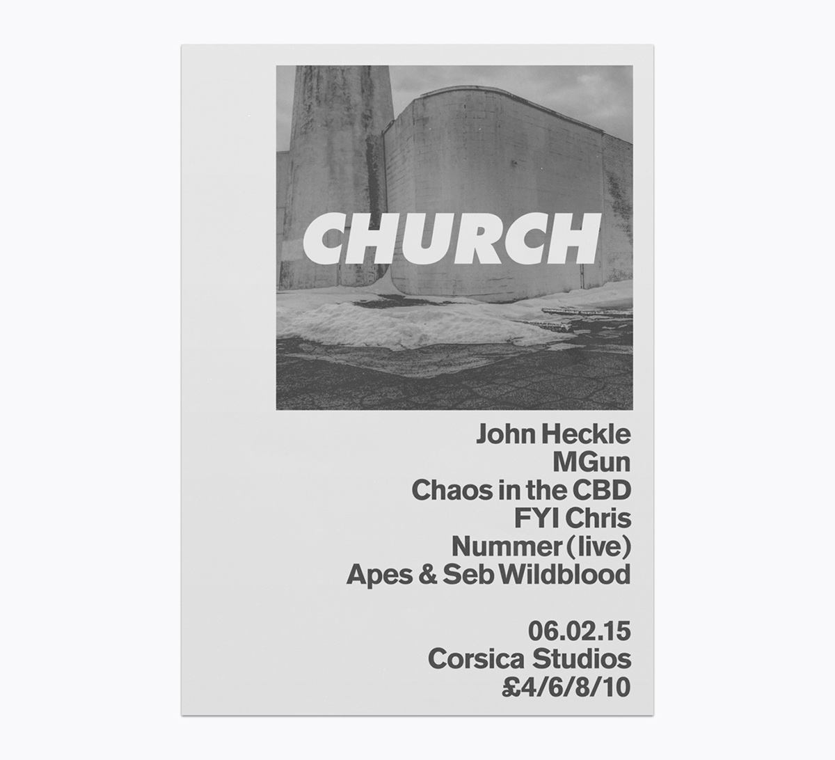
The underlying grid that unites the posters is derived from the square shape of the Church logo, while the visual language employed references the mundane vernacular of London city life in a stark, black-and-white palette.
The underlying grid that unites the posters is derived from the square shape of the Church logo, while the visual language employed references the mundane vernacular of London city life in a stark, black-and-white palette.
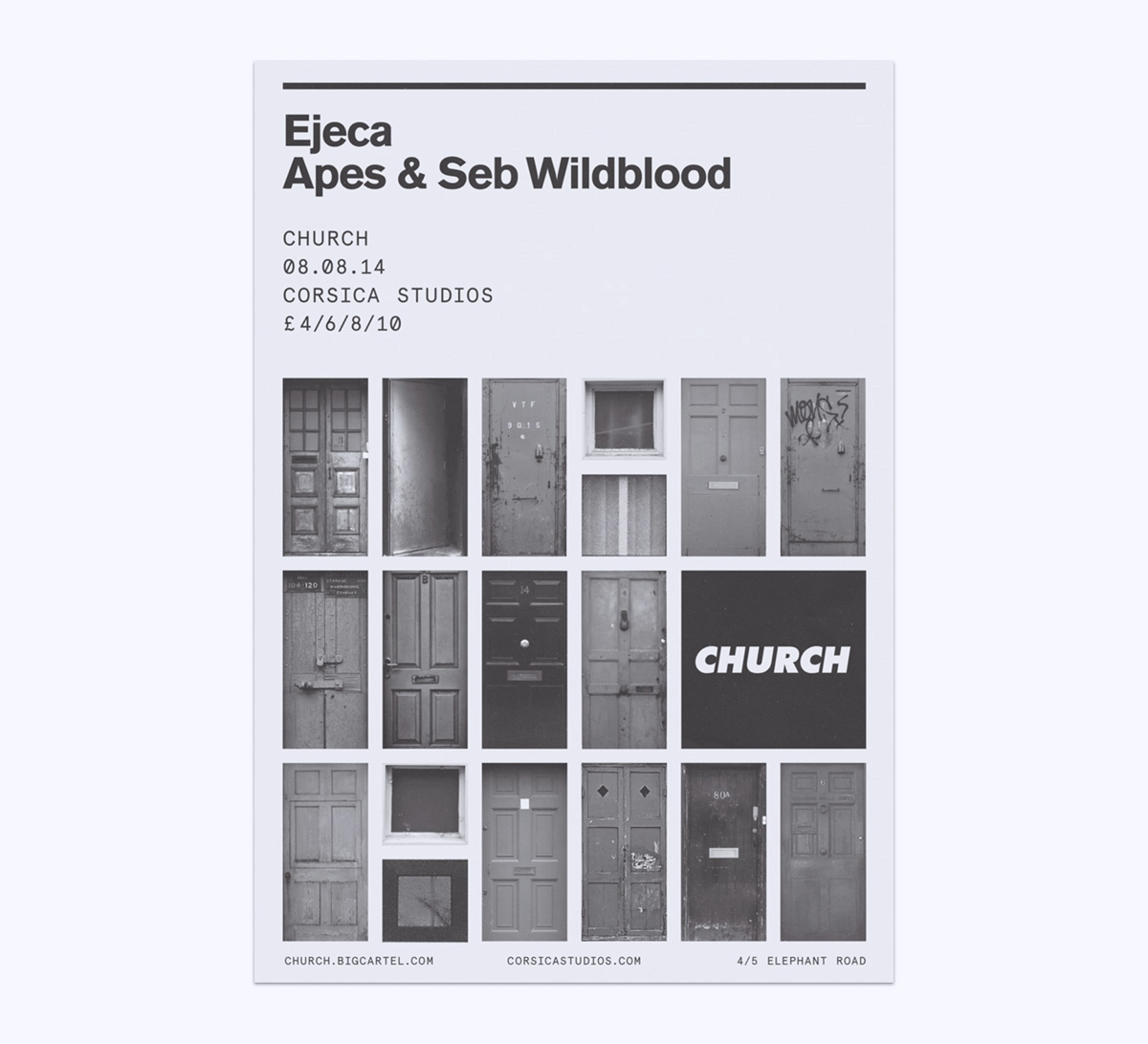
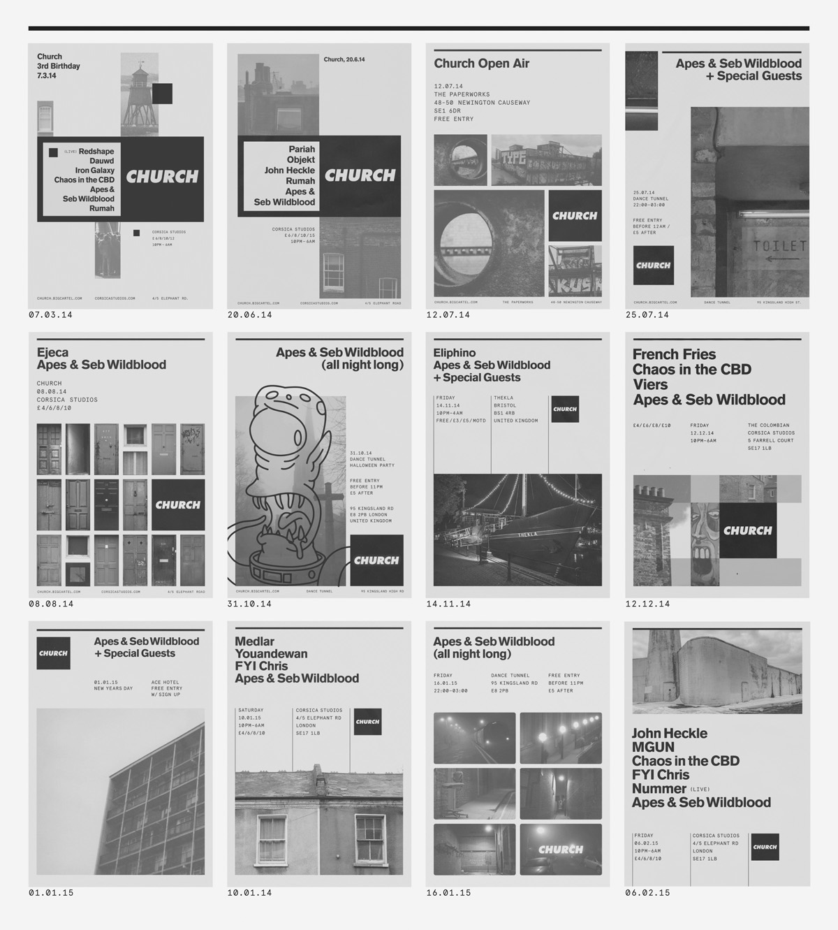
For each poster, little vignettes of red-brick row houses and brutalist architecture are arranged within the rhythmic constraints of the Church grid.


From party to party; a retrospective of a year’s worth of posters we've designed for Church.
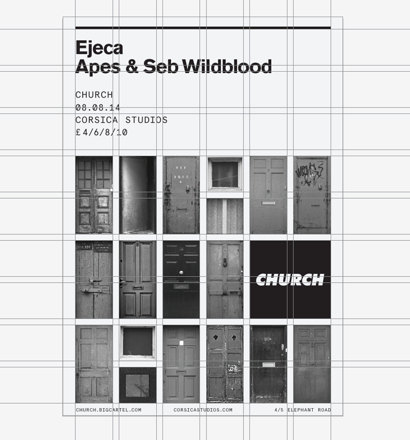
The underlying grid for the Church posters based on the square shape of the logo. An A2 is divided into 6 columns and 9 rows, allowing for plenty of variation within the 54 units created.

Reproductions of select Church UK posters available as Giclée prints on natural white, matte, ultra smooth archival paper.