UKG is an all-in-one human resources and workforce management solution.
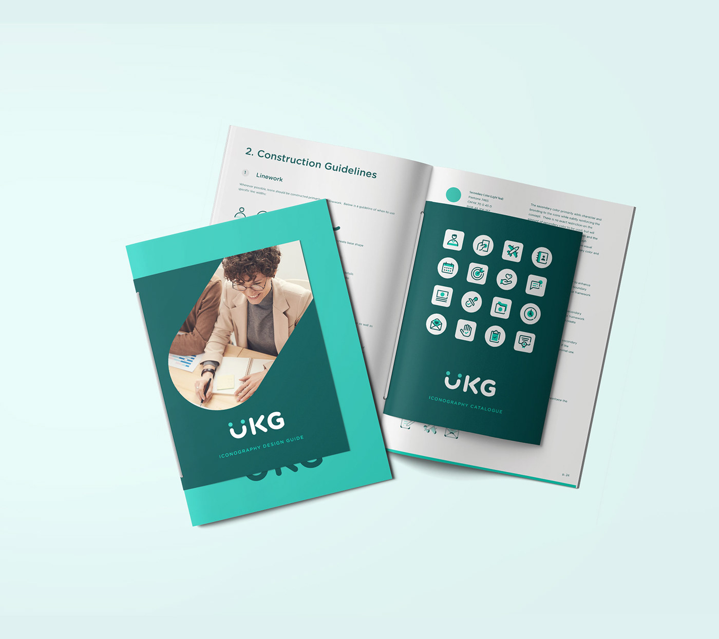
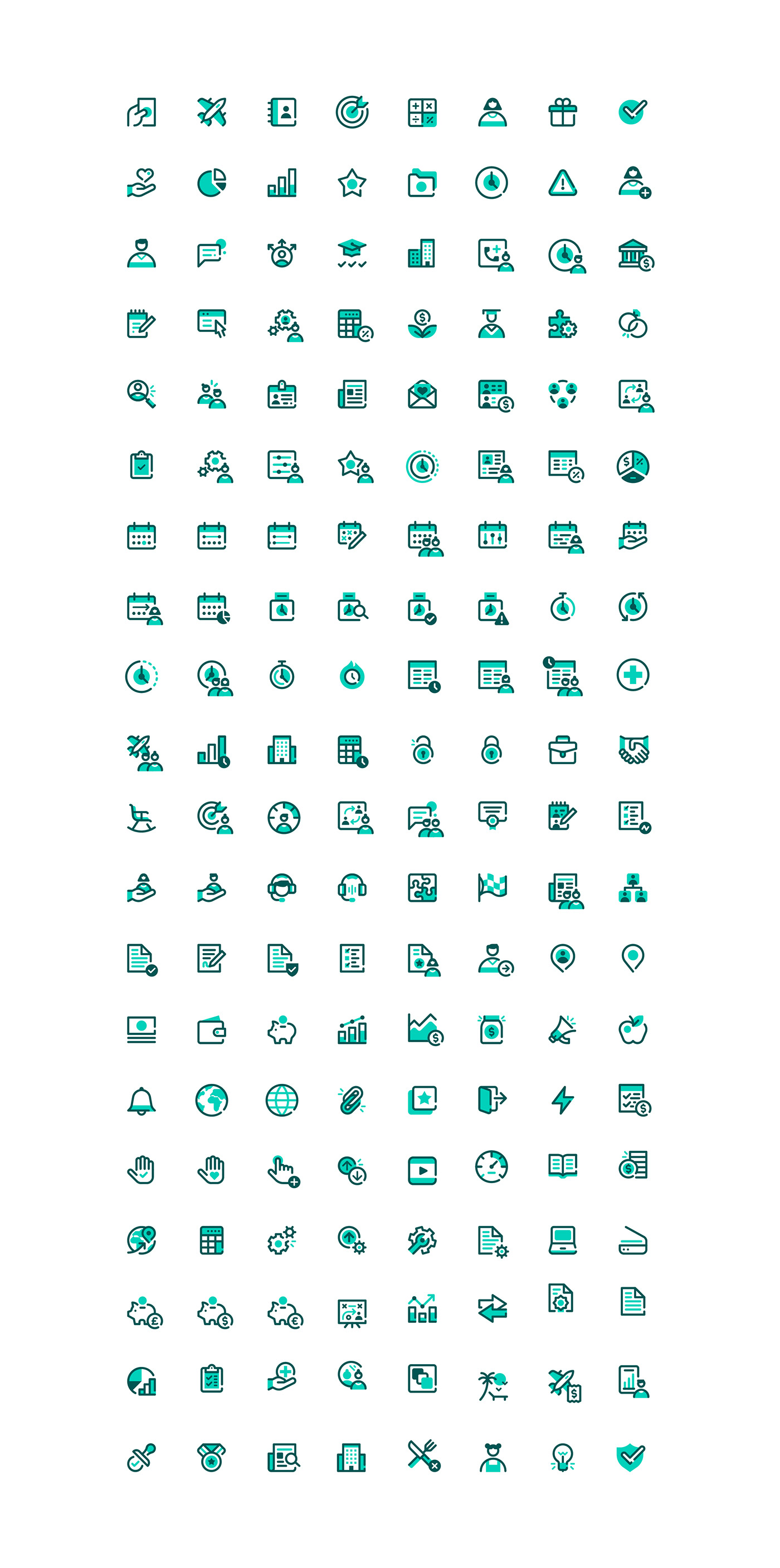
We collaborated with them to create a bespoke icon language based on their newly developed brand identity that would be used to guide and navigate a user around the app interface. Their entire icon library was refreshed with a unified design system.
We helped create a guide with grid-specific guidelines to craft a coherent design language which also enabled further in-house production as needed. Numerous iterations of shapes, colours and space were tested to arrive at the result below, and counting.


Inspired by the UKG logo mark, brand icons should be constructed primarily using rounded 'friendly' line work, with filled shapes as a secondary option where needed. Below is a construction guide showing the grid system, modifier 'buffer' and how to use specific line widths, line breaks, colours and shapes.


Modifiers are used to add a layer of meaning or context to icons. They can help indicate a different icon state (for example when an item is completed) or divide icons into specific subcategories (for example when an icon involves a team).