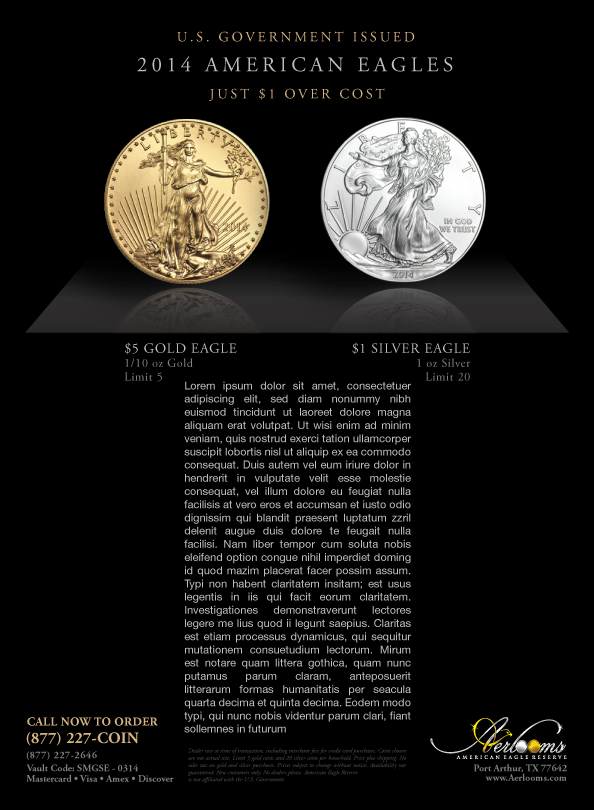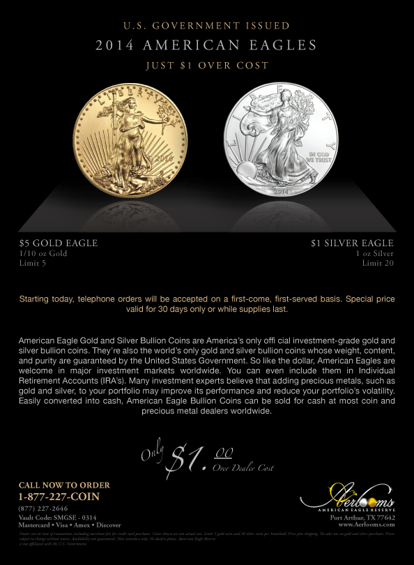
This is the layout for an upcoming ad in the Smithsonian magazine for The American Eagle Reserve company. This is the original idea: I wanted to make the ad look as museum-looking as possible. I wanted to represent a flow of space around the text and the layout as a whole to represent a modern-day exhibit.
The bottom picture is the final print for the ad space. Marketing went with this bottom layout. To them, they feel as if the text in the top picture may be out of place. In the end, their opinion matters most. (But just for reference, I'd like to see the viewers opinions in the comments).
Fonts used on both layouts were the same as normal: Helvetica Nue and Adobe Garamond Pro. Program used was Adobe Illustrator.


