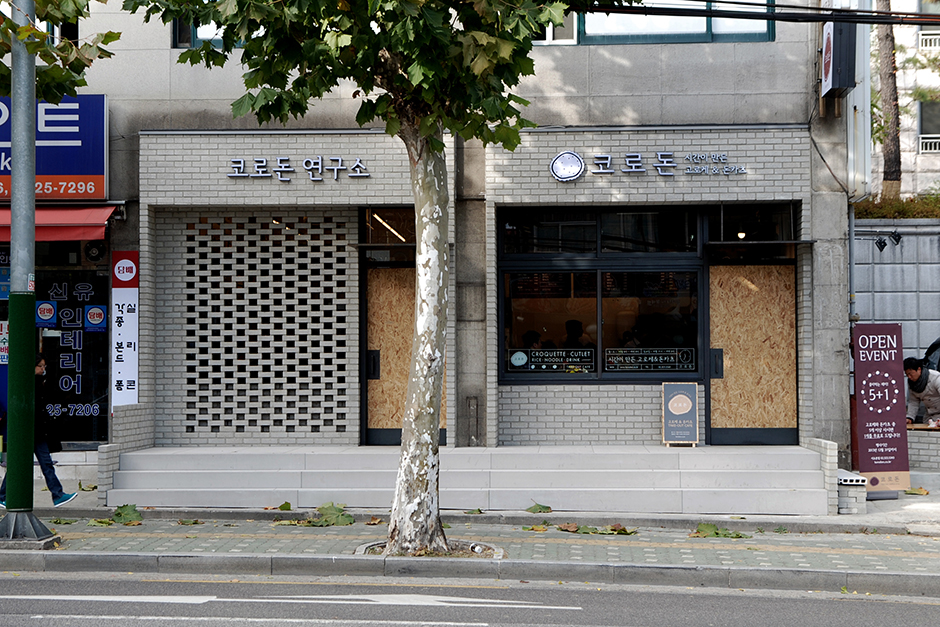
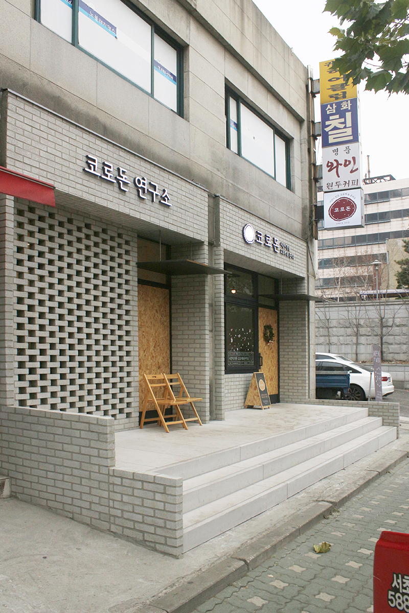
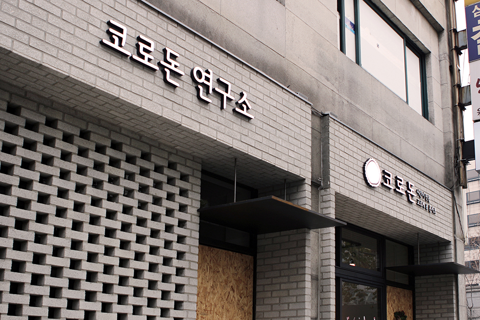

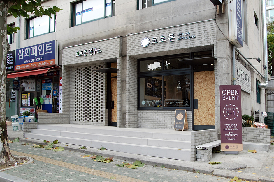
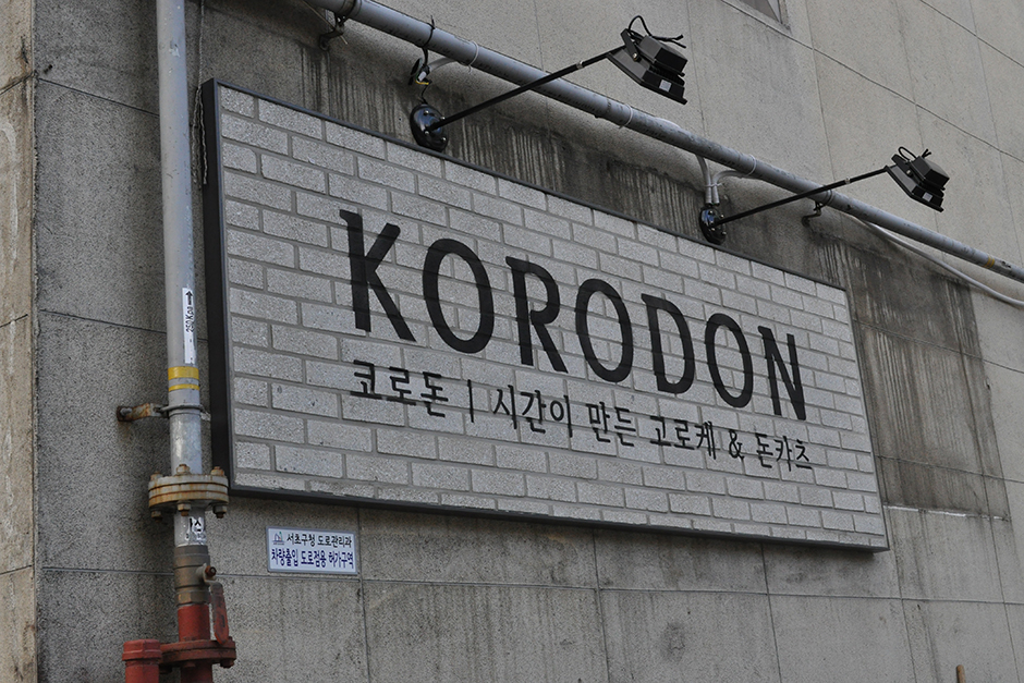


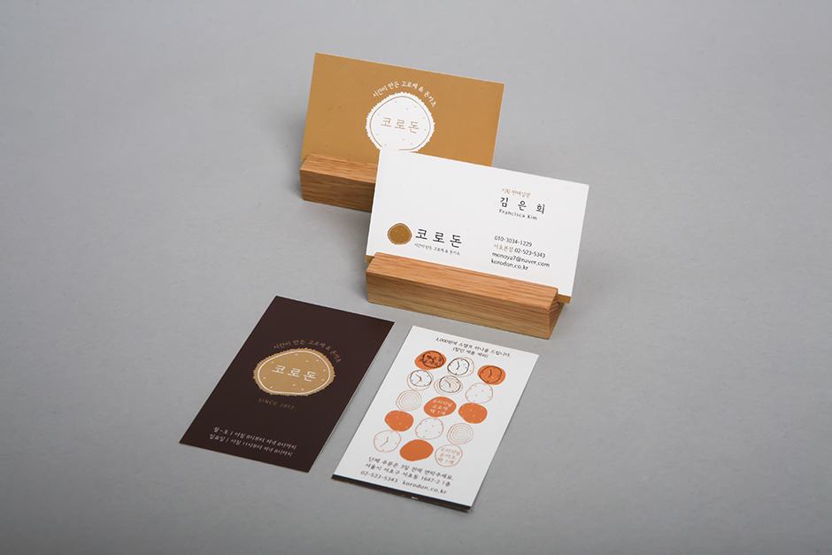
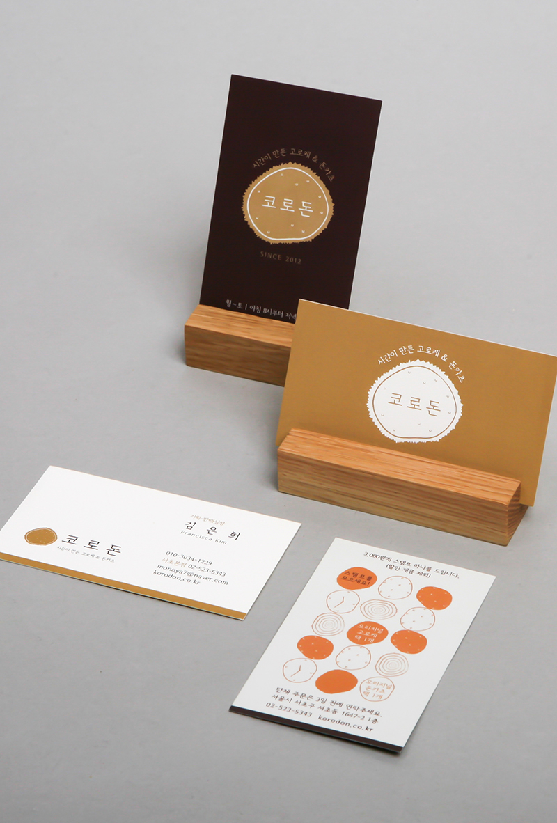
KORODON Brand & Interior Design
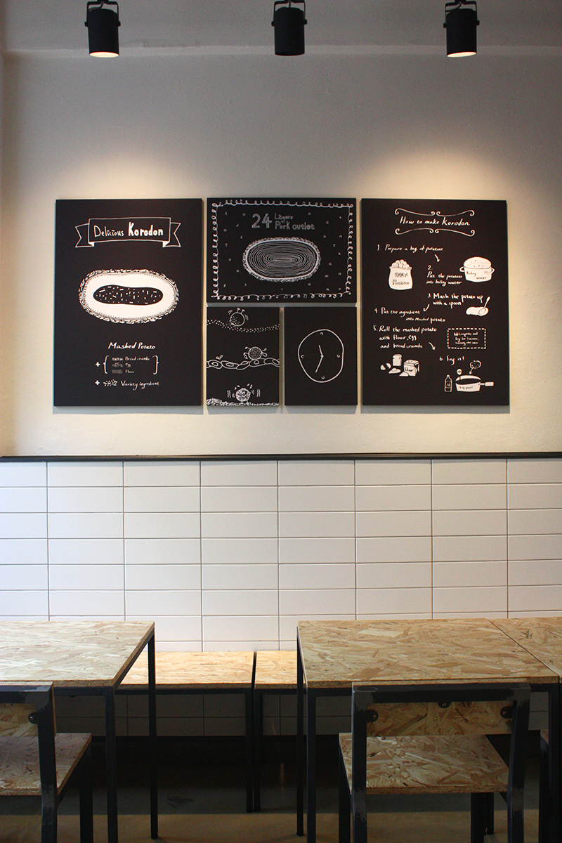
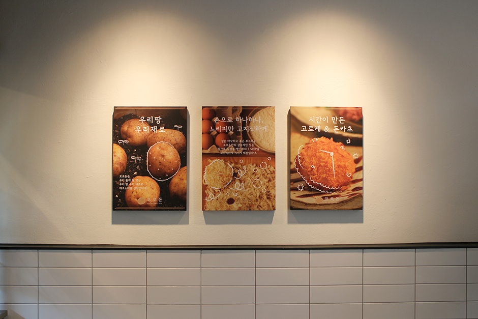
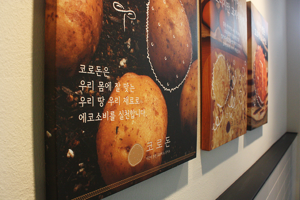
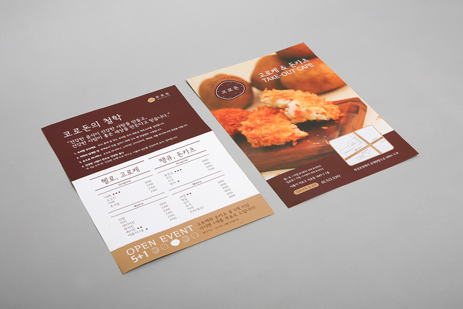
Korodon is a handmade potato korokke (Japanese croquette) & tonkatsu take-out café. The key idea behind this brand is “healthy person makes healthy food.”
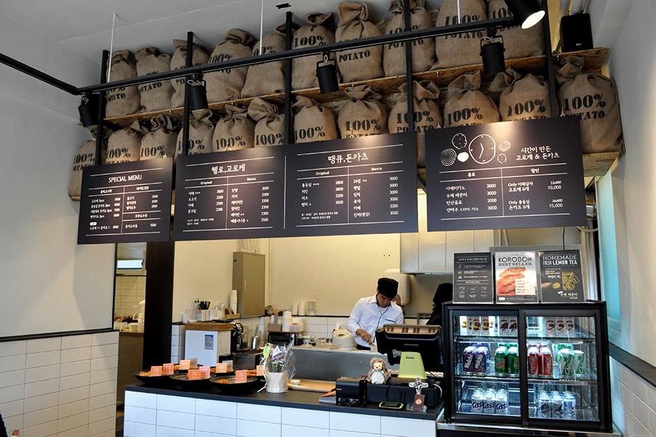
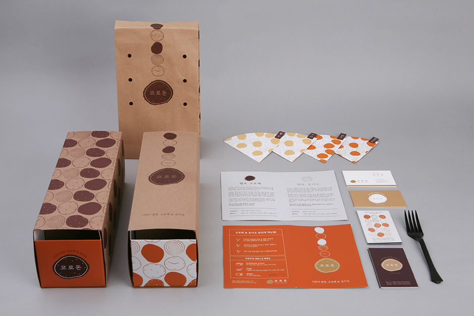
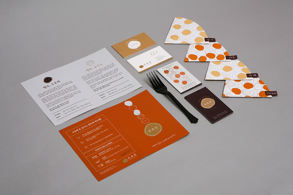
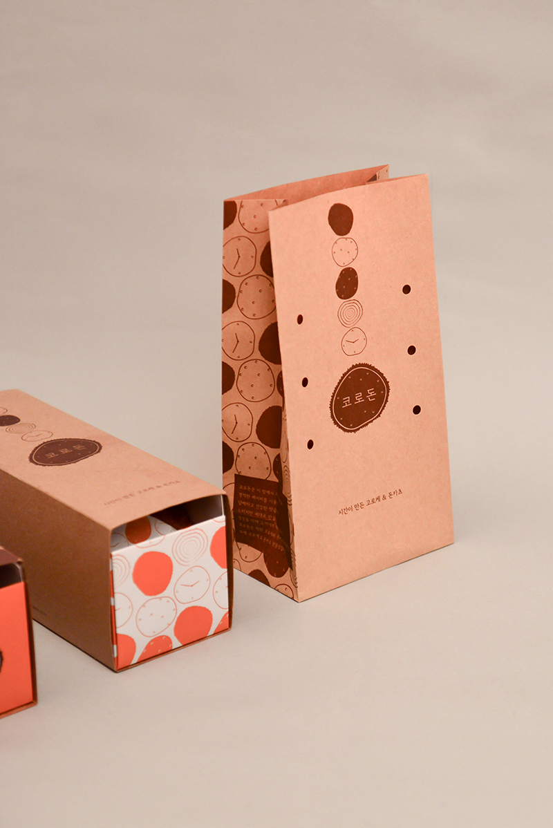
We worked with the client from brand concept, naming of the brand, designing brand identity, package design, and the store design. Koroke and tonkatsu of Korodon is made out of wheat flour, eggs and breadcrumbs. The logo itself represents the 3-step process.
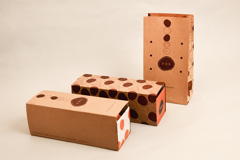
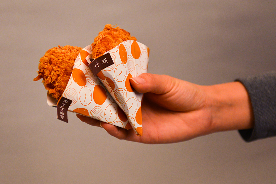
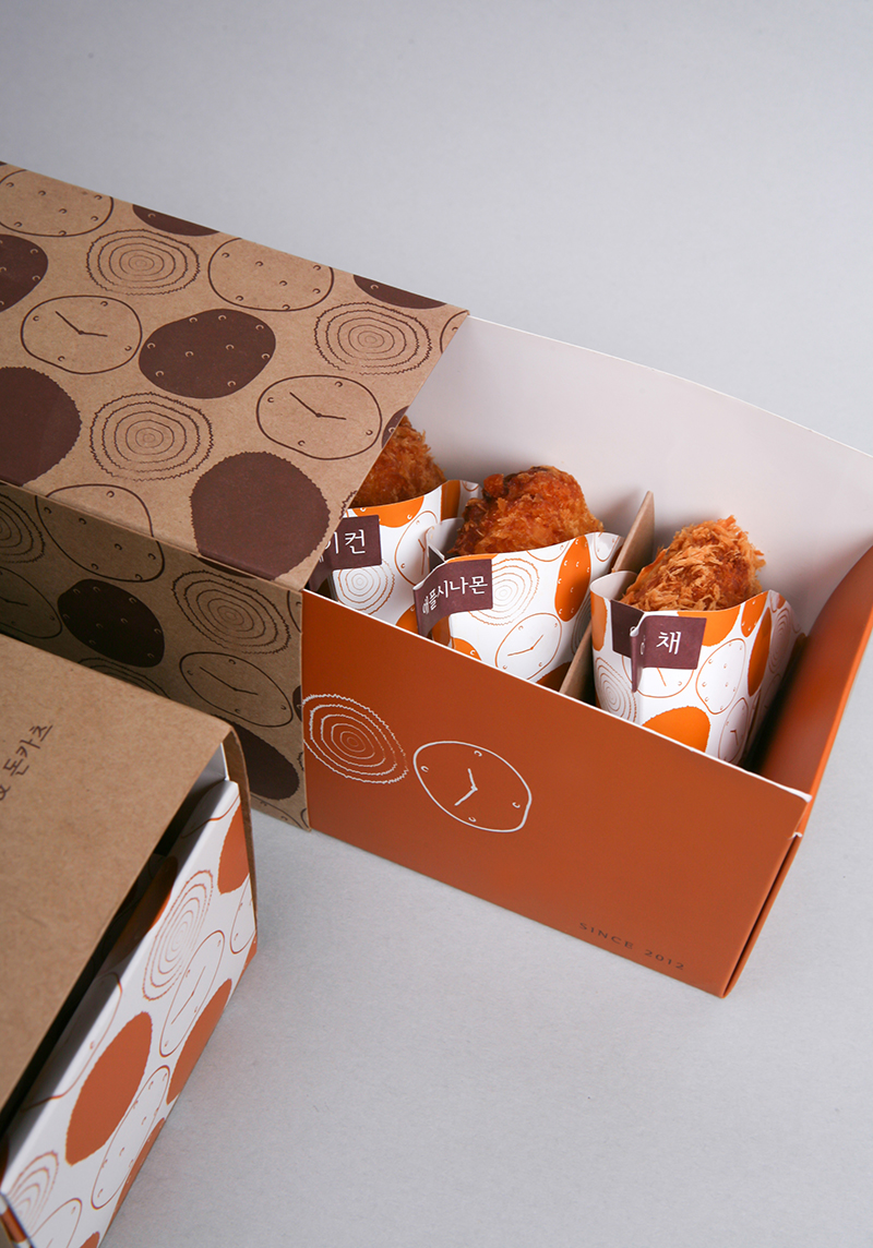
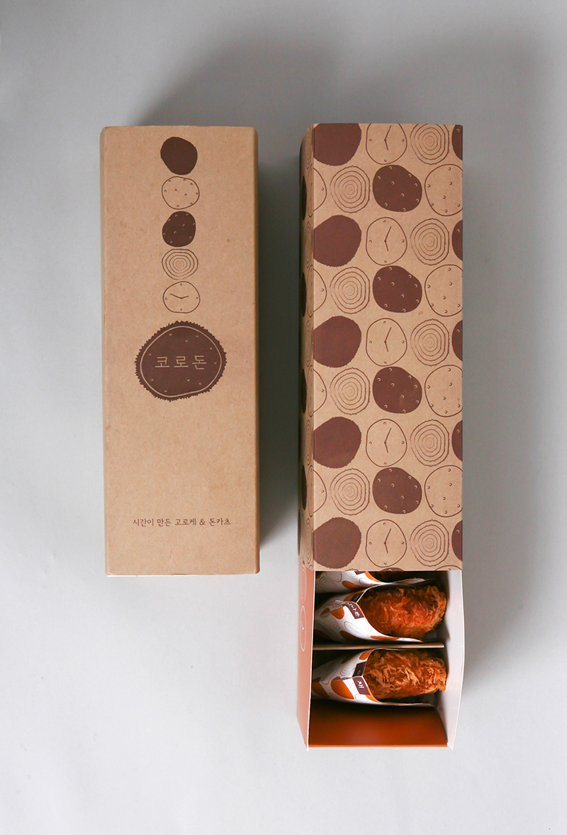
Korokke is a popular street food in Korea. Usually, take-out korokkes are wrapped with square-shaped waxed paper, then with paper bag. We wanted to position korokke as “giftable” food. For Korodon’s take-out package, korokkes are wrapped with cone-shaped waxed paper, then with swiss roll cake box, which is suitable for gift as well.
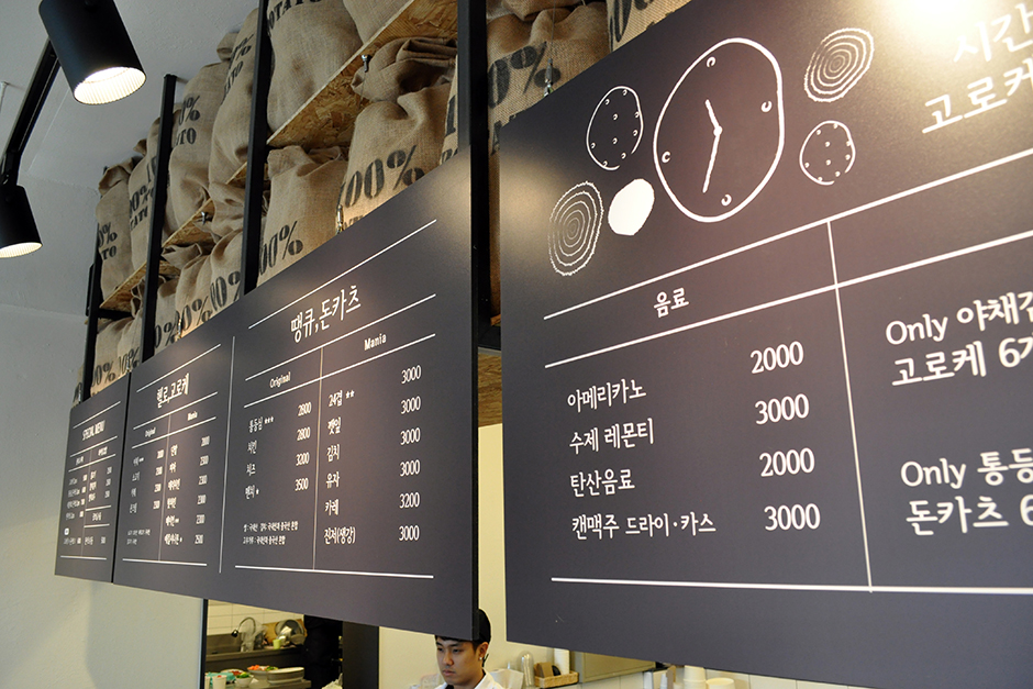
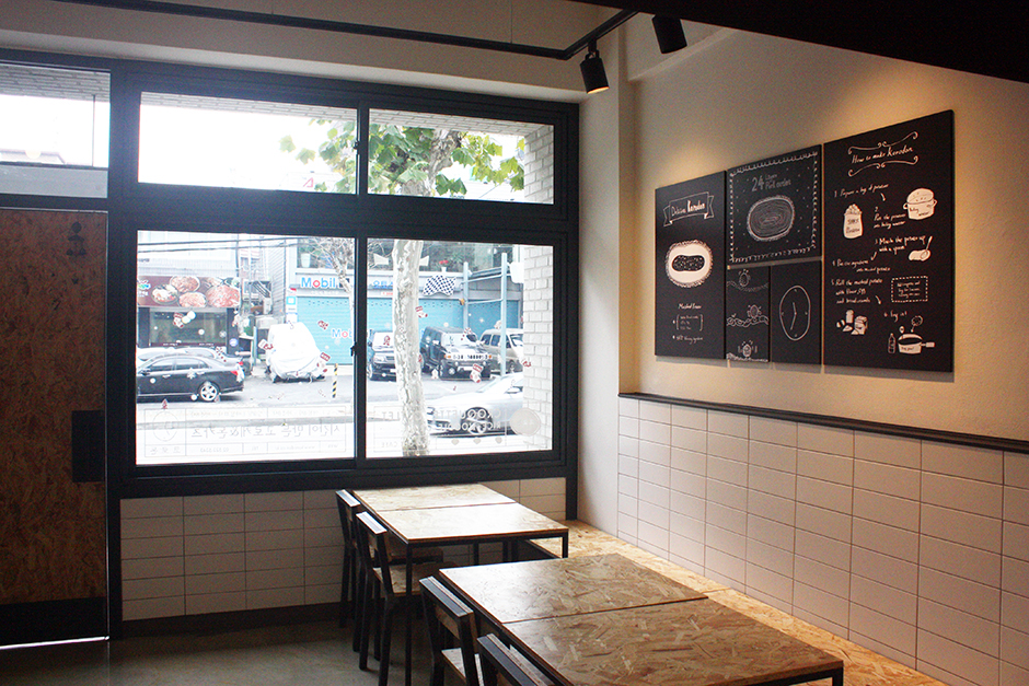
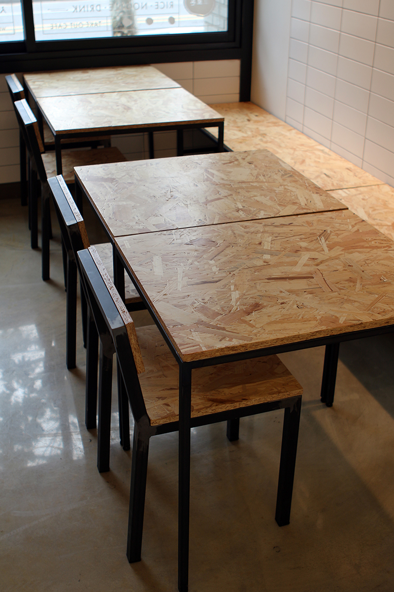
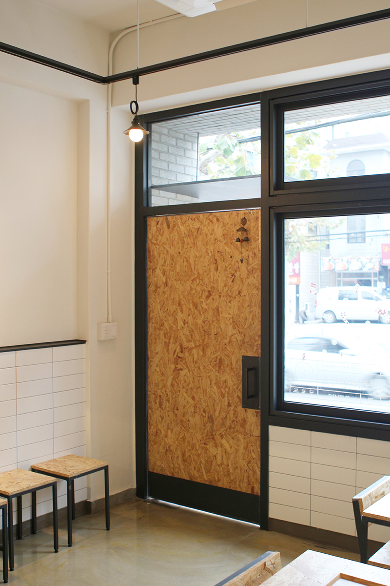
The store is divided into kitchen station and retail area. For kitchen station, we wanted to provide enough amount of sunlight going through the kitchen, forming interesting pattern on the front. We also used potato sacks above the menu board so that the customers would know potatoes, not wheat flour, are the main ingredients of korokke.
* Collaborated Designer Anna Choi


