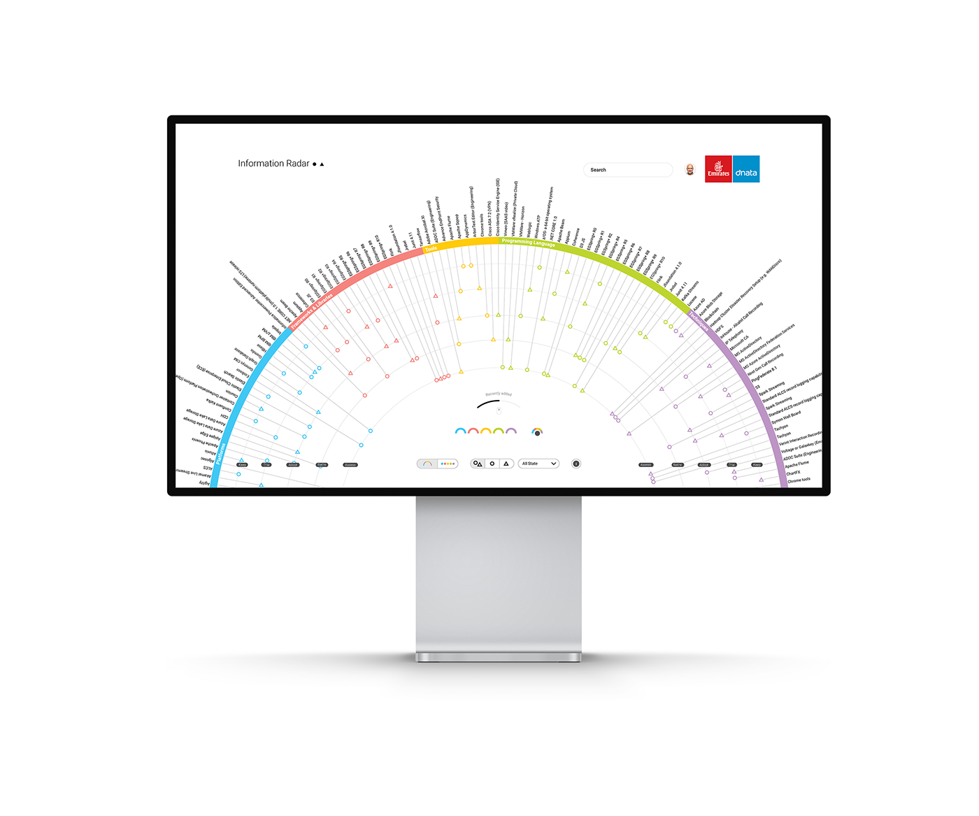
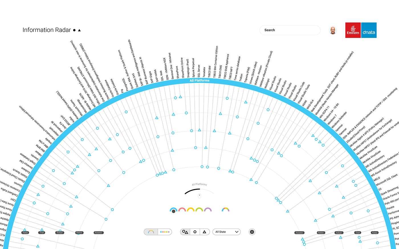
Find a meaningful way to integrate complex information with an interactive design and strengthen user’s engagement by making information understandable with a quick analysis.
This showcase offers insights on how to translate static infographics into digital and dynamic ones. Visual narratives can explain complex concepts and ideas in a clear and engaging way. Using rich interactive visualizations may help stakeholders have a clear and comprehensive view of their design and development tools. This can improve, among other things, the pace, the analytical resources available, and the results of many different projects.
The features presented in the information visualization platform below have been ordered and grouped based on different layers of information (tools, frameworks, programming languages, platforms, etc) as commonly used within IT and design departments.
With this information visualization platform, stakeholders will be able to search and filter information faster, as well as add a timeline to know the current status and track all changes made by different people in the project.
Case study: Medium link