


Our school, like many others, has a television program. It used to be called Channel 3, but it would be seen in the two neighboring towns next to us, so Channel 3 wouldn't work anymore. So in 2011 the channel changed its name to the Spotswood Public Schools Network. At first the logo was just that same title againsta whitebackground with stage lights on the top. It was way too busy and too detailed for small things like a microphone wrap. The logo after that was just "SPSN" with a bunch of blue and yellow squares above and below the letters. So, this year our class has been "comissioned" by the tv class to make a new logo. This is my attempt at it.

This is the final version of my logo. I wanted it to be more towards a sport's team-like logo since they've nver gone that route before. And since our school has a decent athletics record, I thought it would be a nice little nod to the teams.

The Black and White version of the logo

The "holiday" version of the logo. At first the horse face was red, but that hurt peoples eyes and frankly it was a little scary.
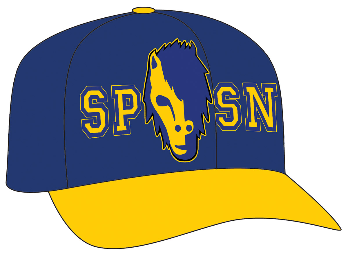
A baseball cap for the tv studio, students, staff, and parents.

A t-shirt supporting the tv studio for students and parents.

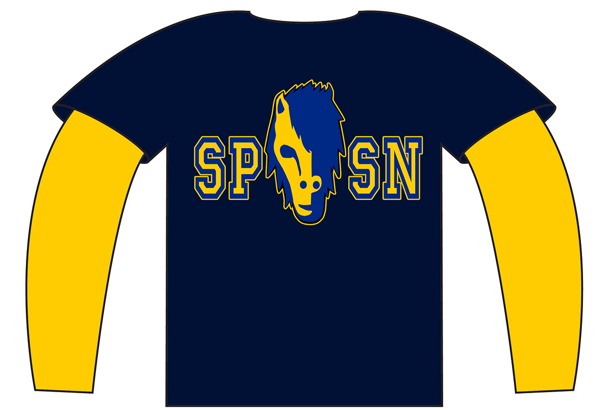
A t-shirt supporting the t.v. studio for people working on the set, the director, and other staff members that just want to show their support.
Layered t-shirt for students and parents. It would make a nice present for someon to get in a fundraiser.

Your classic long-sleeve t-shirt for those that don't want to show their arms.

A polo t-shirt for that extravagent and luxorious student or parent that you know.

Coffee Mugs

The Microphone Wrap
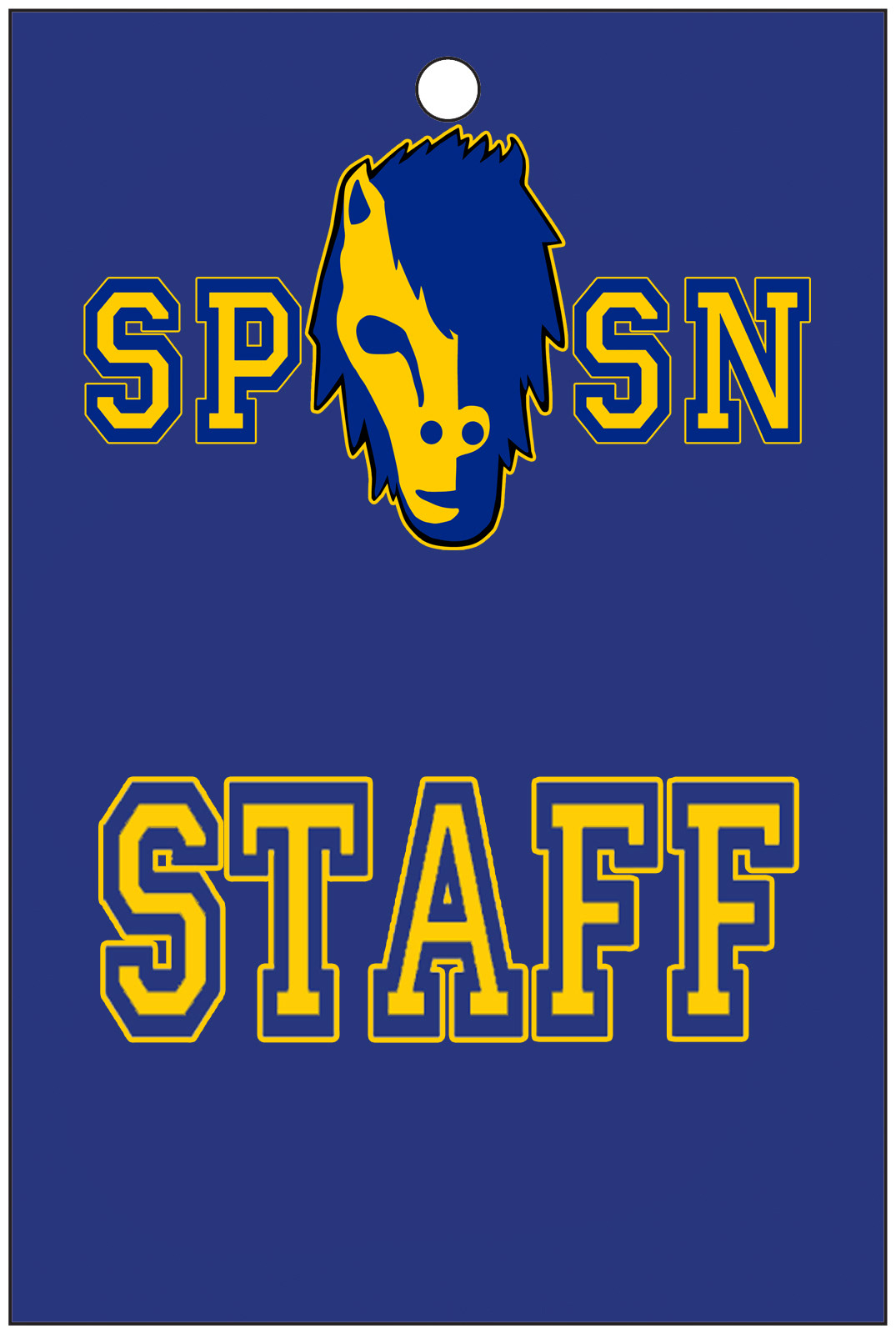
The Staff ID for staff members and people in the studio

Twitter Feed
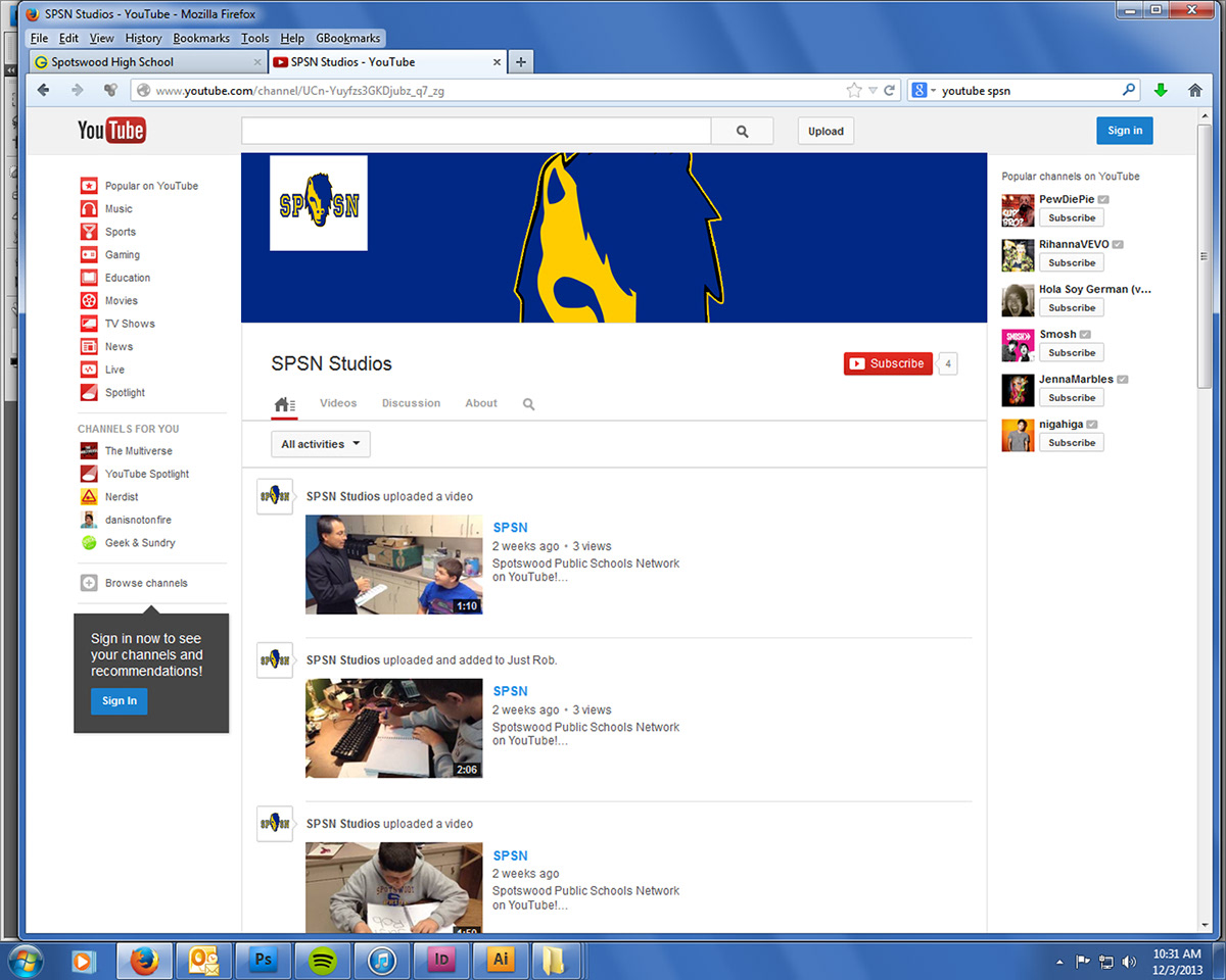
Youtube Page
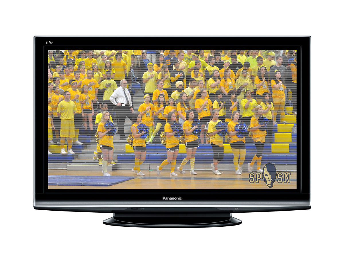
And finally how the logo would look on tv.
Thank You for Viewing!


