Projeto Gráfico: Alan Torres
Diagramação e design: João Meireles
Concept
[PT]
O projeto gráfico para as capas seguiu o mesmo princípio que o miolo, e tem como objetivo gerar um impacto visual, traduzindo toda a riqueza de conteúdo do livro. O vermelho e elementos visuais dão a impressão de movimento e dinamismo, mesmo conceitos que geram interferências nas tipografias, quer seja através da disposição dos caracteres, quer seja através de efeitos de movimento nas letras. Tais efeitos refletem os estilos do miolo.
[EN]
The graphic design for the covers followed the same principle as the inside, and aims to generate a visual impact, translating all the richness of the book's content. The red and visual elements give the impression of movement and dynamism, even concepts that generate interference in the typography, whether through the arrangement of the characters, or through the effects of movement in the letters. Such effects reflect the styles of the brain.


Elements and textures
[PT]
Os elementos visuais integram os padrões ilustrativos. Eles foram pensados para representar a ideia de sequência, progressão, evolução e construção. Traduzem a importância de seguir os princípios, caminhar sobre os princípios, se desenvolver sobre os princípios. Compreendem o nível mais abstrato do livro, mas não menos importante, pois recebem a função de integram todas as partes, traduzindo um sistema visual holístico, em que cada parte aponta para o seu todo.
[EN]
Visual elements integrate the illustrative patterns. They were thought to represent the idea of sequence, progression, evolution and construction. They translate the importance of following the principles, walking on the principles, developing on the principles. They comprise the most abstract level of the book, but no less important, as they are given the function of integrating all the parts, translating a holistic visual system, in which each part points to its whole.
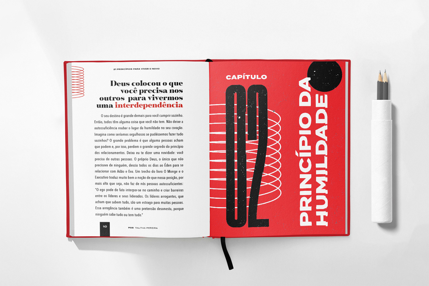
Typography
[PT]
Entre as fontes que possuem melhor contraste com a escolhida para o corpo se destacaram Termina e Tusker. Elas também são tipografias Sans Humanista que possui muita personalidade e estilo. Combinada em grande escala, compõem um layout moderno e muito atraente. A decisão de transcrever os títulos em vertical é uma alternativa para sair do padrão de grande parte dos livros do mesmo segmento. É também uma solução que integram textos em grande escala e permitem o nivelamento de estrutura para títulos com diferentes quantidades de caracteres e quebra de linha equilibrada entre as palavras.
Um grande diferencial em cada capítulo são as frases destaque. Elas geralmente abrem e fecham os capítulos e necessitam uma atenção especial. E pelo falo de frases, citações, e afins, terem um aspecto mais atemporal e até um tanto clássico, a solução aqui foi combinar uma fonte serifada, moderna e com muita personalidade. Essa decisão é também é uma resposta para esse ponta de estilo atemporal que a ideia de princípios evoca para o livro.
A fonte Tenez tem origem brasileira, mas possui distribuição mundial. Além de toda sua personalidade é uma fonte muito exclusiva, ou seja, ainda pouco usada em projetos gráficos. Sem dúvidas, ela é um mix de combinações que comunicam mais do que os objetivos de estilo gráfico do livro, identificam também um pouco da personalidade da autora.
[EN]
Among the fonts that have the best contrast with the one chosen for the body, Termina and Tusker stood out. They are also Sans Humanist typefaces that have a lot of personality and style. Combined on a large scale, they make up a modern and very attractive layout. The decision to transcribe titles vertically is an alternative to depart from the standard of most books in the same segment. It is also a solution that integrates large-scale texts and allows leveling of structure for titles with different amounts of characters and balanced line breaks between words.
A big difference in each chapter are the highlighted phrases. They usually open and close chapters and need special attention. And speaking of phrases, quotes, and the like, having a more timeless and even somewhat classic look, the solution here was to combine a serif font, modern and with a lot of personality. This decision is also a response to that timeless style edge that the idea of principles evokes for the book.
The Tenez font is of Brazilian origin, but has a worldwide distribution. In addition to all its personality, it is a very exclusive font, that is, still little used in graphic projects. Undoubtedly, it is a mix of combinations that communicate more than the graphic style goals of the book, they also identify a bit of the author's personality.


Illustrative
[PT]
Nos primeiros ensaios apresentado, houve uma aposta em desenvolver apenas elementos gráficos para compor o livro de forma ilustrativa. Após uma análise mais profunda do livro, percebi que a resposta de estilo visual disruptivo e moderno era apostar em colagens. Colagens são extremamente contemporâneas, e ao mesmo tempo atemporais – um elemento muito importante em um livro que não quer se prender apenas ao seu tempo. Elas abrem um universo de possibilidades, o que torna única cada implementação no livro.
[EN]
In the first essays presented, there was a bet on developing only graphic elements to compose the book in an illustrative way. After a deeper analysis of the book, I realized that the answer of a disruptive and modern visual style was to bet on collages. Collages are extremely contemporary, and at the same time timeless – a very important element in a book that doesn't want to be limited to its time. They open up a universe of possibilities, which makes each implementation in the book unique.