Oz Design Visual Identity Redesign


Concept and Redesign of the Oz Design Agency.
The main objetive of this redesign was to redeem and express graphically the origins of the name of the company, Oz Design, which actually came up after the "Wizard of Oz" fable.
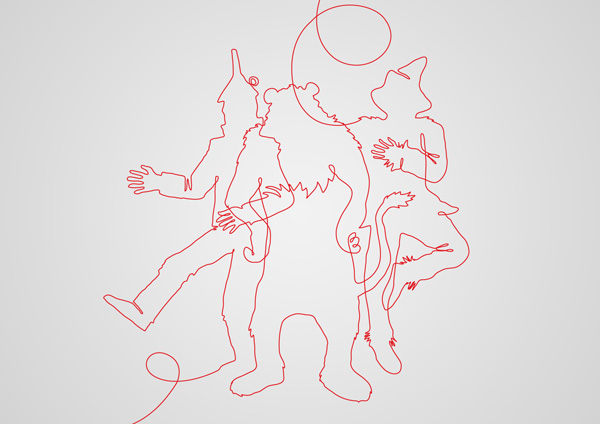
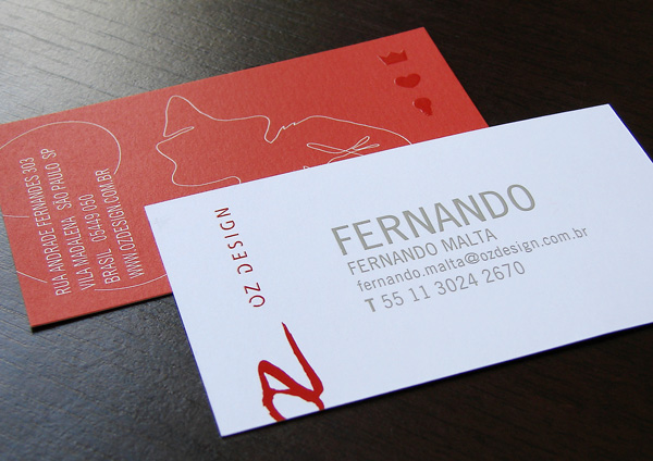
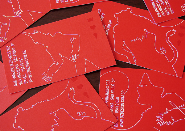
So, we elected some key icons, like the characters (scarecrow, tin-man and lion) plus what they were seeking for (heart, crown and lamp) symbolizing the key words that, associated, represents the soul of the company: EMOTION, RATIONAL and EXCELLENCE.
The characters were designed with a thin, gestural line, remembering us that good ideas came first from a sketch, a rough, a free thinking.
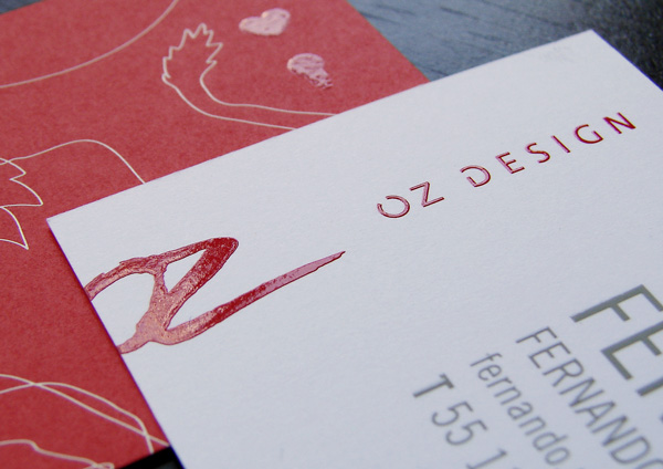
The icons (hear, crown and lamp) were expressed with simple and well constructed lines, bringing the sense that all good ideas must be well executed to express its full potential.
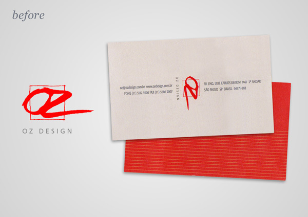
As a complement for the project, we've decided to work a little on the logo, to give some fresh air, modernity and legibility without lose its well recognition on the market, with some clean up and new type work.
Date: 2008 | Client: Oz Design | Approval: André Poppovic, Giovanni Vannucchi and Ronald Kapaz | Account Manager: Ana Tereza Albert | Print Production: Sônia Pimentel | Character Illustration Refinement: Funtoones Studio | 3D Illustration: Fernando Malta | Photos on this presentation: Fernando Malta.
This project was designed as a Senior Designer at Oz Design.

