

Rise ’73 Brand Identity
Rise ’73 is an up-and-coming commercial real estate group in Boston, Massachusetts. The new firm approached us to help name and build the brand identity for their venture. Their aim as the next generation of real estate advisors is to have an identity that mirrors their industry approach: being innovative and transparent, and making the experience flexible and enjoyable. Rise 73 wants people to see them as allies, not agents; full of optimism and energy, not corporate condescension. So we set to work to bring their dream to life.
Scope
— Naming
— Logo
— Typography and Color
— Messaging
— Layouts and Collateral
— Brand Guidelines
— Logo
— Typography and Color
— Messaging
— Layouts and Collateral
— Brand Guidelines

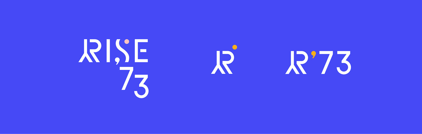
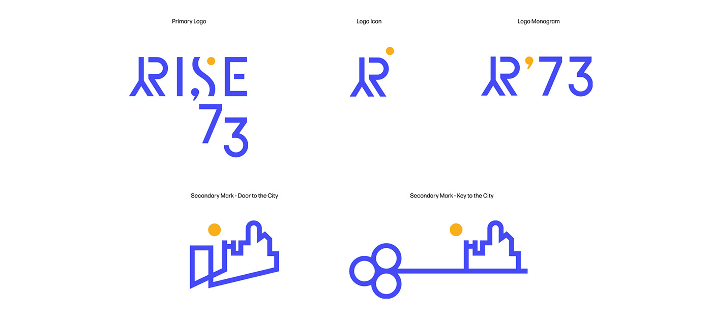
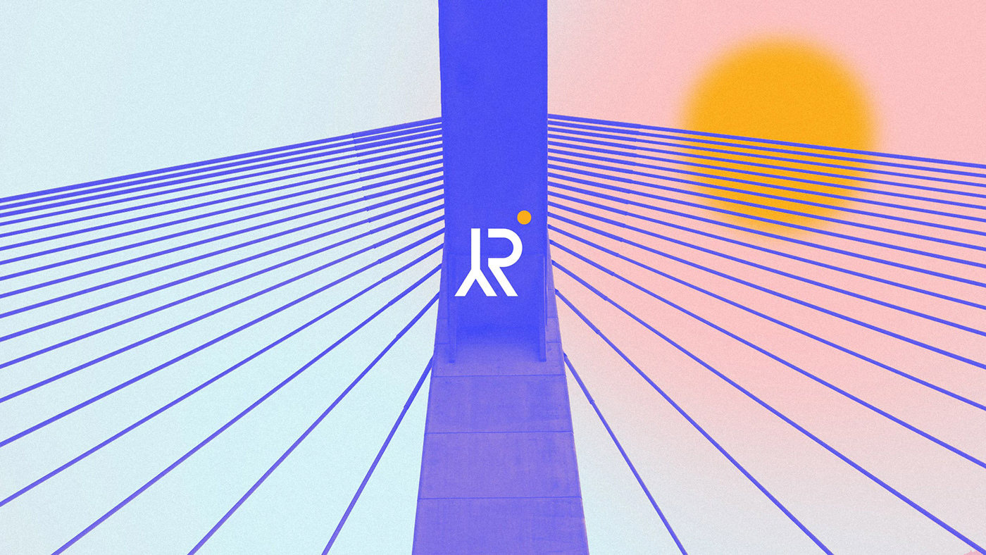
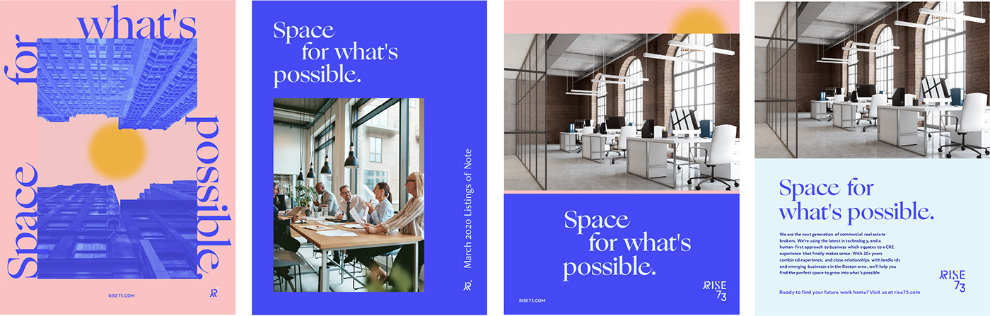
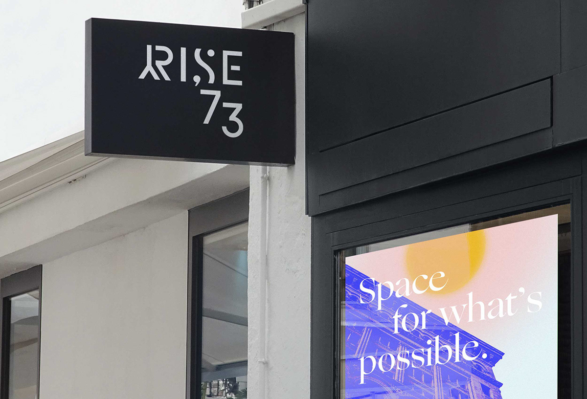
The logo features an ode to the iconic Leonard P. Zakim Bunker Hill Memorial Bridge (“The Zakim”), and a rising sun. The name and logo allude to growing possibilities in the city of Boston. The color palette beams brightly, separating Rise ’73 from the predominantly darker, more reserved palettes of competitors.
Brand Color Palette

An optimistic verbal and
visual identity
visual identity
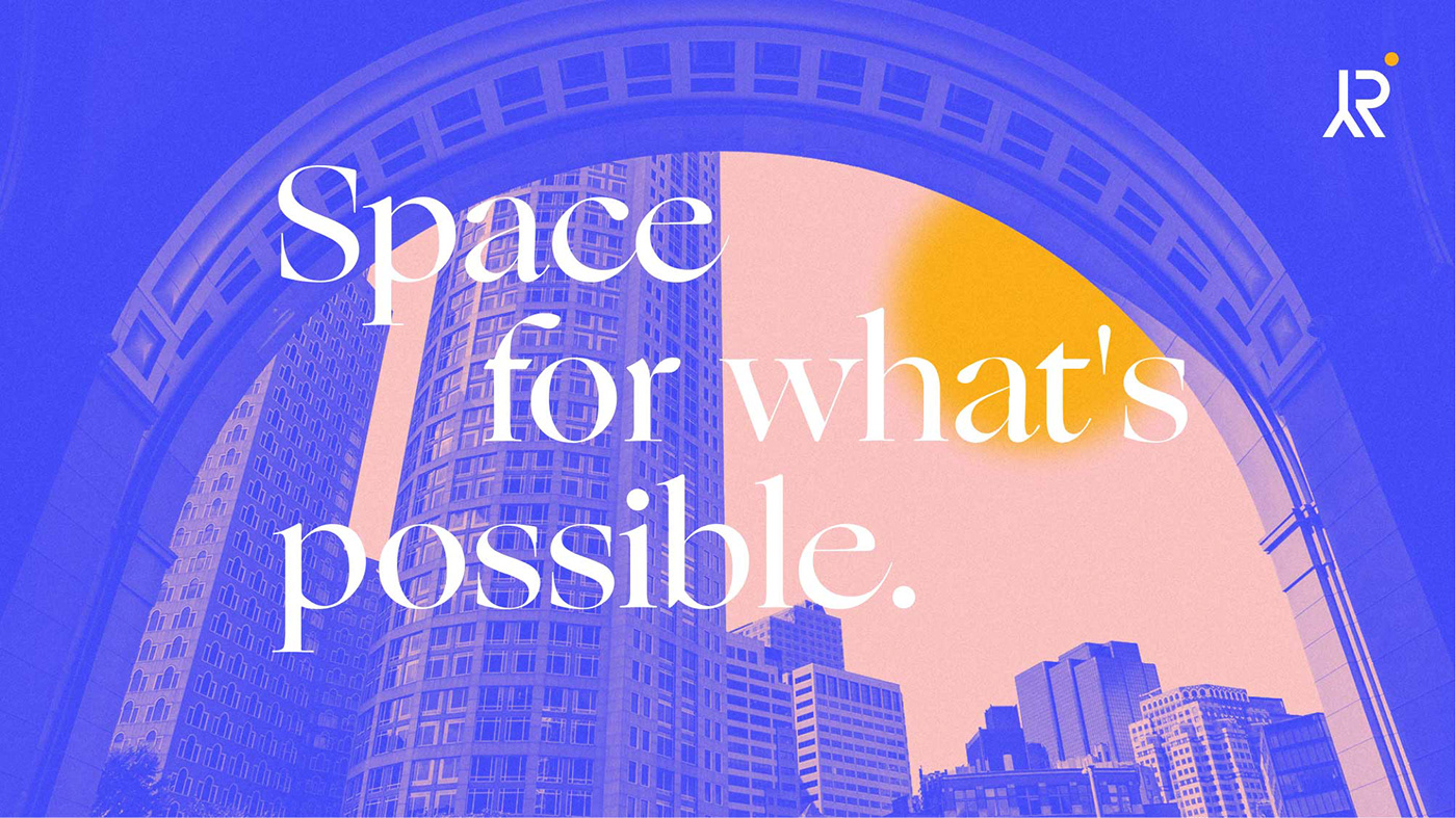
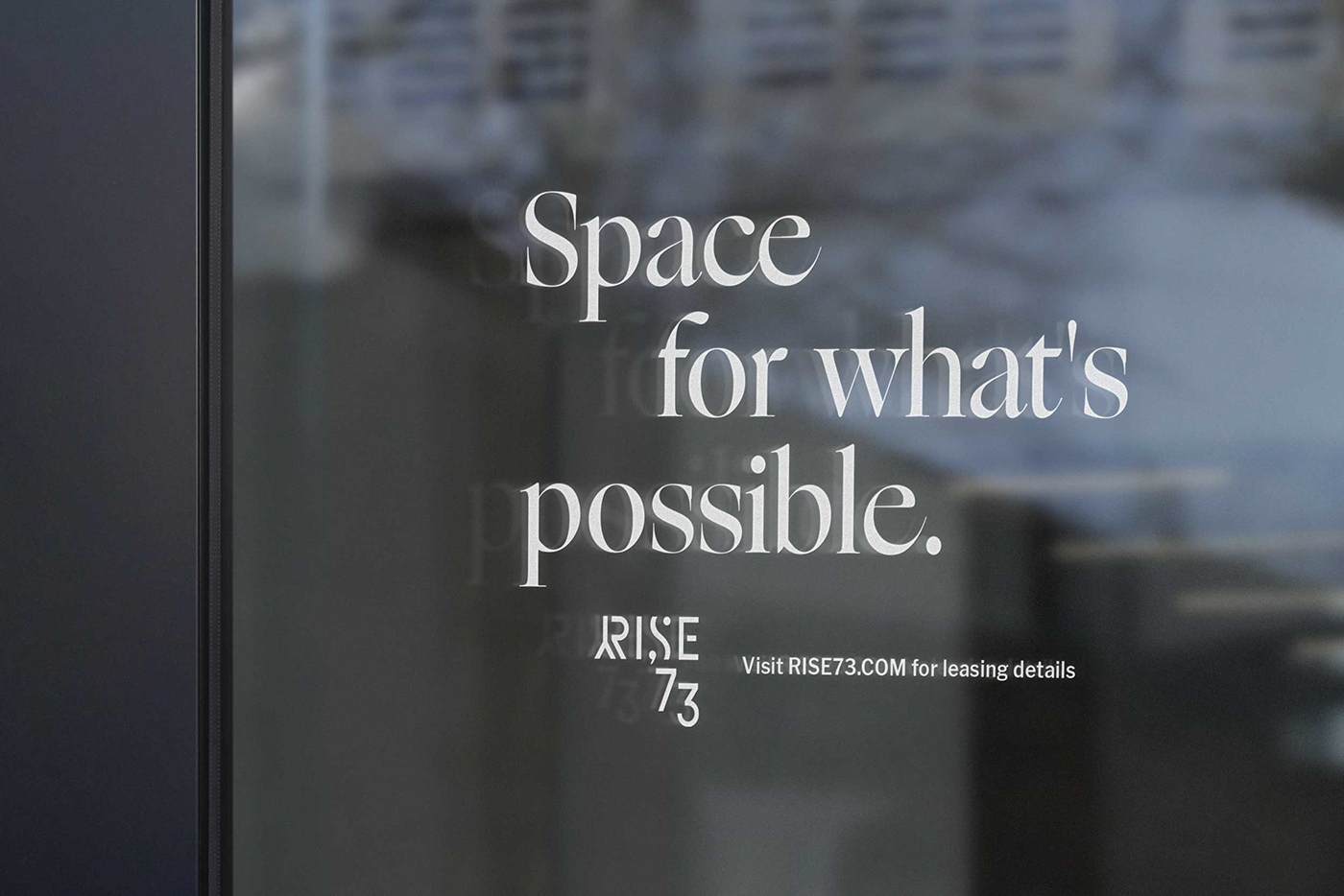
We worked on core messaging for Rise ’73, landing on “Space for what’s possible” as their purpose tagline. This optimistic vision extended into the color palette, typography, and photo treatments. The rising sun from the logo carries through imagery of Boston with energetic gradients overlaid. Ogg, a typeface by Sharp Type, serves for headlines across the brand. The classic yet unique serif sets a trustworthy tone against the bright colors and gradients.


Typography

Brand Guidelines


