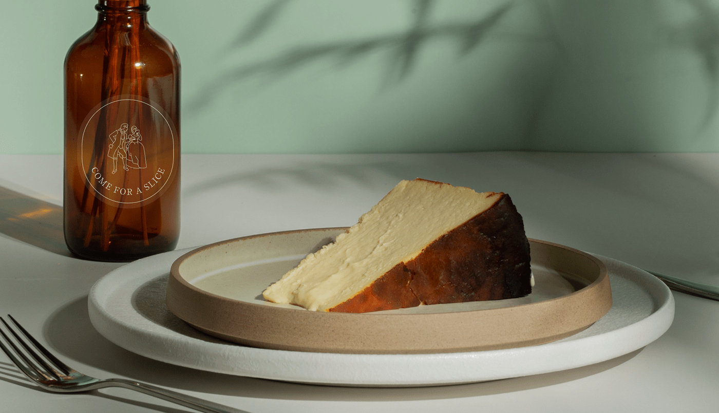

Visual identity, website design and photographic art direction for BASK. burnt cheesecake.
BASK. is a Japanese Patisserie that makes cakes based on the Basque burnt cheesecake recipe with a Japanese twist. The cultural exchange between West and East played a central role in the main visual concept of the brand.
Credits:
Brand Strategy & Copy - Daniela Maestres
Photography execution - Jon Low


The visual approach aims to create a ‘new colonial’ style using European classic references fused with the simplicity and practicality of both Basque and Japanese styles/cultures. This allowed me to experiment with contemporary serif fonts contrasted by minimal iconography.
Lush vegetation as a common element to both cultures, and also predominant in colonial era. Scenes full of charm and refinement,. Women as muse, being honored, treated, pleased, seduced. Traditional Basque beret hat.
+
The Euskara. (basque) alphabet
Lush vegetation as a common element to both cultures, and also predominant in colonial era. Scenes full of charm and refinement,. Women as muse, being honored, treated, pleased, seduced. Traditional Basque beret hat.
+
The Euskara. (basque) alphabet


The brand balances a certain amount of sophistication with playfulness and modernity.

According to the findings of the strategic stage, the identity should be simple, refined and alluring targeting mainly mid-class women.
Photographically we aimed for smoothness, elegance and minimalism. We prefered lateral lights, adorning the set with indoor plants elevating the product and creating a special moment.
Photographically we aimed for smoothness, elegance and minimalism. We prefered lateral lights, adorning the set with indoor plants elevating the product and creating a special moment.


