


Camina Lab
The mobility of the future gets a new branding

A new branding for the startup that will make our cities greener.
Camina Lab is a new mobility startup and seed accelerator dedicated to developing sustainable transport solutions for the future of the cities.
We partnered with them to develop a comprehensive, consistent, and human-centered brand and digital presence in line with their values and that speaks directly to their target audience.
Read the complete case study here.

The brand logo
Urban with a warm aftertaste

The logo is based on stencil letterforms. Those are the type of letters used to paint the roads, making a direct connection with Camina Lab sector: mobility.
Despite being a stencil, this unique typeface stands out for having rounded forms that endow it with a kinder, warmer character.
It is not common to find such a non-aggressive stencil typeface. Its personality is very different from what is expected, reinforcing brand recognizability.


Color palette
Your brain can’t ignore these colors
After our initial competitor analysis, it was clear that we would not use the color green. Instead, we created a powerful palette with strong contrast.
The use of intense yellow and asphalt black is inspired by the painted signs on the street. In color psychology, the yellow+black combination is the one our brain notices first, that’s why it’s used in danger signs.

Image curation
On the move
The images are carefully selected considering the audience and brand values.
We curated all the photos with the same criteria:
→ All photos should convey the idea of mobility. There should always be people on the move or using transportation.
→ There should always be an intense yellow element, reinforcing the brand connection.

Custom icon set
An icon is worth 100 words
We created a set of custom icons as part of the brand, to be used on different touchpoints to help make the messages more visual.

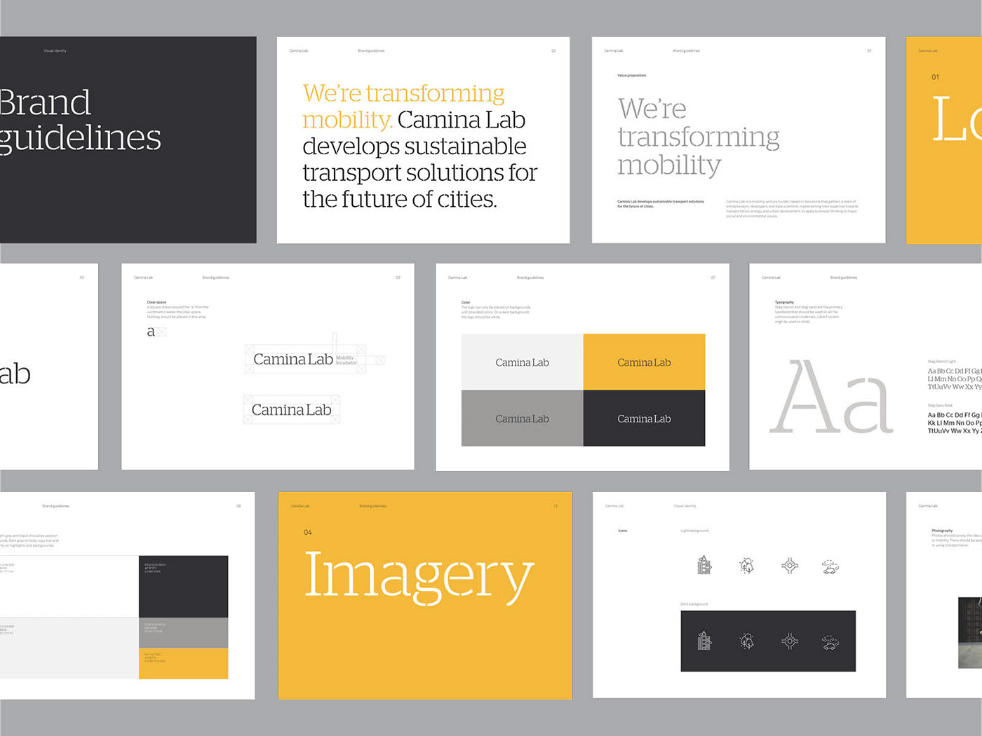
Brand guidelines
Consistency builds trust
A brand becomes recognizable by being consistent over time. We created a document with brand guidelines to keep consistency across every touchpoint.
Brand applications
Eye-catching content
We designed the Instagram feed of Camina Lab, website, stationary and other brand touchpoints.


