

Meetings & Events • Marketing • Project Management
Styling • Lectures • Event Staff
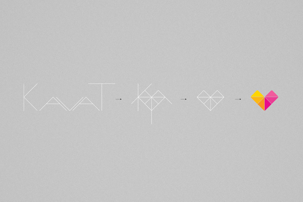
A small agency with a big heart who is pounding extra hard for interaction between people and creative marketing. Their previous logo stood for planning and was symbolized by the ´Check Symbol´, used in the daily planning of events through checklists. In the new identity Kavat wanted to retain that feeling but also bring in the warm, friendly and kind-hearted side. The outcome of the new Logotype also resulted in a grid pattern.
Together with the identity we created a brand new website. For an agency like Kavat it is important to be up to date and always running. It´s also important to show that to their future customers, visitors of the site. There for we created a portfolio countdown device which visually will show visitors what and when Kavats next projekt is. They can scroll through every future event and also visit the portfolio page where every past project will show.
This set-up also inspires Kavat to update their site more frequently.
Bonnier, Drivhuset, Länsförsäkringar, Skövde Municipality
and Manpower are some of their customers.
and Manpower are some of their customers.
In collaboration with Grebban
2013


Thank You!


