
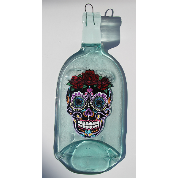
Glass bottles are melted in a kiln either flat, or into dish shapes. They are then painted, decorated, etched, or the labels are reapplied to create these creative works of art.
LOGO
A septagon shape represents the 7-sided kiln used to melt the bottles. The interlacing pieces of the septagon represent the kiln bricks patterned in different shades of green like the different shades of green bottles Meting Zone most commonly uses. These greens were methodically color picked from dozens of green bottle photos and chosen based on their compatibility with the gold. The green also signifies the recycled nature of this art form; bottles are salvaged and given a second life. The gold of the line and tagline was inherited from the popular gold wire used to decorate the necks of many of the bottles. Typography: the main font is bold and legible with just a touch of script so it remains gender neutral, but still has a free-flowing creative feel. The tagline is a legible sans-serif since it’s the smallest.
_______________________________________________________________________
BUSINESS CARDS

Pearlescent business cards.

Back of business cards.

_______________________________________________________________________
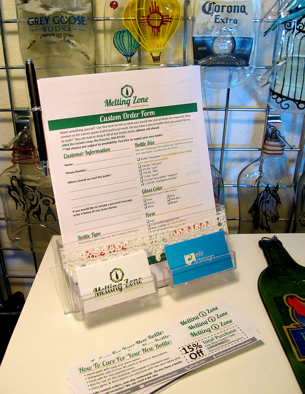
CUSTOM ORDER FORMS
_______________________________________________________________________
CARE SLIPS
These Care Slips are wrapped up with each purchased bottle. They tell the new owner(s) how to care for their new bottle and supply a coupon for the online store.
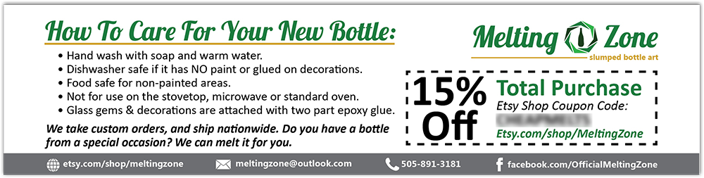
Design Challenges: there was limited real estate so the content needed to be compressed. I kept the amount of colored ink to a minimum (hence the gray bar at the bottom vs. green). I used a range of font sizes so the hierarchy of the information is quickly conveyed visually.
_______________________________________________________________________
WINE FESTIVAL SUBMISSION
In order to be an artisan vendor at the Wine Festival, it is required to submit photos to the city to be juried. These photos help determine if the artisan will be accepted as a vendor or not.
I staged each bottle in a setting that was relevant the the bottle's painting/decor.
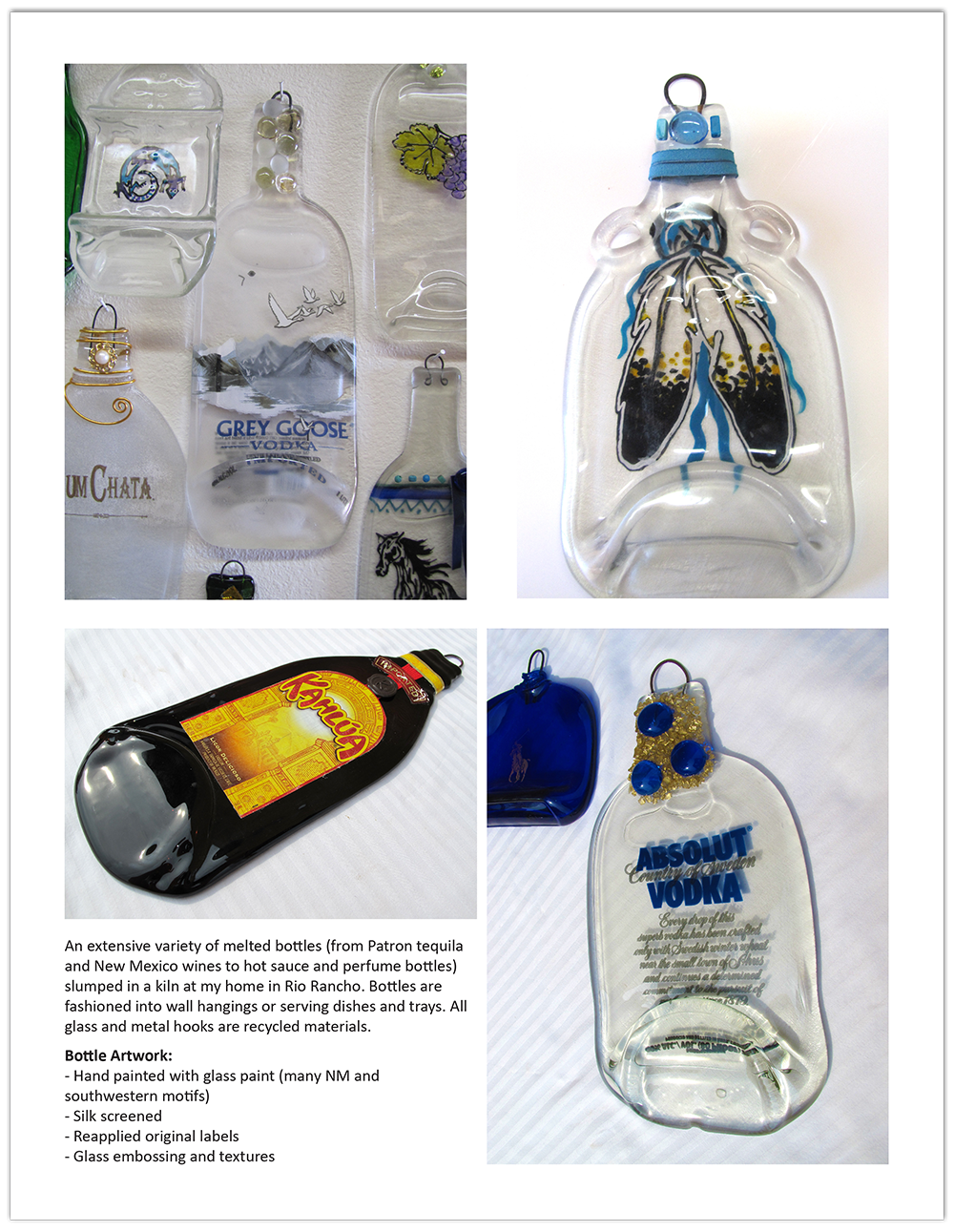
I included a short description of Melting Zone with the photos on the last page as supplementary information.
_______________________________________________________________________
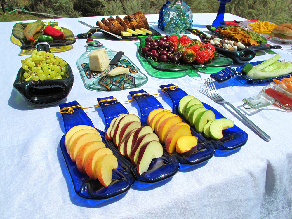
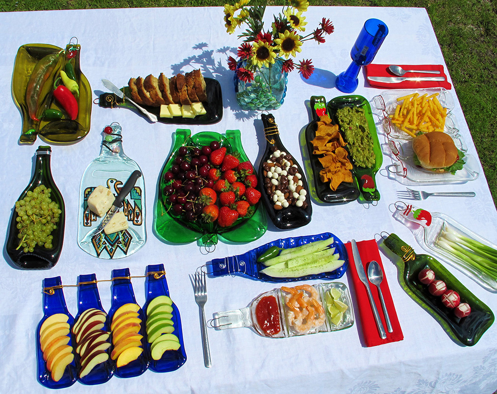
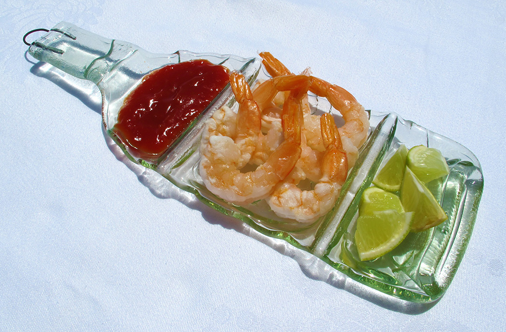
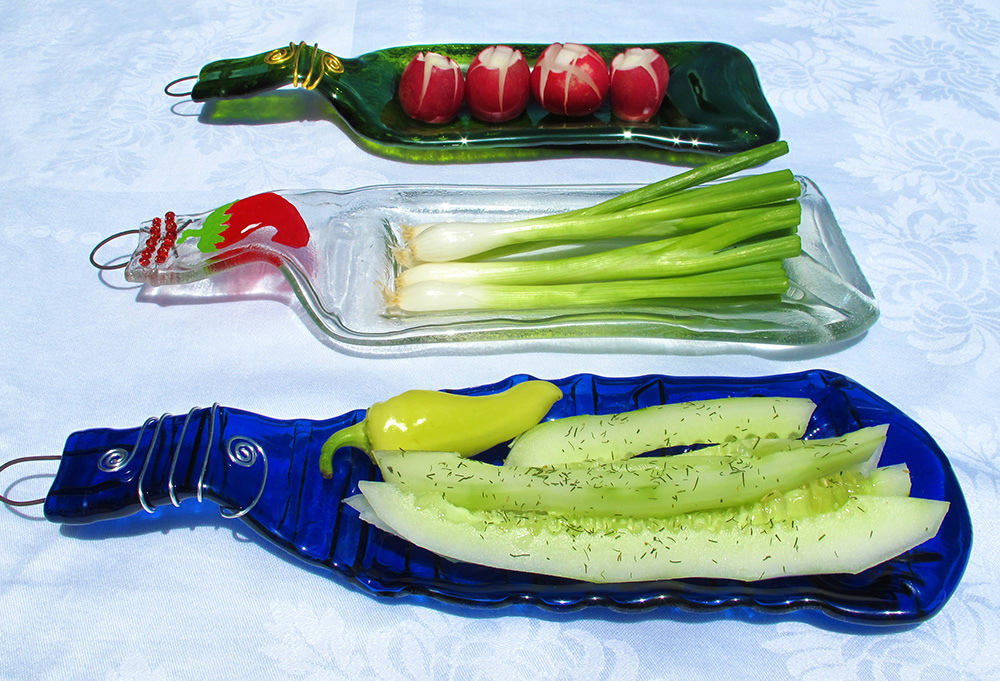
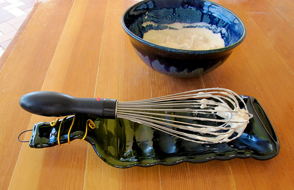
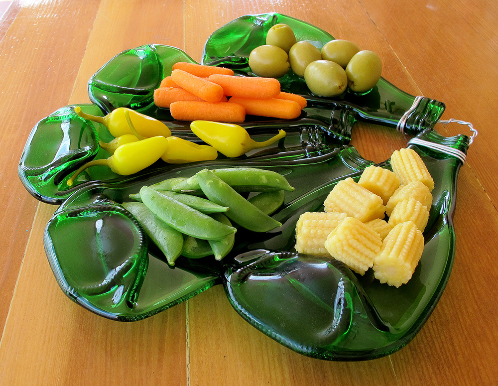
FOOD DISPLAY PHOTOS
I predicted that having photos showing the functional uses of the different dish types would aid sales. With these photos displayed in the booth at the Wine Festival, customer's had a better idea of how they could creatively use a Melting Zone dish. Here are a few of these photos.

_______________________________________________________________________
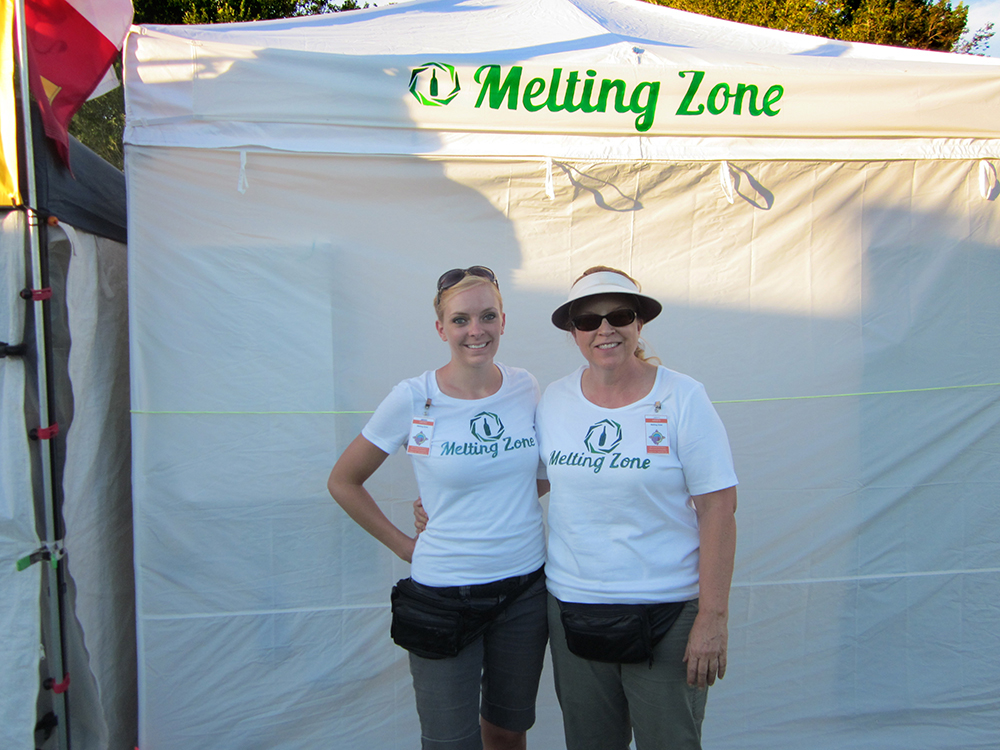
BOOTH BANNER

Booth closed up.

Setting up.
_______________________________________________________________________
SHIRTS
_______________________________________________________________________
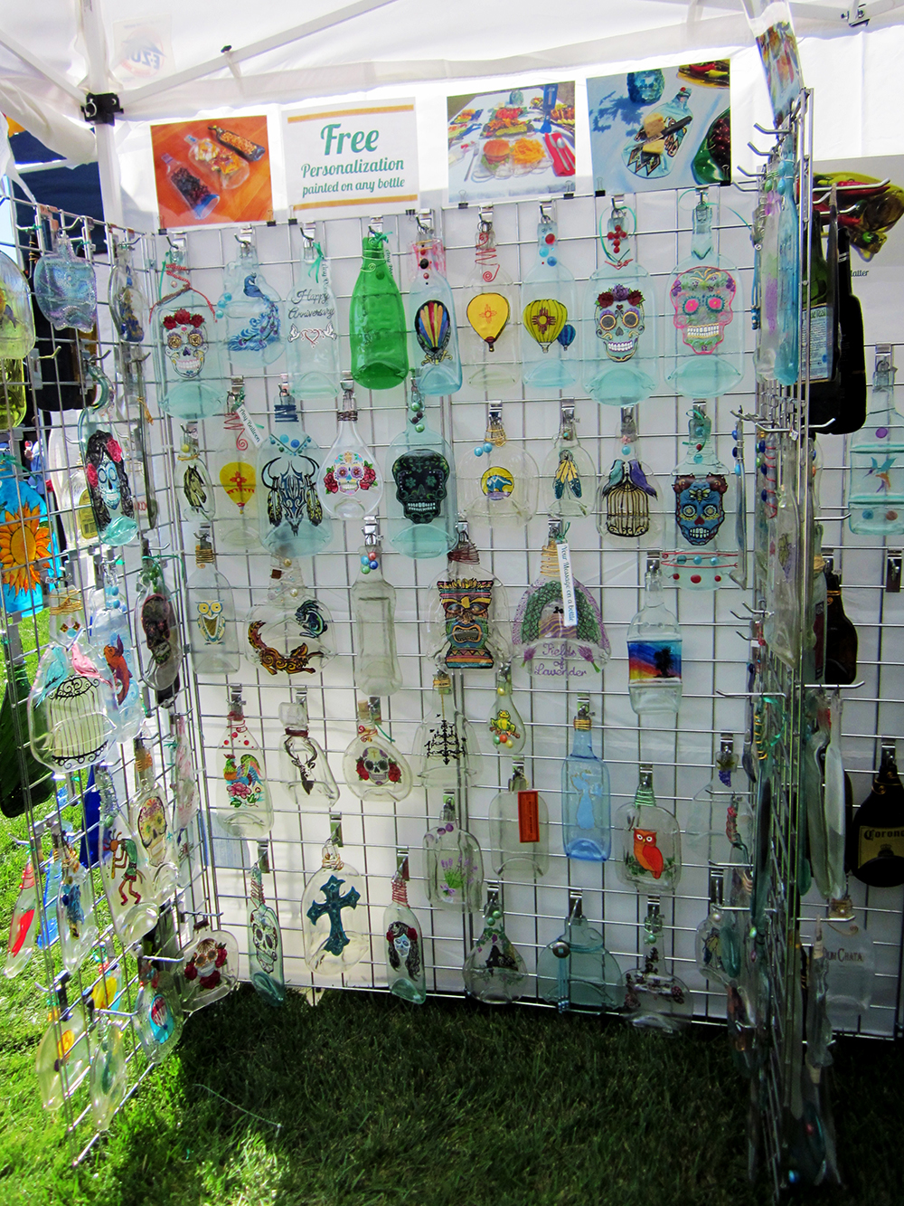
INSIDE THE BOOTH
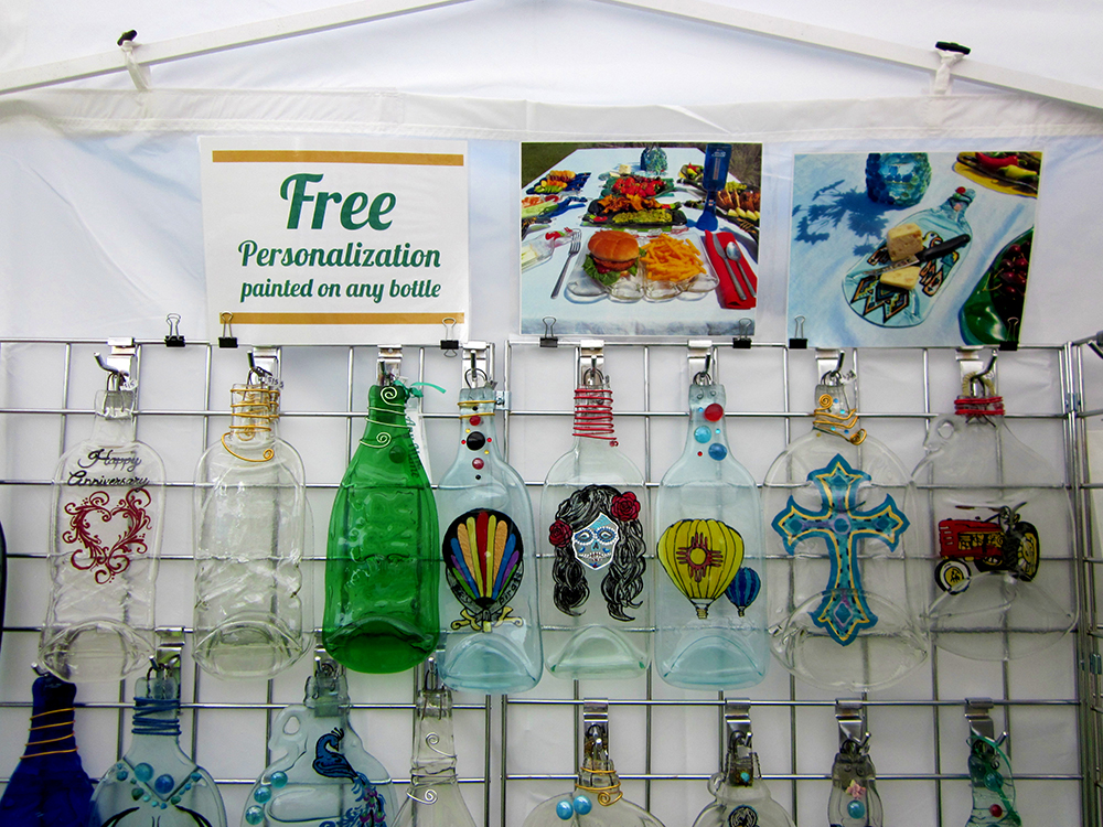
Display photos were shown along the top of the grid walls along with promotional signage.

Above the different types of dishes were photos showing usage ideas.
_______________________________________________________________________
ALBUQUERQUE JOURNAL STORY
Melting Zone made it in the Albuquerque Journal! A reporter was at the wine festival and he hand selected two artisan booths to write about, and Melting Zone made the cut.
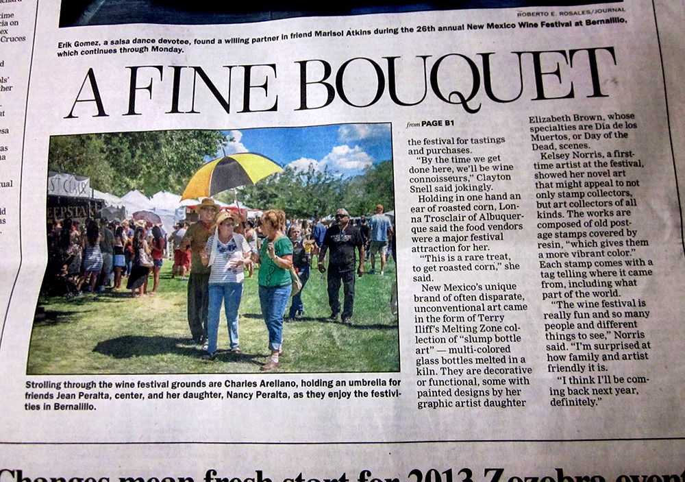
“New Mexico’s unique brand of often disparate, unconventional art came in the form of Terry Iliff’s Melting Zone collection of ‘slumped bottle art’ - multi-colored glass bottles melted in a kiln. They are decorative or functional, some with painted designs,... the specialties being Dia de los Muertos, or Day of the Dead, scenes.”
_______________________________________________________________________
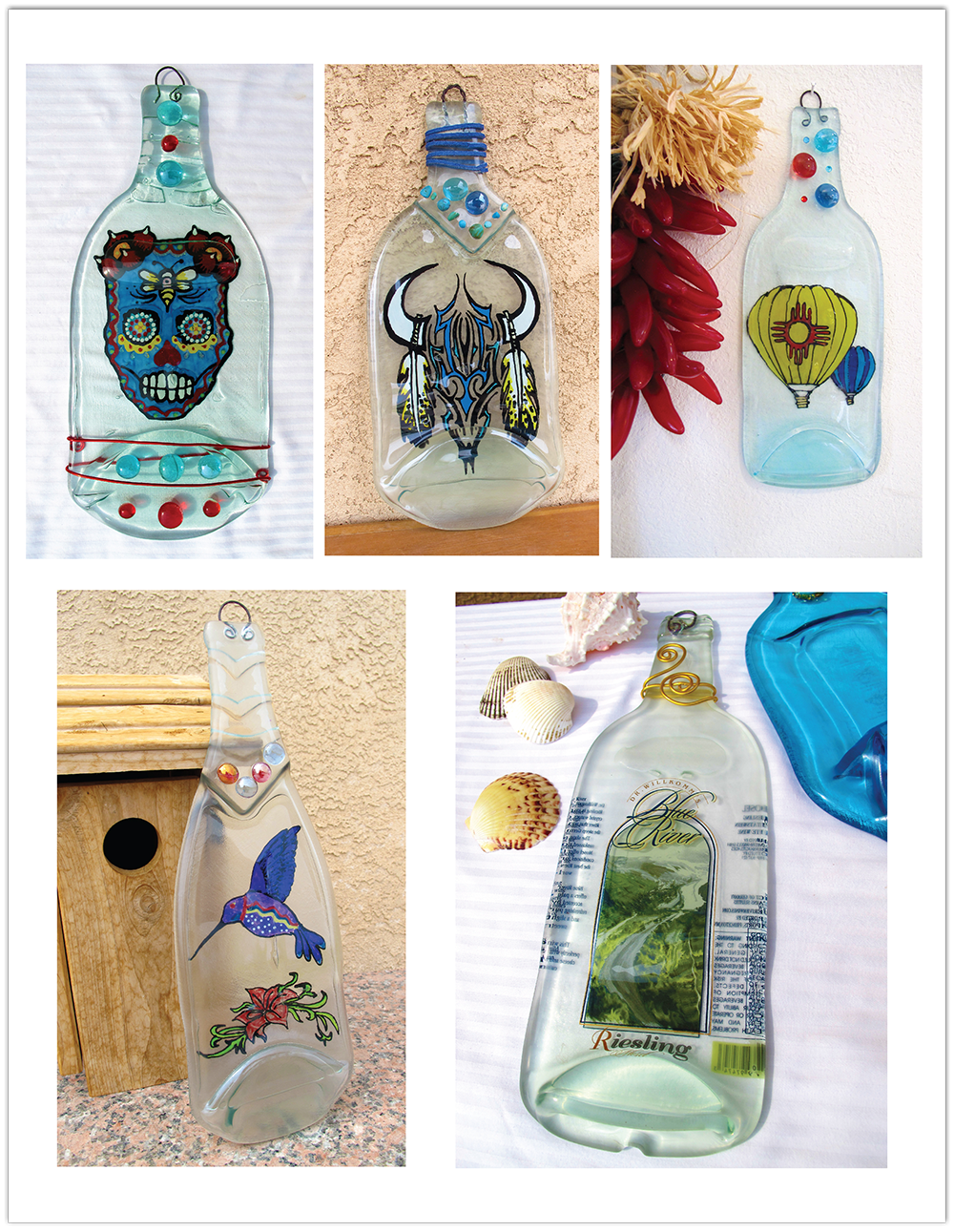
PHOTOGRAPHY FOR THE ONLINE STORE
Photos I took of some of the bottle art for the online shop: www.etsy.com/shop/MeltingZone

The most popular painted bottles are the Dia de los Muertos skulls.
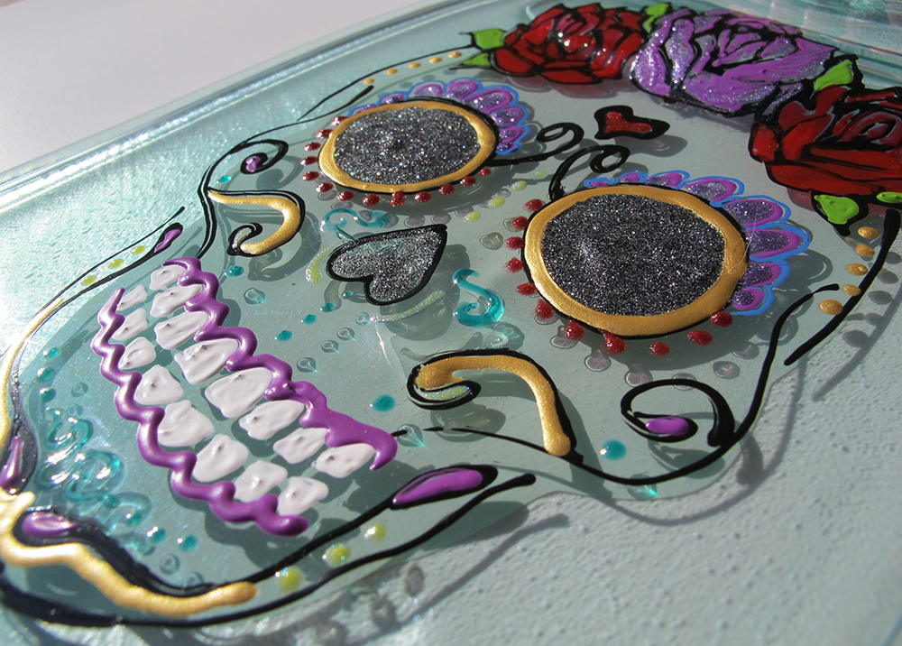
(All Dia de los Muertos paintings by me, Liz Brown)

Reapplied label (by Terry Iliff).

Etched glass (by Liz Brown).

New Mexican Dia de los Muertos skull (by Liz Brown).
_______________________________________________________________________
PROCESS WORK

Preliminary logo sketches. After the septagon concept was solidified different variations of it were explored.

Preliminary logo mockups. Dozens of people who had never seen the project before (and were from a variety of backgrounds and demographics) were asked to weigh in on which variations they liked best and why.
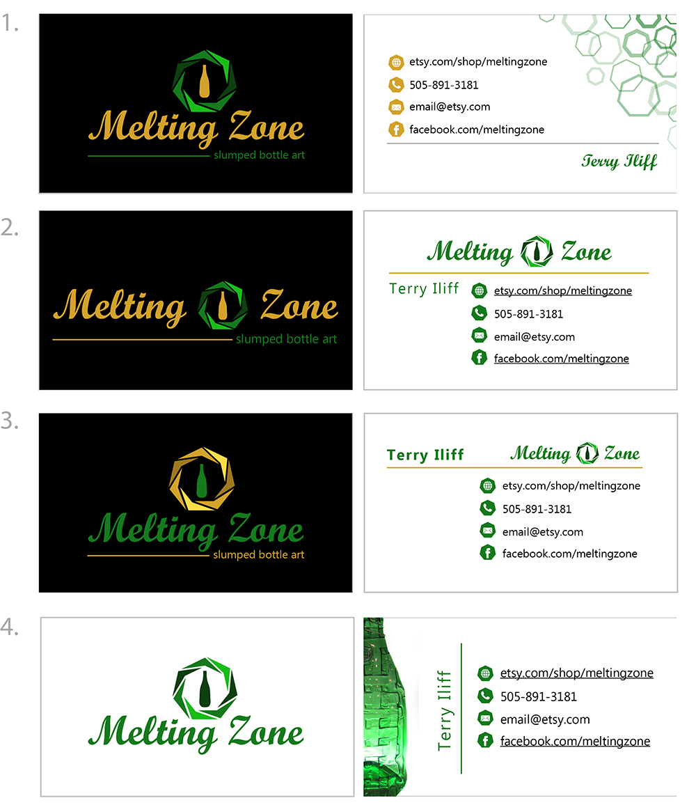
Top 4 mockups of the business card. Left = front, right = back. A combination of these concepts were chosen for the final card.


