


Memot 纯粹计划 | Branding & Packaging Design
Client: Memot 纯粹计划
Industry: Beverage
Service: Branding / Packaging Design
Photos are provided by Memot
Memot uses cold brew techniques to produce small bags of coffee and tea, which can be easily carried and stored. The package idea fits in with the lifestyles of Memot’s target audiences. They are young urban workers with intense daily schedules, but would still appreciate caffeine beverages with good quality and taste.


In fall 2021, the founder of Memot, Susie, reached to us in a forum held in Shenzhen, China. Susie shared her thoughts on upgrading the brand and packaging design. She felt that the brand concept wasn’t being communicated.
The message Memot wants to tell is simple, like its Chinese name 纯粹计划, which means “pure plans”. No matter what occasions you are in: Working in an office, on a business trip, or traveling, you can enjoy a nice cup of coffee or tea at any moment. Pure products for pure needs. The liquid can be poured into hot or cold water. Memot also encourages people to be creative, such as mixing the liquid with milk or spirits to make a latte, milk tea, or cocktails.


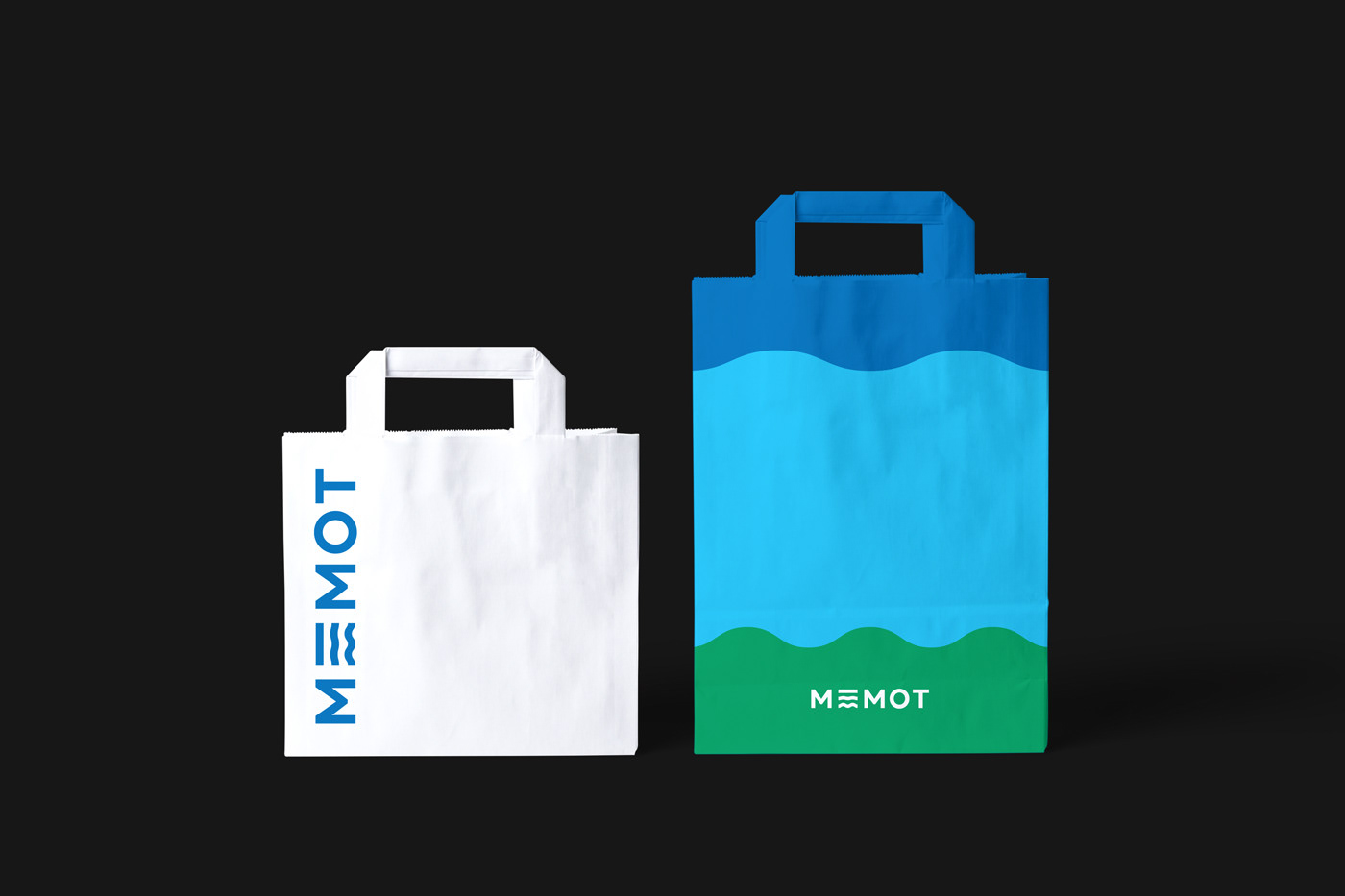
For the rebrand, we wanted to keep Memot’s loyal customers and attract new audiences at the same time. We discussed things that were worth kept, and elements that could be eliminated. For the logo design, we transformed the bars in the letter “E” into ripples. Ripples represent the textures of drinks and the changes in emotions. This way, without having a logomark, Memot can still contain a personalized and memorable symbol. We decided to use the “E” as a brand symbol individually in some applications.


A strong characteristic that we kept is Memot’s bold color palette. Cobalt blue and yellow were widely used on their previous packages. We make blue the primary brand color and added more saturated colors in the system to create high contrasts. The colors can express different flavors and personalities. Memot focuses on the online markets. A vivid appearance helps them attract attention quickly.
The ripple idea is extended in the graphics. By combining the bold shapes and colors, the visual system becomes alive. A brand can be simple and playful at the same time.


Enjoy ☕️💙


