Canton Community Center
Identity and Marketing Collateral
November 1, 2013
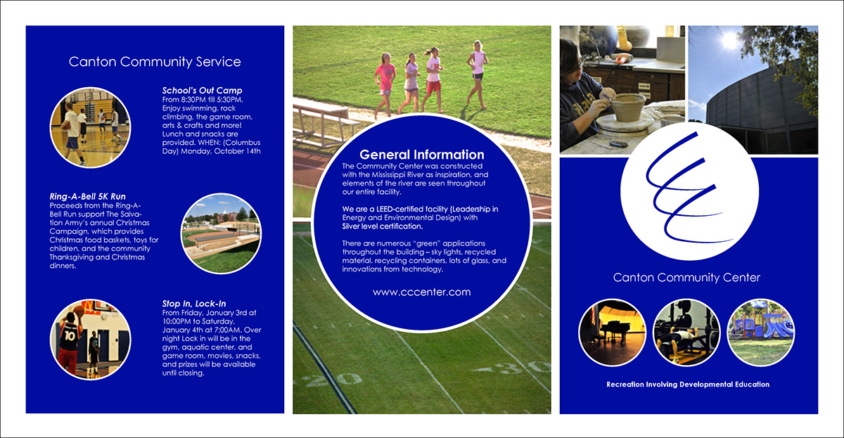
Canton, Missouri has no place for kids to go and play. It is well documented that kids in after school programs have higher success rates in the classroom. This community center targets children from ages thirteen to fifteen, since that is the primary age where kids begin to drop out of school. The design process mainly deals with the psychological research of young teenagers and what motivates them to be engaged in school. I am responsible for all photography. The abstract logo is simply the three C’s that represent the name of the community center. The design of the logo and the brochure is based on shape psychology. Circles, ellipses, and ovals suggest community, friendship and love, while also encouraging stability and endurance. Royal blue gives the logo and brochure the balance it needs. Blue represents one of the colors that motivate teenagers, the color combined with the circular motion of the logo gives the positive energetic motion needed to inspire kids to attend the community center.