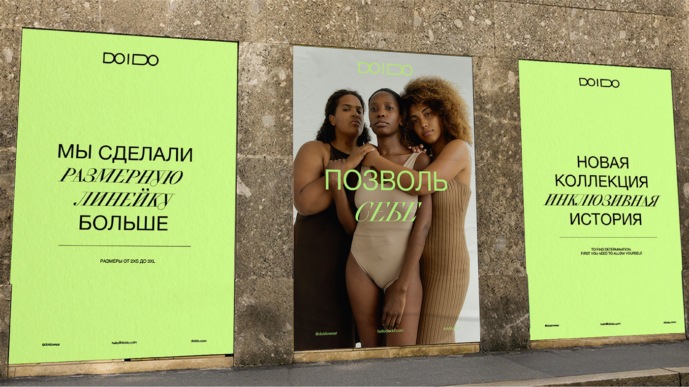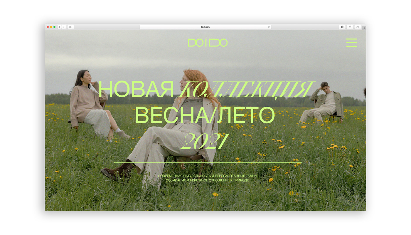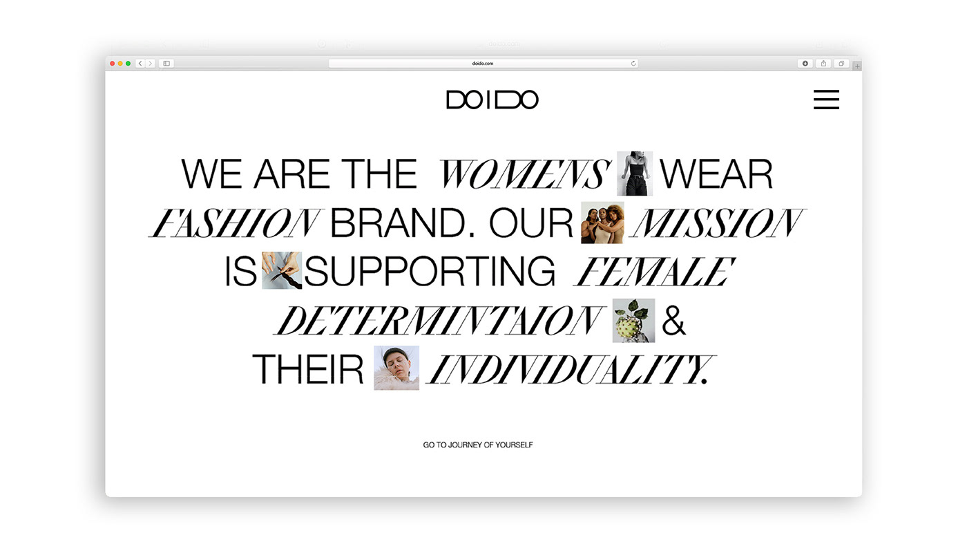
The main idea of the brand is to support all women who want to find courage and individuality.The brand adheres to a wide range of sizes from 2xs to 3xl, even plus size. Thus, the brand emphasizes the importance of the features of each figure and takes care of the fit of the products on different figure types.
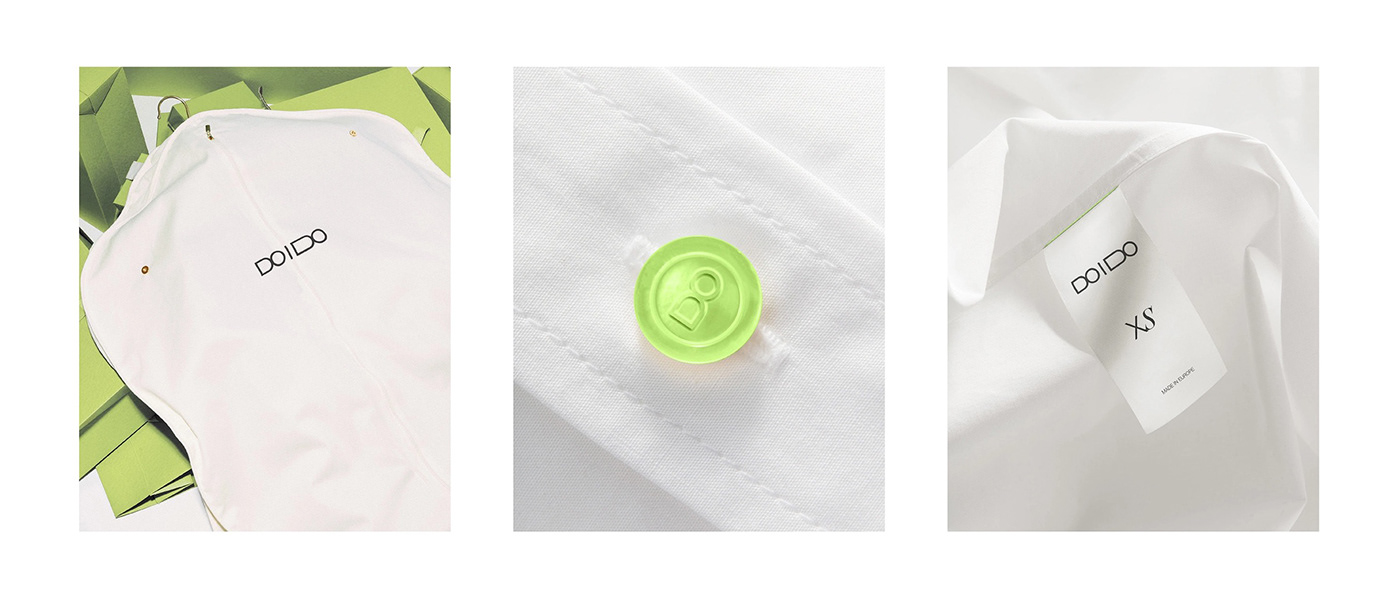
By using high-quality materials, the brand pays attention to the durability of the products, so that the customer does not resort to "fast-fashion" purchases. The idea of anti-consumerism came about as a reaction to the mass-market strategies of brands that sell inferior products under the guise of eco-friendliness and excessive recycling, forcing consumers to buy more and more. The brand offers to step out of this endless vicious cycle and consciously take care of the environment, especially through self-care.
By using high-quality materials, the brand pays attention to the durability of the products, so that the customer does not resort to "fast-fashion" purchases. The idea of anti-consumerism came about as a reaction to the mass-market strategies of brands that sell inferior products under the guise of eco-friendliness and excessive recycling, forcing consumers to buy more and more. The brand offers to step out of this endless vicious cycle and consciously take care of the environment, especially through self-care.

Throughout history, women were denied freedom of choice. They had to rely on the opinion and judgment of society, religious restrictions, and the beliefs of the time. Today, the situation is different and more and more women are gaining independence. The brand offers its support to women, from a wide range of sizes and recognition of the uniqueness of the female figure to a community of brand experts who help them realize their true desires, needs and personality. It starts with simply treating yourself to something really high quality and changing your usual style of dressing, and ends with a new way of thinking.
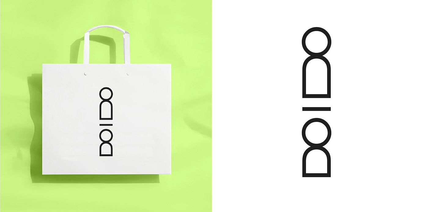
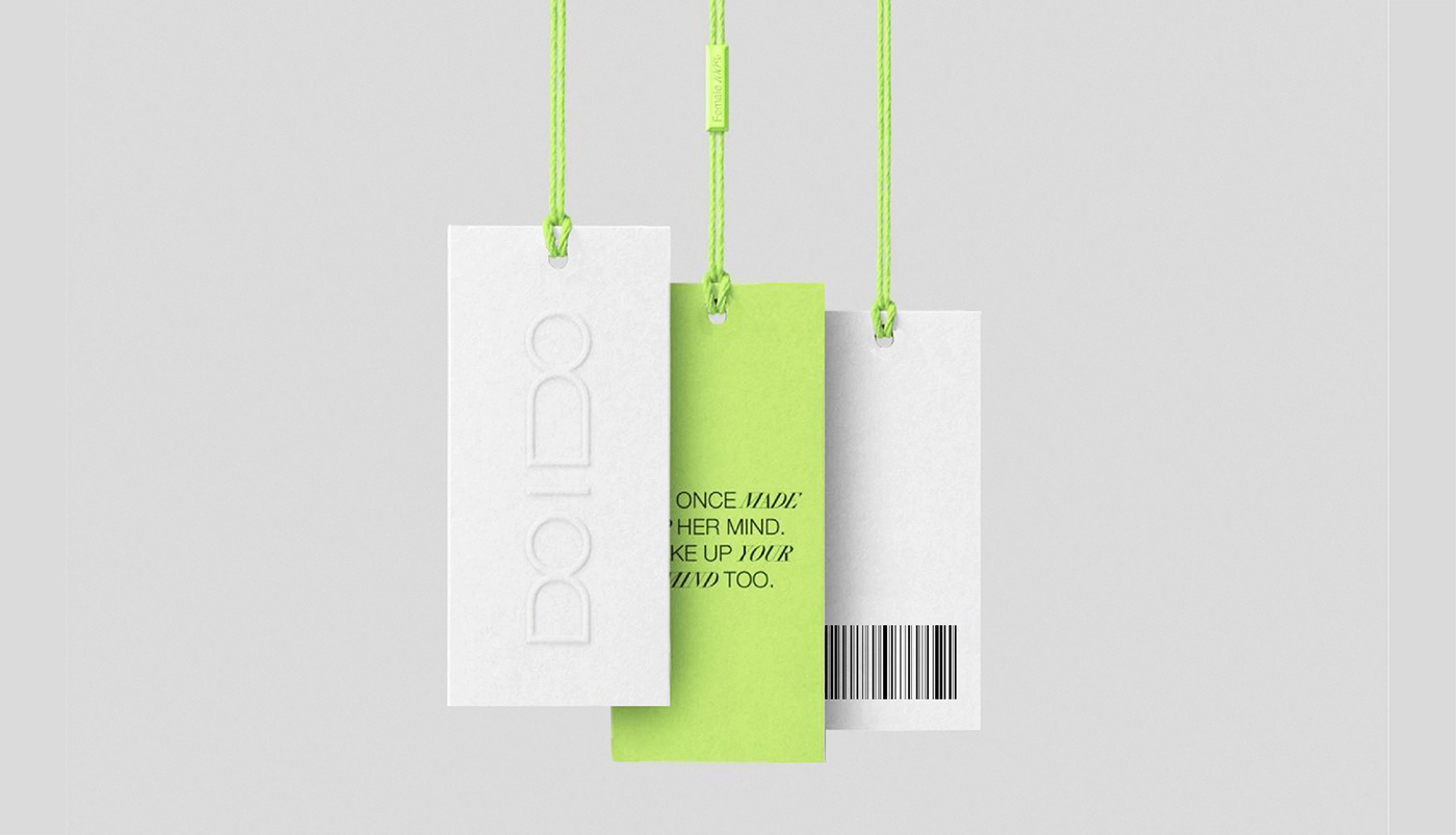
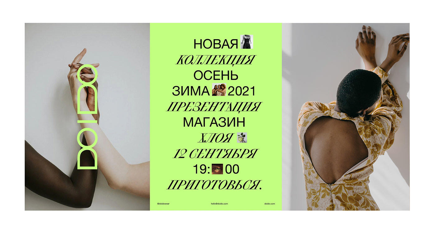
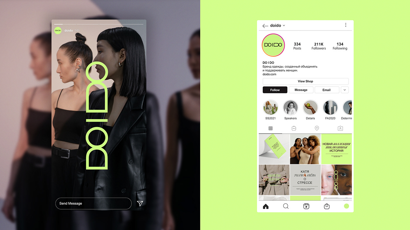
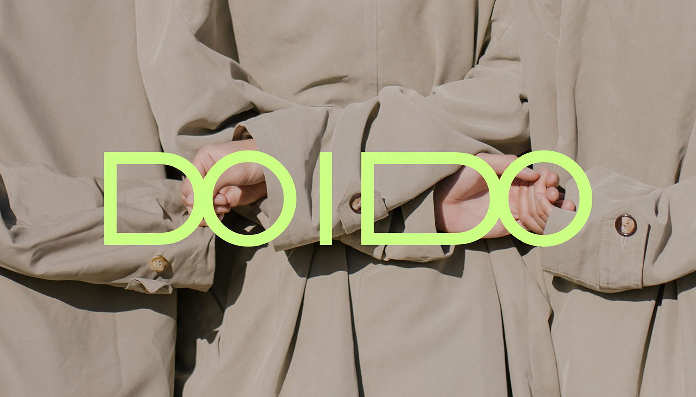
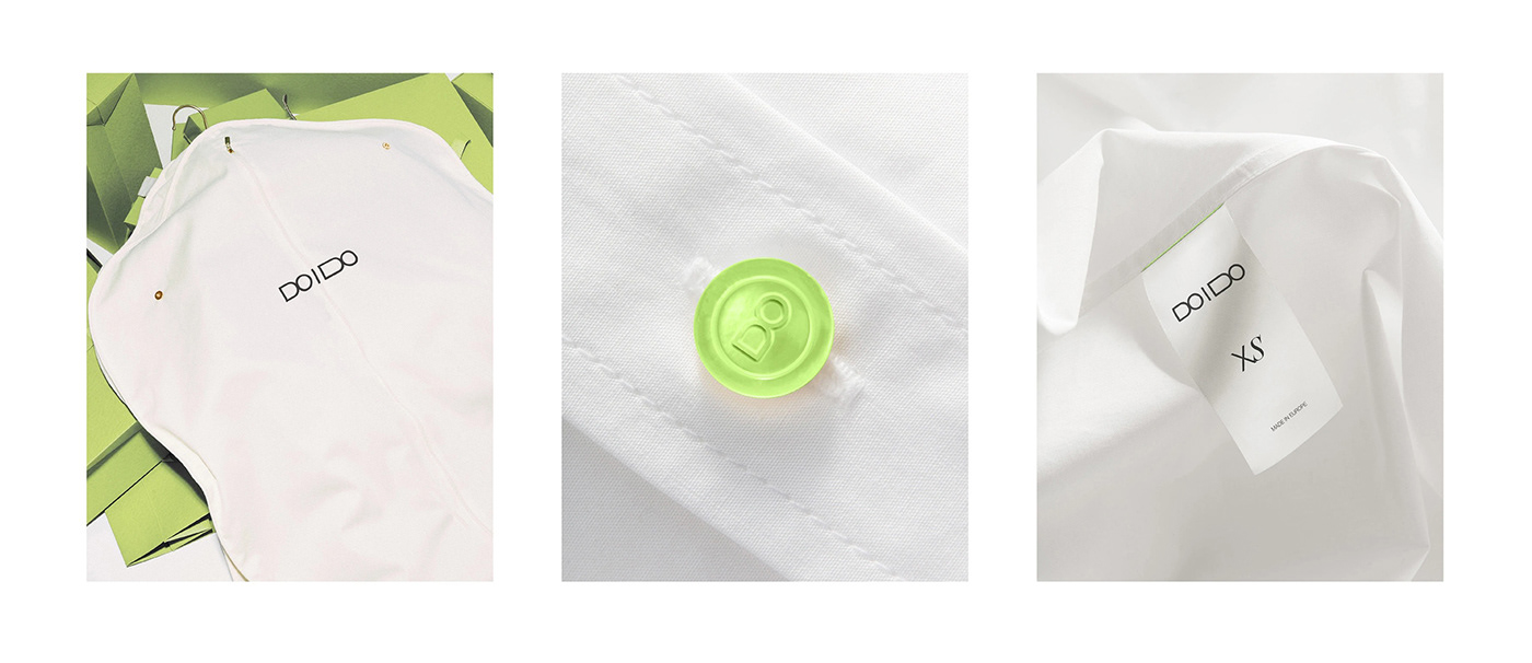
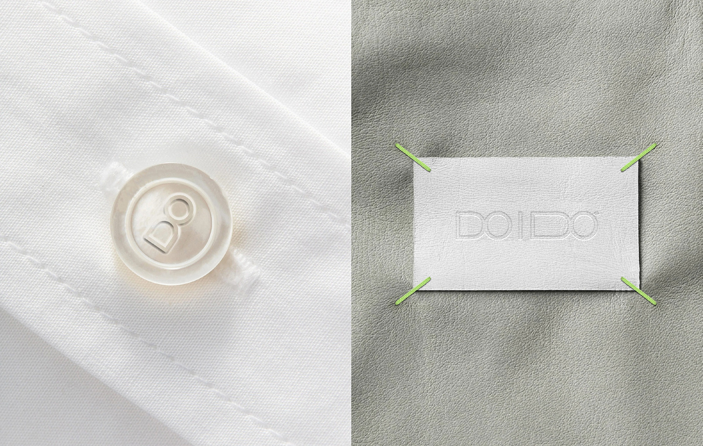
The logo symbolically fits the moment of determination: Do I? I Do! The letter "I" in the logo plays the role of a feature that represents the transition from the moment of not allowing oneself to the moment of fully accepting oneself through The geometry of the word "Do" resembles the image of a person who "grows" after crossing the border.

In our typographic work, we have chosen to reflect this transition from the simple to the complex by showing how the usual Helvetica transforms into a custom font, and how the use of these fonts "turns on" the user through an unusual combination.
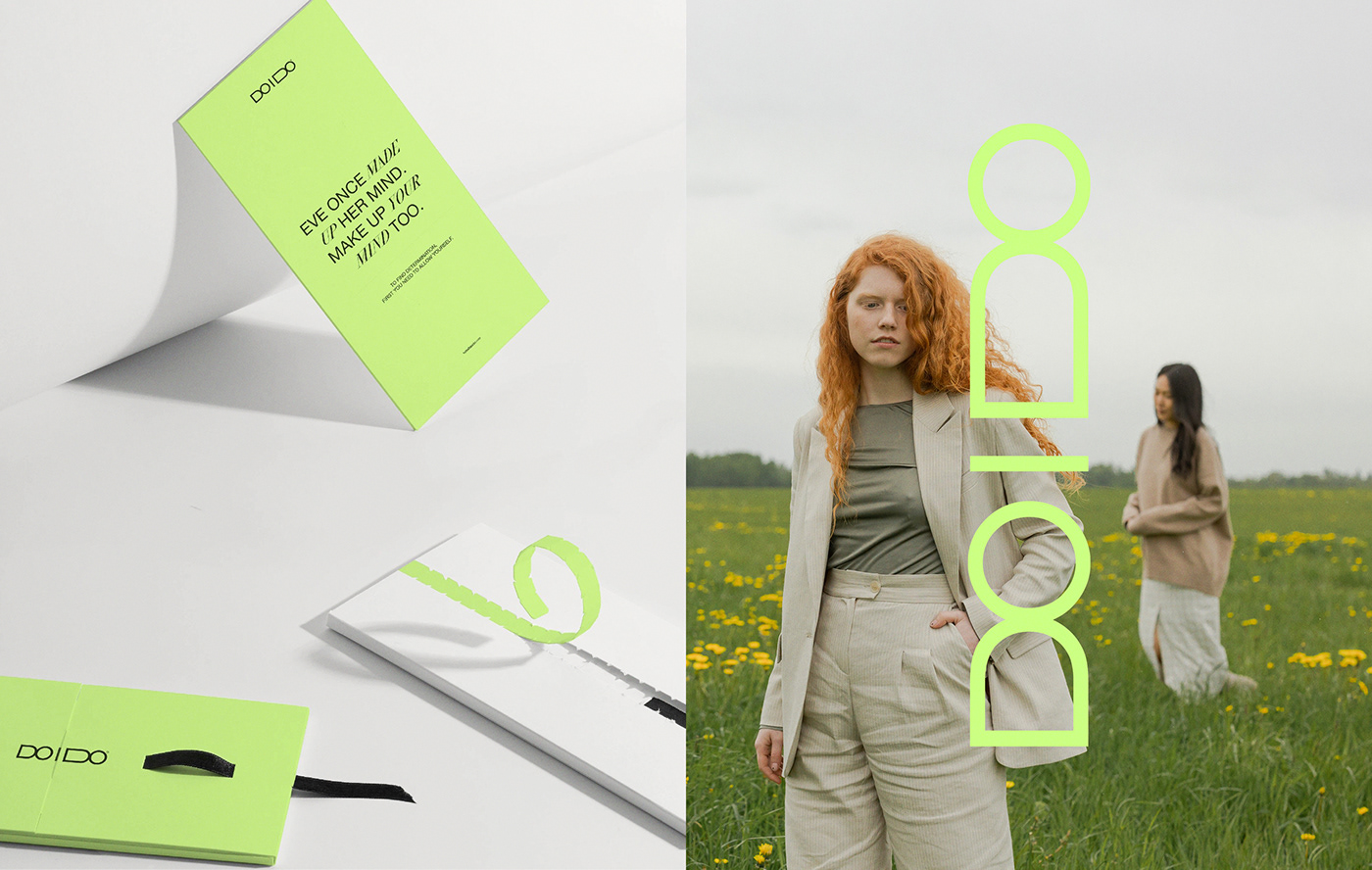
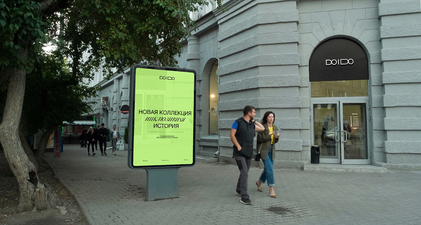
Working on the layout, we paid attention to the vertical line that separates the two states before and after. The same vertical line forms a space for the logo when we place it on the key visual. It stands vertically upwards and forms people: one of them has crossed the line and found the determination to allow himself.
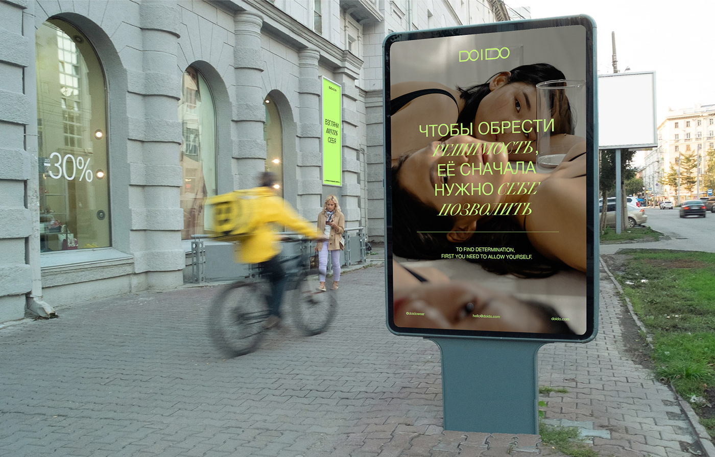
In developing the identity, we have tried to convey the image of an optimistic brand that understands and accepts you, drawing on the very first story of determination, the ancient myth of Eve and the apple. The metaphor of identity: a modern Garden of Eden where you can afford to find determination among your peers.