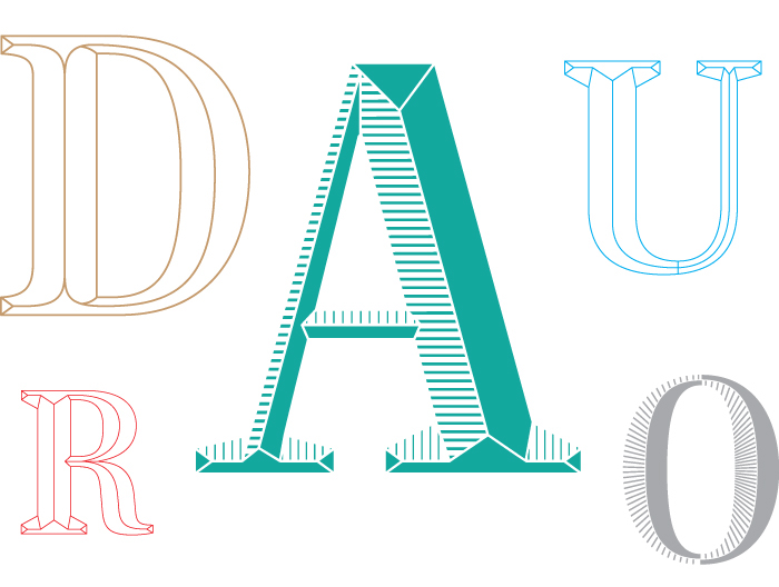
Custom typographic system designed for the identity of an olive oil brand.
This project for DAURO was done with Lo Siento Studio from Barcelona, and consisted in the design of some D capital letters for the labels on the oil bottles and a custom typeface family for the company communication.

The starting point was to explore different graphic ways to represent a thistle, the symbol of the company, together with an engraved capital D. My research began compiling documentation of Fascia lettering, XIX century engravings and photos of thistles.

Designed by Lo Siento Studio. @Photo: Lo Siento Studio
Once the D was designed and applied to the label, I accurately explained to Borja, the art director, the design process: from the original typeface in use, Chronicle Bold Condensed, I designed an 'Outline' version, then 'Lingotillo' (Little gold bar) and finally 'Grabado' (Engraved).

He fell in love with the ‘outline’ and ‘lingotillo’ previous step alphabets and we soon discover all the potential that it had.What if instead of just a letter, the engraved version of the D could become a complete alphabet? And this is how the project became a three typefaces that can work together as a system.

Once the letters were done, I went a bit further and designed the numbers and punctuation marks for the three alphabets.


