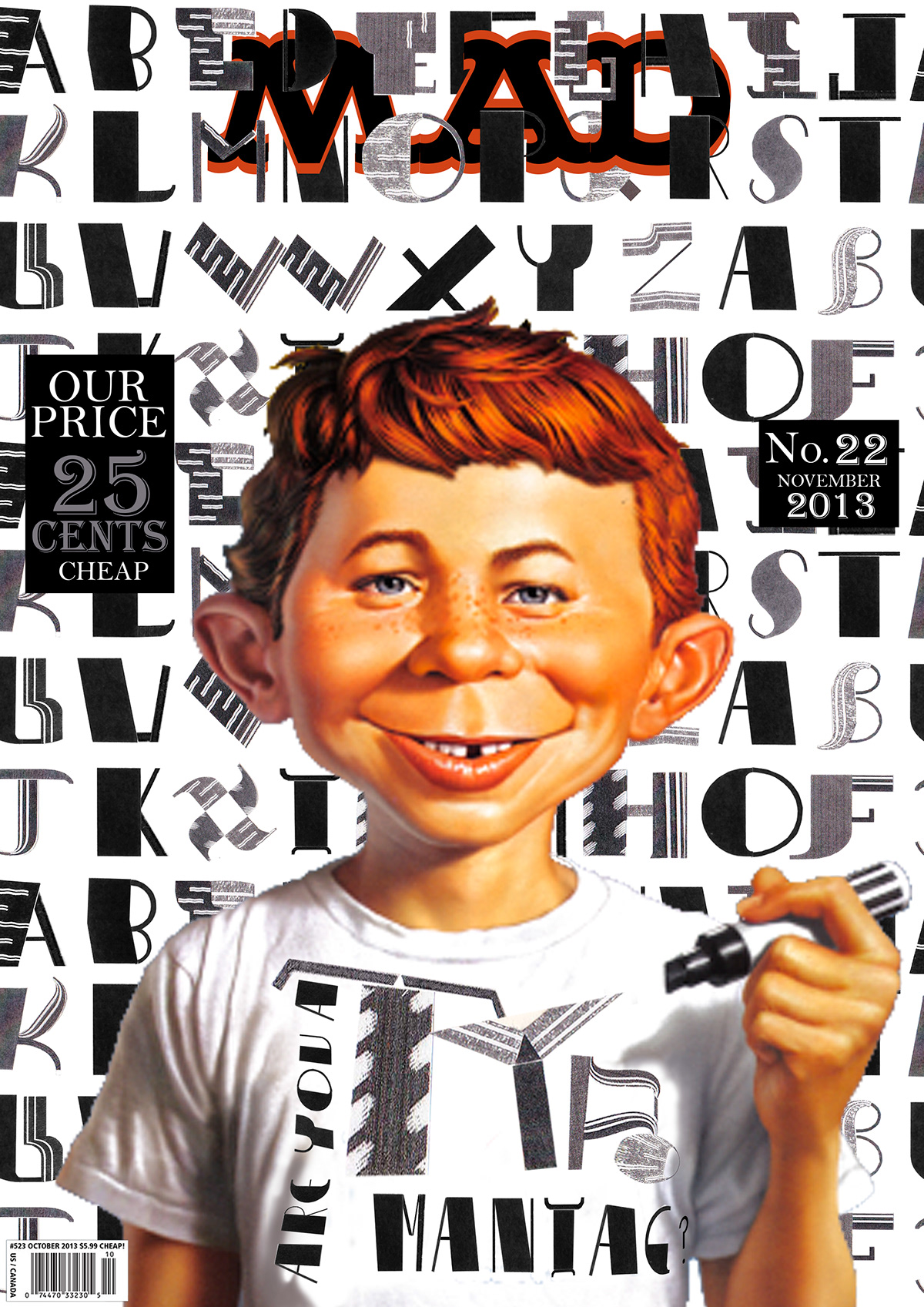
Made for an university project under the subject Desenho de Ecrã, this work consistes in the creation of an manual alphabet using the modules from the typography SuperVeloz, the next step of the work was to create an aplication of the font in a graphic object, for which I choose to design different MAD magazine covers.


This is another typography created for the same proposed exercise although it was designed only to be an experiment it became more illustrative than the previous one.


I choose a series of MAD magazines covers to apply my typographies, mixing both of them in all examples.
Exercise 1


Exercise 2


Exercise 3


