


Praticidade com amor.
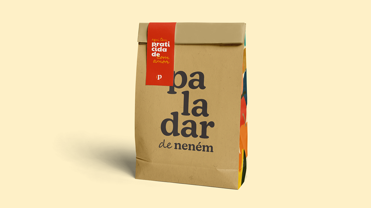
Paladar de Neném é uma empresa de papinhas formada por duas irmãs, com o propósito de levar praticidade e alimentação saudável com amor para mães e bebês. A montagem das papinhas, diferente das tradicionais do mercado, é feita em camadas, com o propósito de permitir que a criança identifique o sabor e a textura dos alimentos separadamente.
Paladar de Neném is a baby food company formed by two sisters, with the purpose of bringing practicality and healthy eating with love to mothers and babies. The assembling of the baby food, unlike the traditional ones in the market, is done in layers, with the purpose of allowing the child to identify the flavor and texture of the food separately.


O redesign da marca foi pensado como uma forma de profissionalizar e trazer ainda mais personalidade para a marca, destacando-as de seus concorrentes. No decorrer do processo estratégico, descobrimos que dos atributos que a definem, deveríamos ressaltar o lado extrovertido, autêntico e familiar da marca. Como solução, criamos um logotipo carismático e divertido, que aproveita da letra inicial P para formar um emoji que representa tanto brincadeira quanto fome.
The brand redesign was thought out as a way to professionalize and bring even more personality to the brand, making it stand out from its competitors. During the strategic process, we discovered that from the attributes that define it, we should emphasize the extroverted, authentic and familiar side of the brand. As a solution, we created a charismatic and fun logo, which uses the initial letter P to form an emoji that represents both play and hunger.


A escolha tipográfica baseia-se no objetivo de transmitir a responsabilidade e seriedade da marca, através da fonte serifada, mas sem perder seu lado doce, amigável e infantil, com seus cantos arredondados e fonte mais grossa. Como detalhe, no "de", ressaltamos o lado caseiro e feito à mão da marca.
The typographic choice is based on the objective of conveying the responsibility and seriousness of the brand, through the serif font, but without losing its sweet, friendly and childish side, with its rounded corners and thicker font. As a detail, in the "de", we emphasize the homemade and handmade side of the brand.


Instagram


