


Le Chaos Branding Design
Branding solutions for a local outdoor activity organiser.
Client:Le Chaos Ltd. | Service: Branding Design | Year : 2020
Le Chaos was founded by three local outdoor activity trainers. The name and the branding concept was based on the chaotic and uncontrollable experience the participants will have during outdoor activities. Also, the word
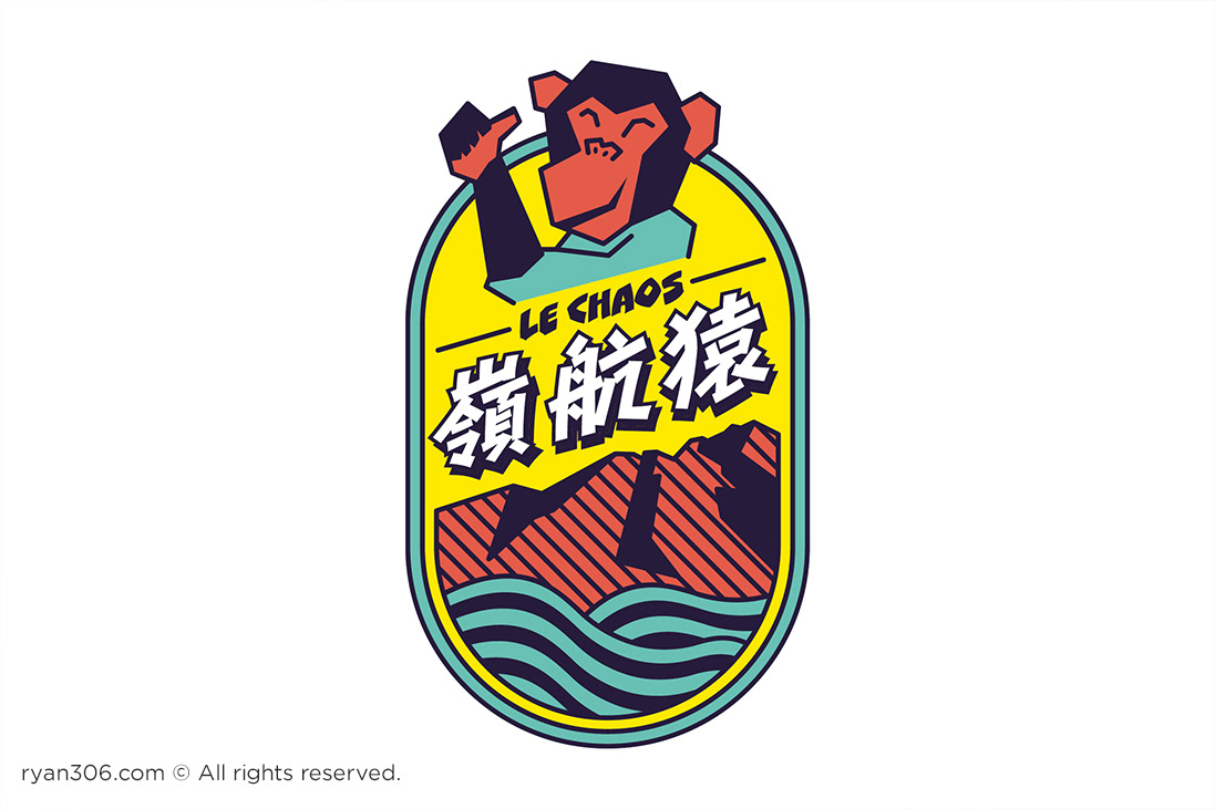
"ape" is included in their Chinese name – "嶺航猿". I have incorporated these elements to create two sets of visual identity in this project.
"ape" is included in their Chinese name – "嶺航猿". I have incorporated these elements to create two sets of visual identity in this project.
The first approach
This approach focused on the chaotic feeling and applied that feeling onto the hair of the ape with an exaggerated facial expression wearing a hat, which symbolised outdoor activities.
With the messy lines and graphic, the choice of colours tended to be more muted to make a good balance.


The second approach
Outdoor activity company usually either focused on water sports or mountain-craft. The unique selling point of this company is this is a rare case that they offer both types of activities. Therefore, this approach focused on the diverse types of outdoor activities offered by this company.
To make this approach more iconic, neon colours, which are usually seen on the safety equipments for outdoor activities, are picked to make the brand more memorable to their consumers.


Thank you for watching.


