Shadi Al Hassan 06/25/2021
Font classification brochure
Font classification brochure
My concept
I took inspiration from the vintage typography cliché that was used in the old fashioned print shops.
Then I decide to use this rectangle as the main shape for my design.
This shape represents all letters.
First I created the layout as 2 square pages for my brochure
because I have to use both square sides as a complete infographic poster for the web too.
Each square is based on a 3-column layout
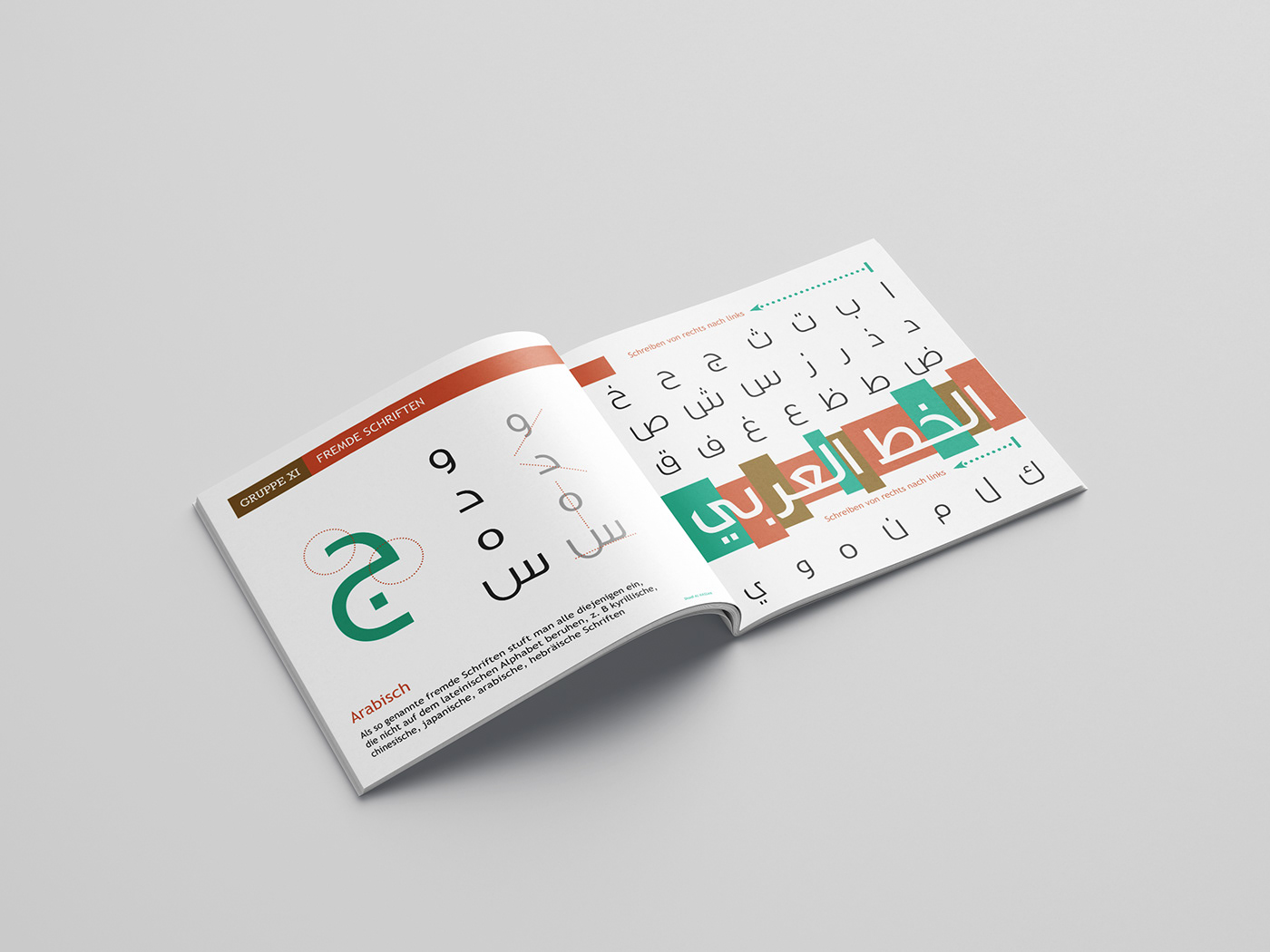
* Typography:
I used Trebuchet Font for subtext
and that's because it's a simple and readable font
and Rockwell for headings just to add more contrast between the two fonts.
* Colours :
I used a range of colors green - orange - brown and black with it
my design can give good contrast to also highlight sections as headings and font group functions.
To show that I used dashed lines or circles.
I used a range of colors green - orange - brown and black with it
my design can give good contrast to also highlight sections as headings and font group functions.
To show that I used dashed lines or circles.
Content:
You will see 11 famous guys in each group of guys
most of the features and the most popular fonts
with some description.
You will see 11 famous guys in each group of guys
most of the features and the most popular fonts
with some description.
Thank you very much.
Shadi!