
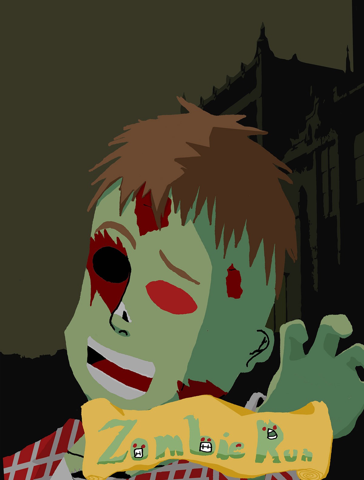
This is the main body of the zombie. This is the part of the project that took the longest. I drew it by hand and then colored it in Photoshop. It took me a few days to actually get this part done.

I decided to draw the hand seperatley for two reasons. The first reason was the paper wasn't big enough to fit the paper. The second reason was because at the time I really was not very skilled at drawing hands. So I figured it'd be best to do it seperatley and just put it with the main body later

In order for people to understand what the poster was about, I had to give it a title that matched what it was for. Then I just hand-drew a custom "zombie" font. It came out pretty good, except the poster was for the Zombie WALK in New Jersey and not the Zombie RUN 5k races. By the time I caught my little mistake, it was waaay too late to change it.
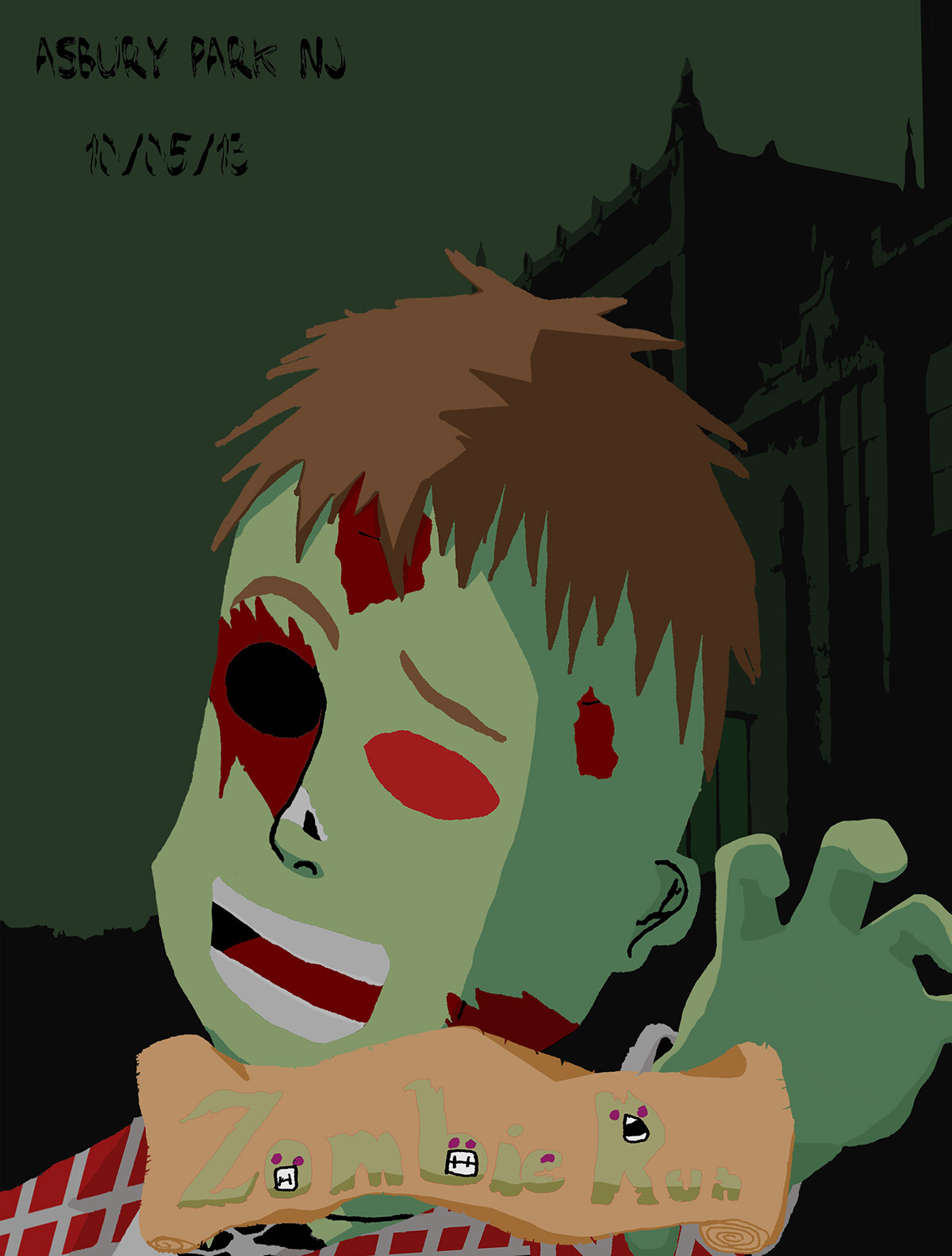
This is an prototype version to see how I would fit everything into the same canvas. Just need to testsome colors see if they'd be good or bad, tweak things if anything needed to be tweeked.
This is the final result of the Travel Poster Project we were assigned in my Graphic Design class. We had to create a travel poster for our favorite New Jersey location or event. Our poster had to immitate the WPA graphic style of the 1900's-1940's. THe posters had to include a visual representation of the destination and we had to use at least one Element and one Principle of Design. We could've even used Hurricane Sandy as a promotional point if we wanted too. We could've used Photoshop, Illustrator, or both. The resolution had to be 300 ppi in Photoshop, and the final size had to be 9 x 12 inches.
THANK YOU FOR VIEWING!


