Bombay Bistro
Logo Design & Branding
Logo Design & Branding
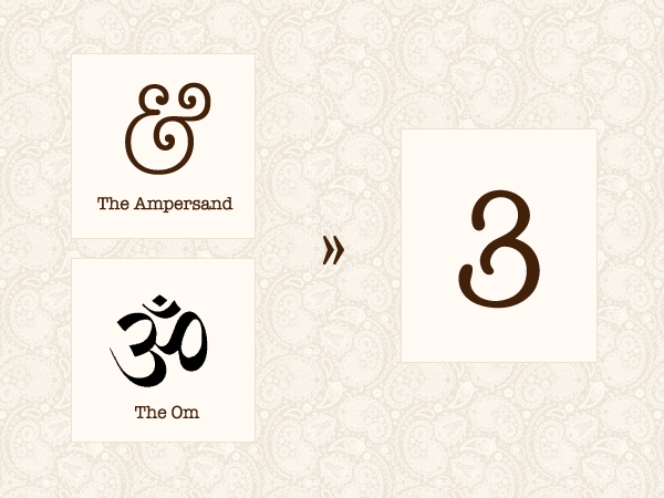
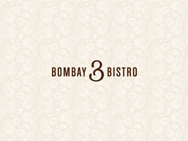
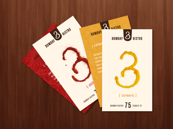
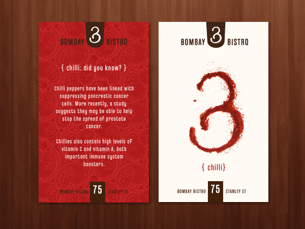
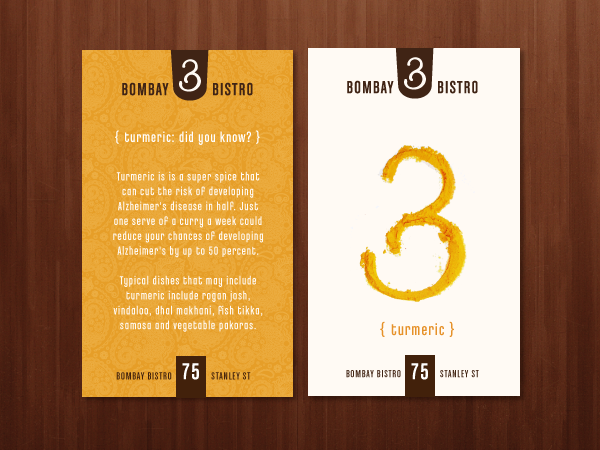
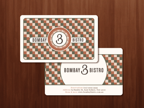
The logo mark for Bombay Bistro is a typographic exercise based loosely on the curves of the Om to create a suggestion of Indian influence and the shape of the ampersand (typographic symbol for "and") to hint at the dual nature of the cuisine of this fusion restaurant.
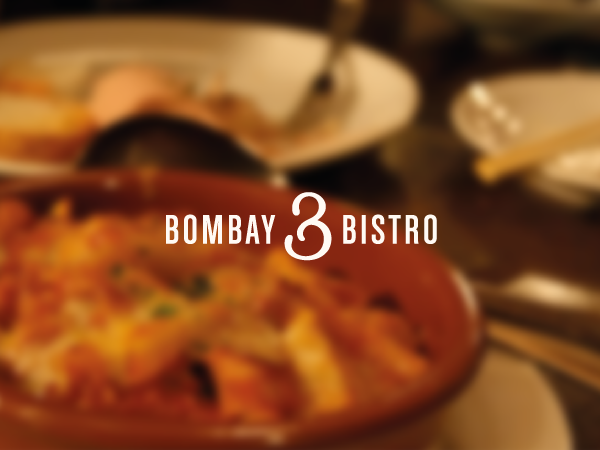
The mark is very versatile, application-wise: its simple, fluent lines mean ease of use for embroidery, stencils, letterpress, painting and pattern-generation.
The type used to complement the mark is a condensed modern sans-serif that emphasizes the Western influence in Bombay Bistro's philosophy, design and menu. The type setup on various collateral follows a combination of oversized numerals and condensed text in line with the proportions of the logo.
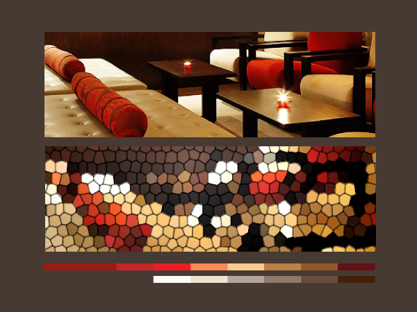
The colour palette has been kept very simple, with tints of beige, cream and honey - with the occasional red - to complement the deep brown of the logo.
The mark is very versatile, application-wise: its simple, fluent lines mean ease of use for embroidery, stencils, letterpress, painting and pattern-generation.
The type used to complement the mark is a condensed modern sans-serif that emphasizes the Western influence in Bombay Bistro's philosophy, design and menu. The type setup on various collateral follows a combination of oversized numerals and condensed text in line with the proportions of the logo.
The colour palette has been kept very simple, with tints of beige, cream and honey - with the occasional red - to complement the deep brown of the logo.