As the trend of revising Saigon's image from my fellow designers, an official brand for Saigon is essentially on demand. Inspired by the old typeface, Saigon now have a duo-logo which remisniscing its old letter spacing as well as bold characteristics.
The logos were furthered with an according set of posters, post cards, neon sign and stickers respectively as part of the exploration. Especially, the stickers was presented with Saigon's must visit local essences suggestively.

Logo Variation

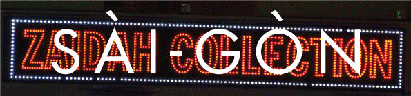
Exploration: CG Neon
Saigon Day
Saigon Noon

Saigon Dawn

Saigon Night

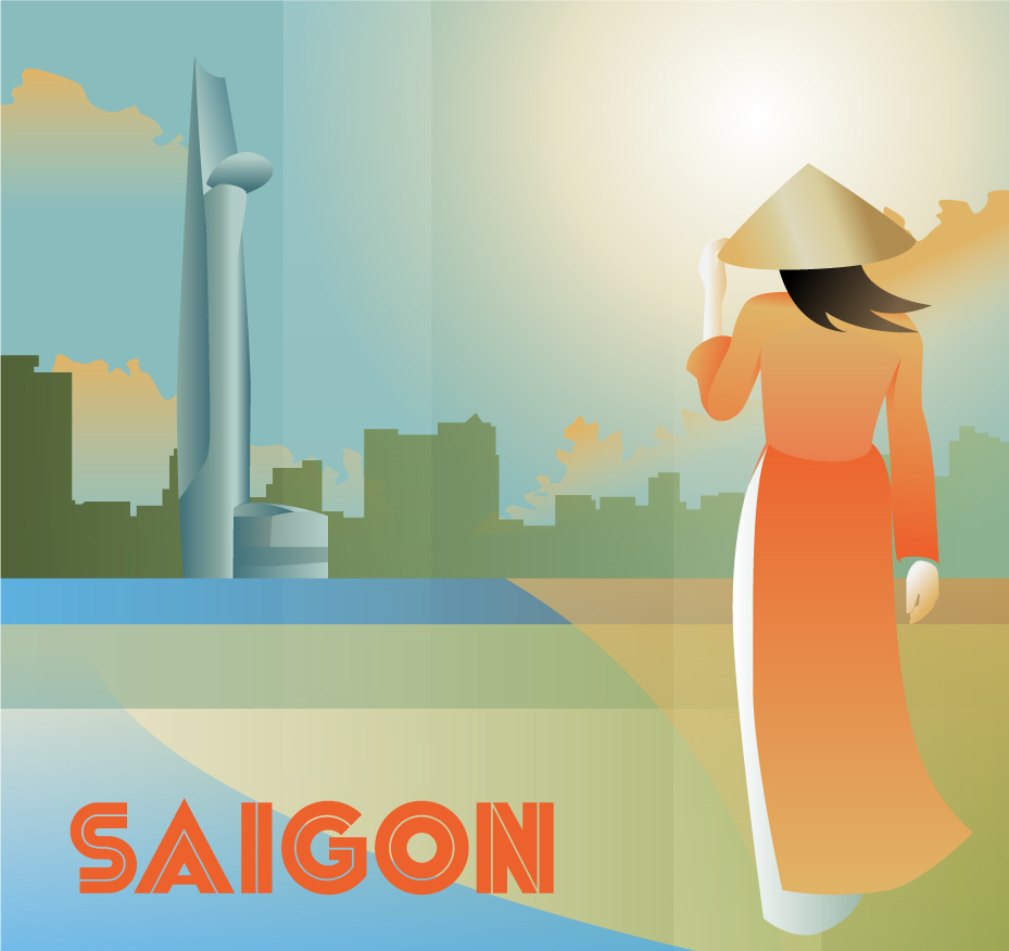
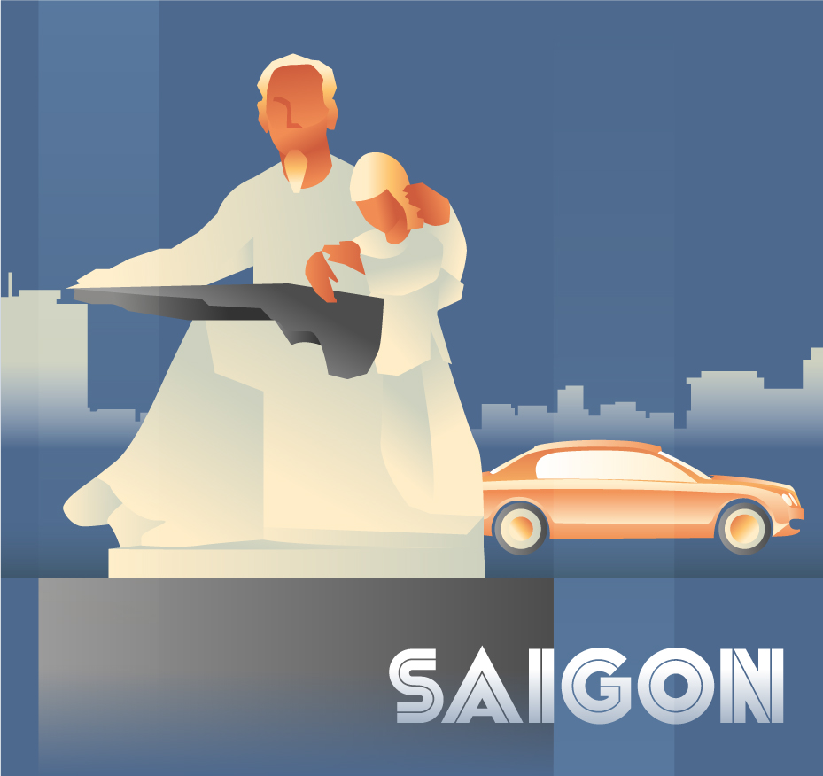
Poster set in real-life background contexts.

Sticker set.