This is a logo design for self-branding. For most of my projects, I collected many references, moods, and information initially; based on the researches, I designed the solutions by gathering the symbolic elements or telling the stories with the rational movements. It's the processes to assemble the essence together; therefore, I try to apply this concept to my logo and its animation.


Logo
As a logo of self-branding, I started with my last name Chang, Chinese charater 張.

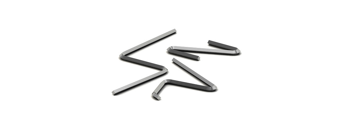
development of assembling concept

All the English letters of "dchang" are all hidden in the logo.

Logo Typeface
This is a mission to find out a typeface for my logo and design a system of visual identity.
First, starting with the logo typeface exploration. The typeface should be clean and minimal, and it has to match the logo style.
Based on these directions, I tried many typefaces, and these are some of the good ones.

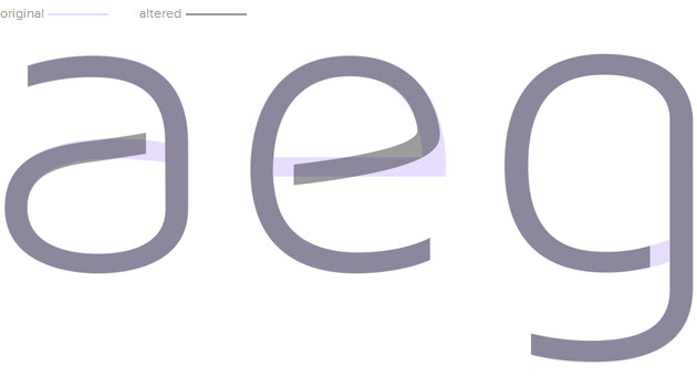
The final logo typeface is modified from Maven Pro Light. It's a minimal typeface, but it looks not cold and too stylish.
I also altered the typeface to be more rounded and broke them apart to match the style of the logo.
character modification

character set


Business Card and Résumé


3D Logo & Animation
Since the logo was composed by 3 elements, I decided to bring them in 3D and show them in different perspective, so the 3D assembling animation came to my head.
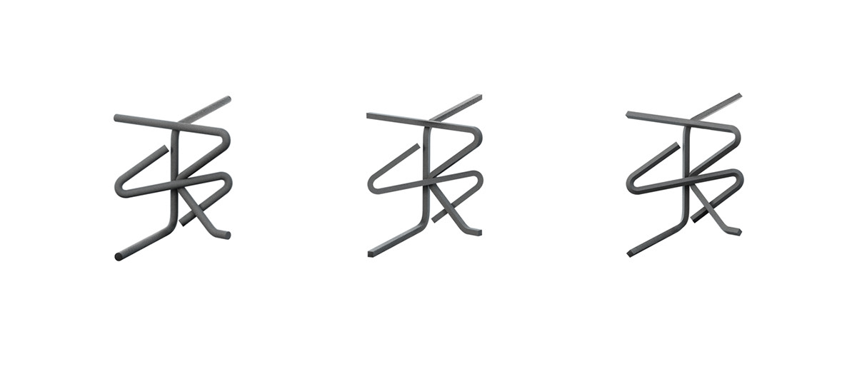

Logo craft

Logo animation in montage