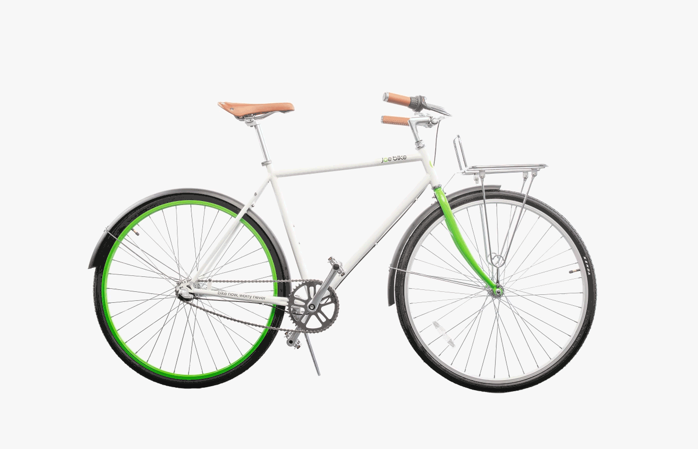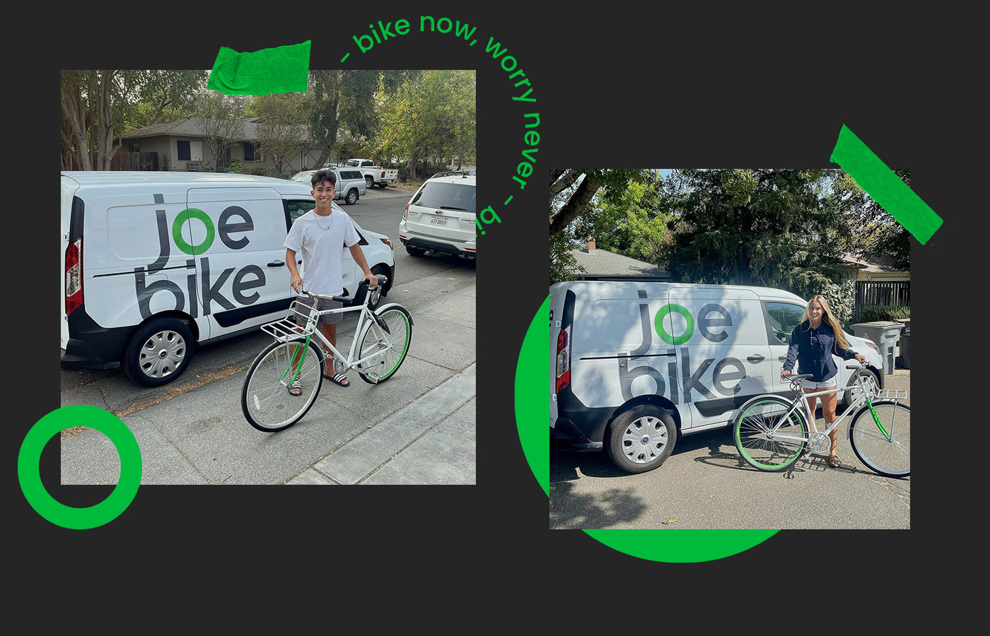
Joe Bike is a bike rental service for university students that aims to provide an affordable, flexible, and low-maintenance way to have a bike 24/7. The company values inclusivity, boldness, positivity, and satisfaction, and wants to make bike mobility easily accessible for students. For $24 a month, students can subscribe to have their own bikes, with free maintenance and theft protection included.
The Challenge:
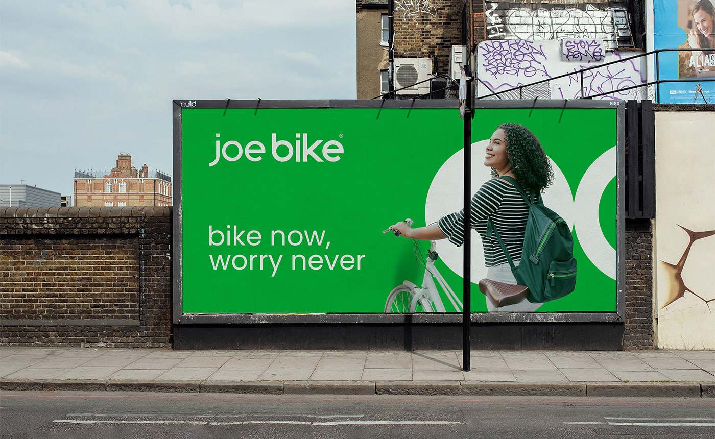
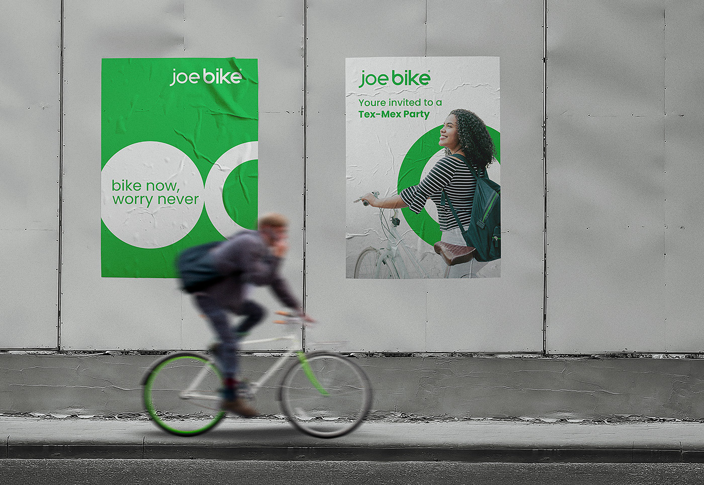
Design a brand identity for Joe Bike that reflects its mission of making bike mobility convenient and enjoyable for university students. A thorough understanding of the brand's core values, which are boldness, inclusiveness, positivity, innovation, and a commitment to customer satisfaction, is necessary.
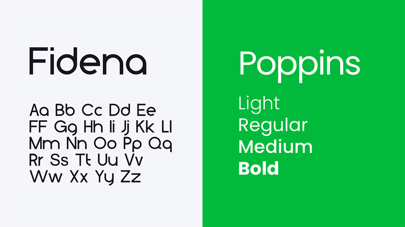
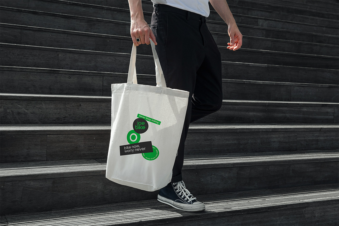
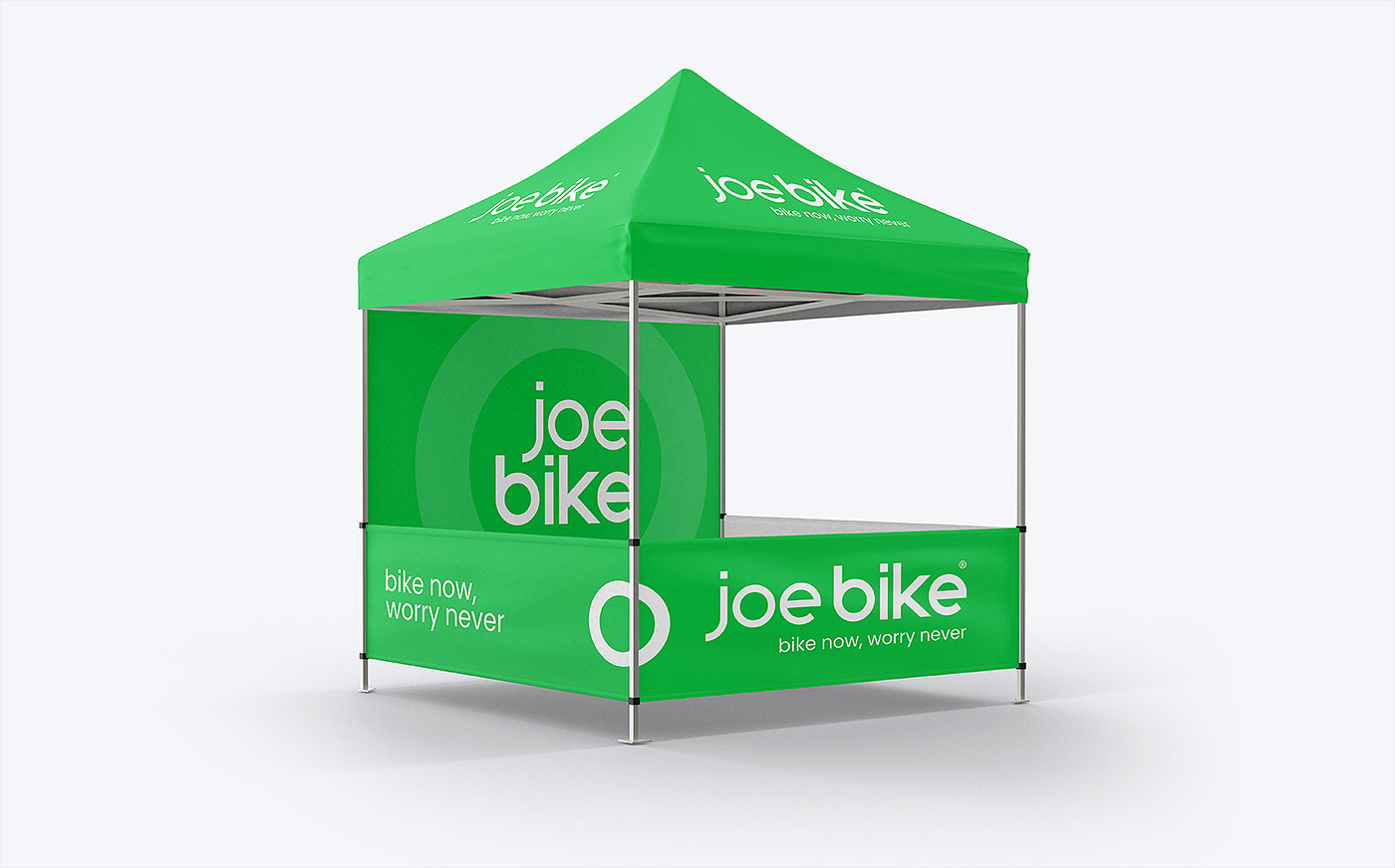
The deliverables include a logo concept, mood imagery, bike branding, a preliminary color scheme, font choices, and a word mark that expresses the brand's spirit and connects with the target audience of university students.

Concept:
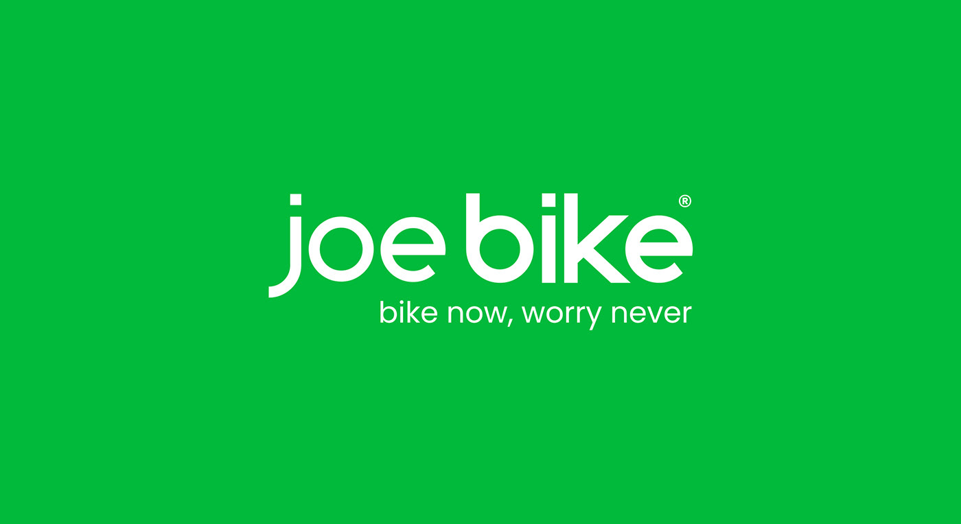
The logo concept uses a modern font with a bold contrast to differentiate between the person (represented by the word “Joe” in dark gray) and the object (represented by the word “Bike” in dark gray). The letter “o” in green represents the rim of the bike, incorporating the brand's environmental consciousness. The use of green and dark gray gives the logo a modern and sleek appearance.