


INTRODUCTION
Ever since the first outbreak back in December 2019, millions of lives and occupations of the entire population have fallen under the severe destruction of COVID-19.
Looking on the bright side, the global pandemic is a boost to human’s awareness of their own life quality; meanwhile being a motivation for the development of pioneering technologies, including smartphones, smart-watches and facemasks that help with detecting threats and keeping ones safe and sound.
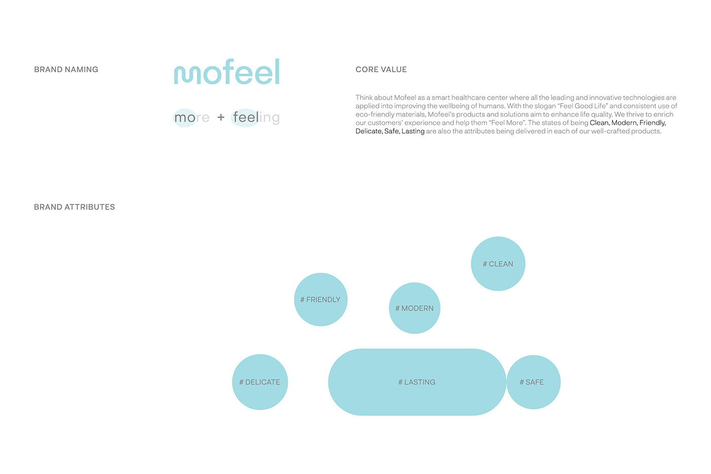
Those inspirations led to the birth of Mofeel - a representation of our strong belief in a future where humans and technology all join hands, bringing the field of Community Health Care to the next level.

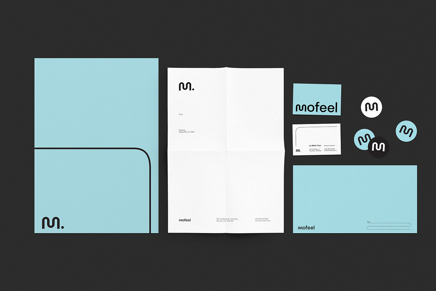
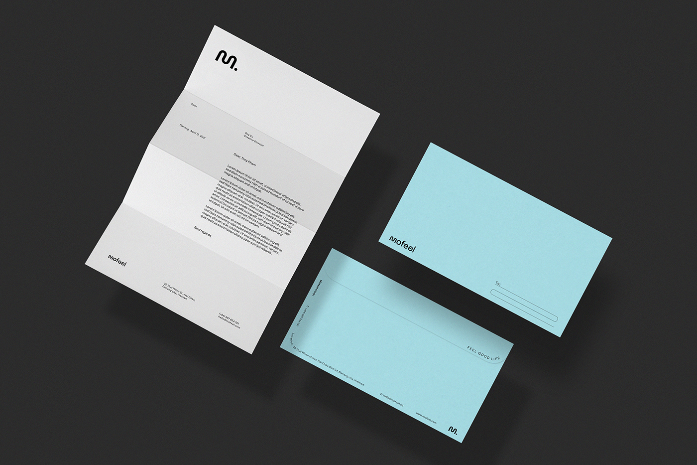
STATIONERY
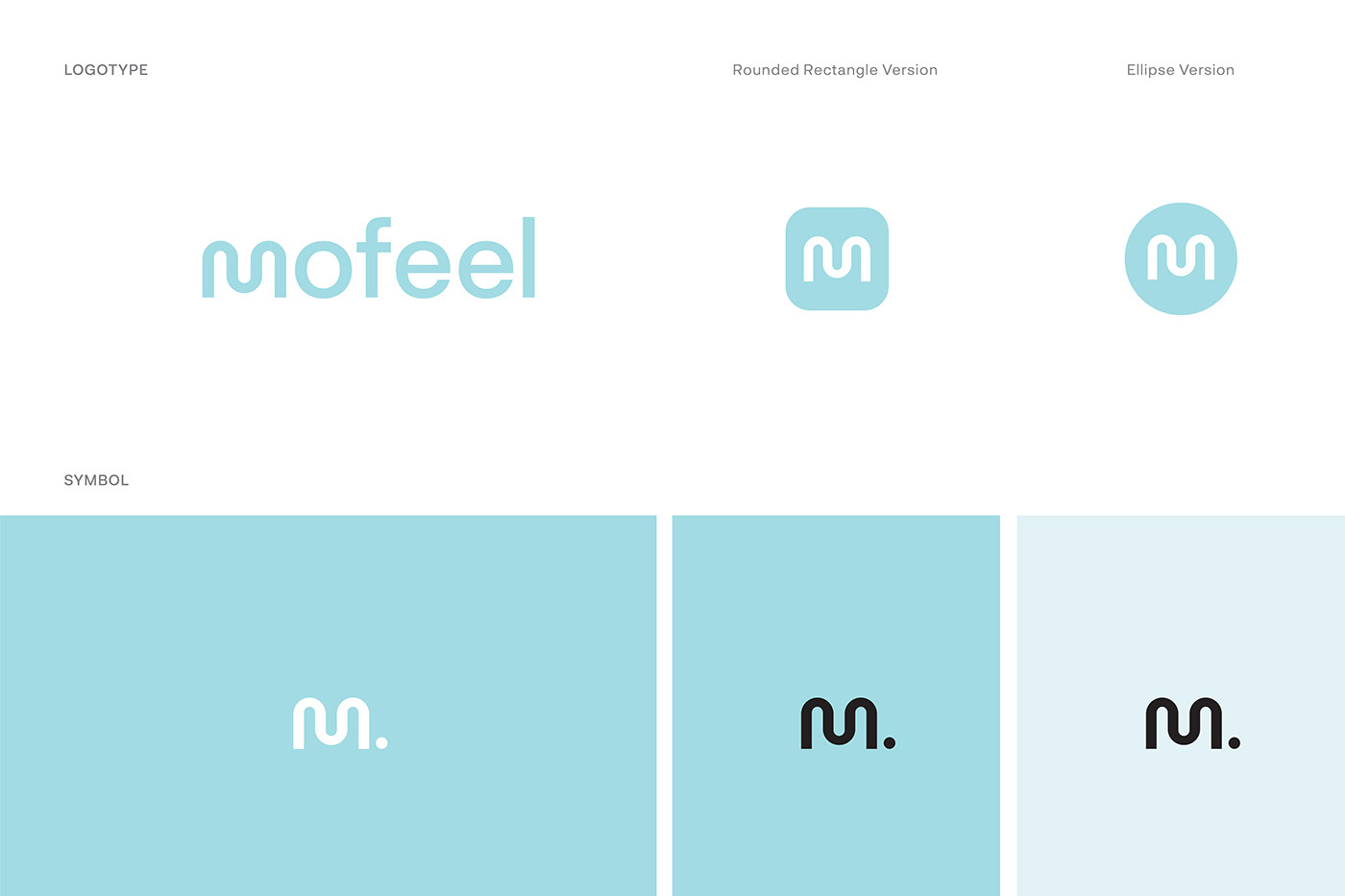
We optimize and integrate the concept of minimalism in the design of Mofeel’s stationery. The logotype, which accounts for a large proportion of the design, is easy to be recognized and displayed in a variety of sizes and angles. We also make good use of negative space and pastel colors to stimulate the openness and freshness that the customers are looking for in a quality life.
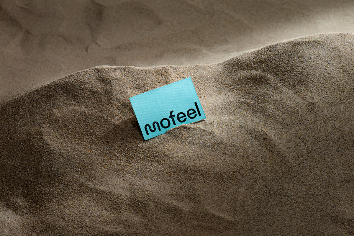
ThuanAnPaper’s Magic Touch – Jade 180gsm (FSC) helps increase the sense of luxury and elegance in our products as we aim to maximize our valued customers’ satisfaction with the best and well-selected materials.

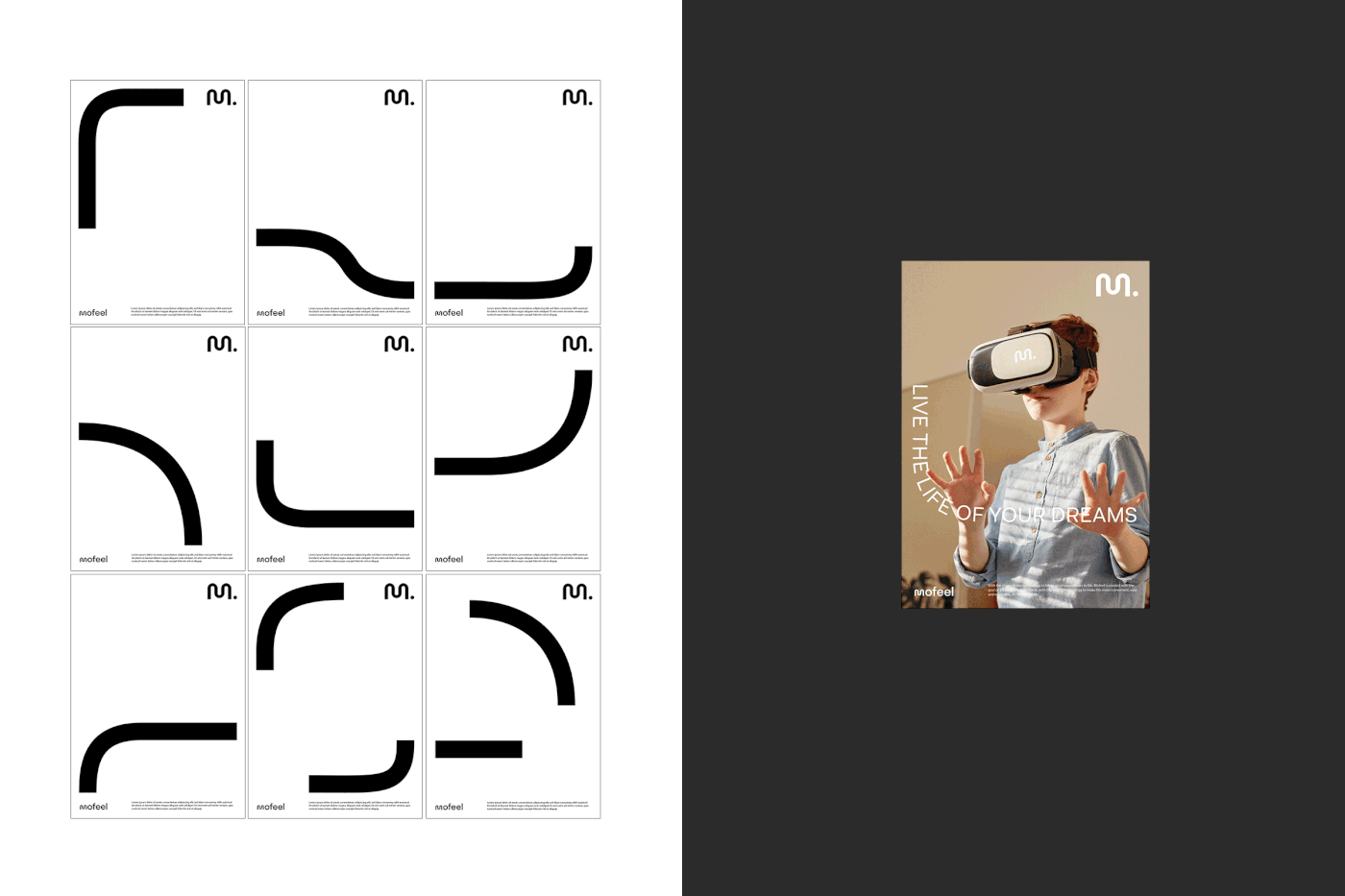
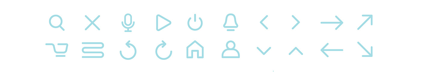
MOTIF
Our main idea is to create a fresh and flexible customer experience using free yet purposeful curves.


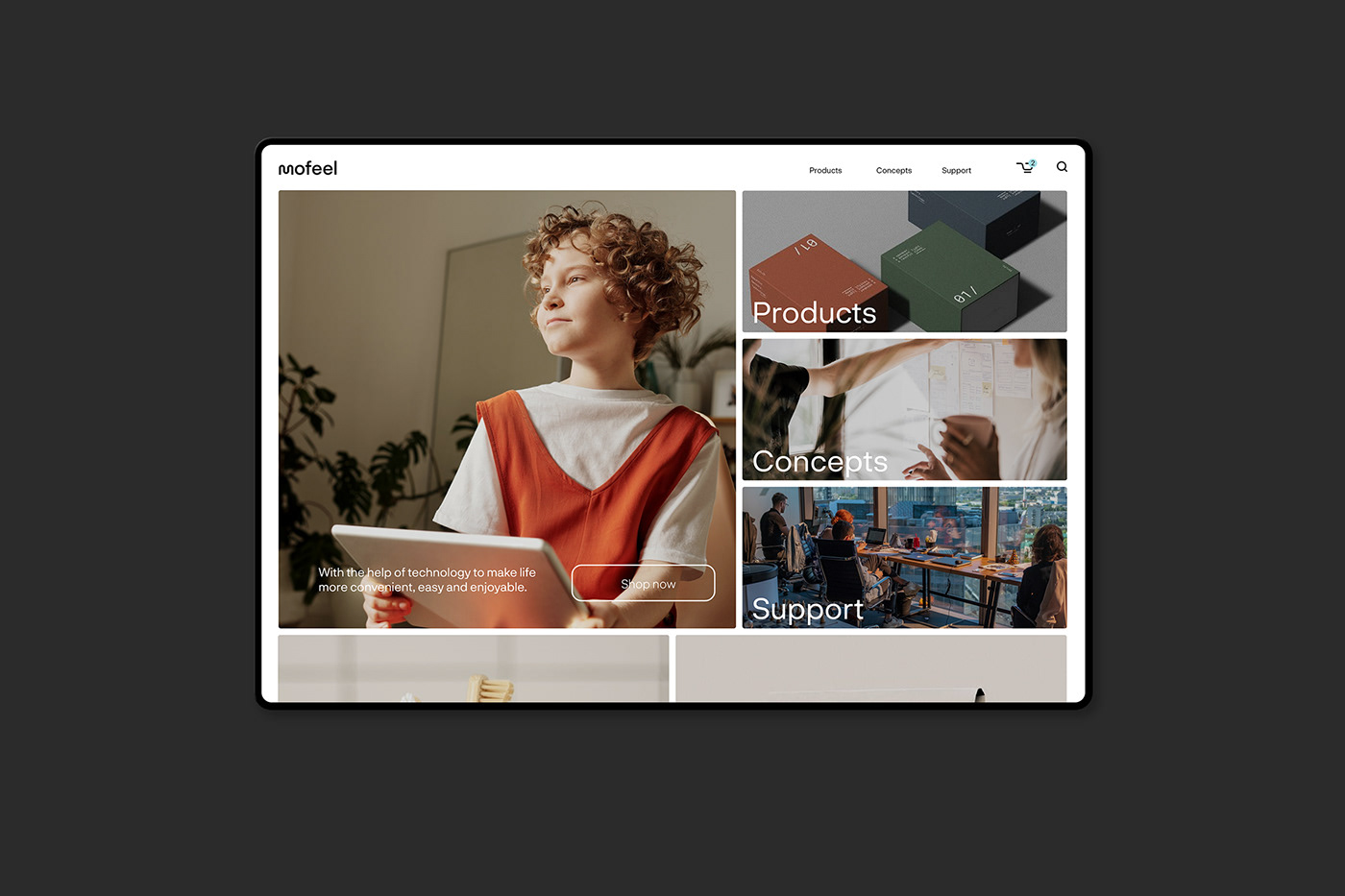
ONLINE INTERACTION
A consistent design applies across all of our website/app UI. Our focus is optimally on providing a user-friendly experience and easy to make changes when needed.


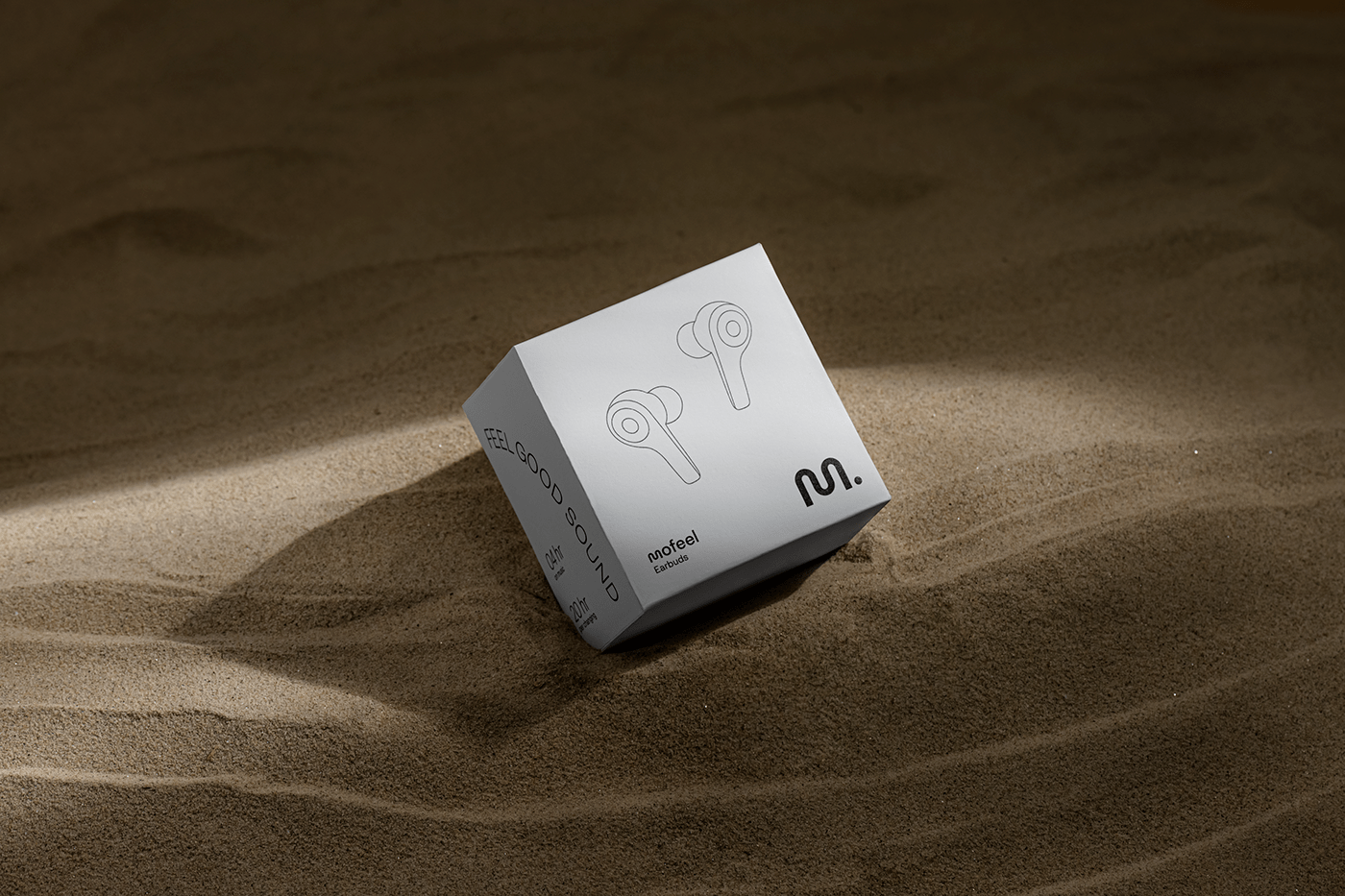
PACKAGING
Inspiring from the concept of minimalism, the packaging design gives attention to the key elements such as logo, motif, slogan and product image (illustration), making good use of negative space. Olin Rough High White 300gsm (FSC) by Arjowiggins paper is used in the mass production of packaging.


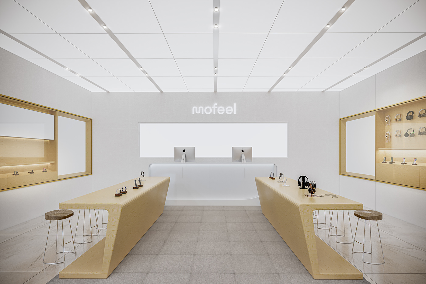
STORE
Mofeel's store is built to be futuristic, yet still intimate and customer-friendly. Simple and expansive space aims to create a modern and energetic look; while moderate lightning and wood materials help warming up the cozy atmosphere.

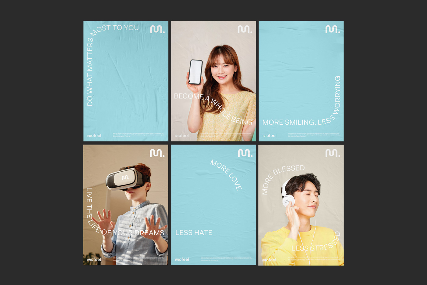
OUTDOOR
As the same of online interaction, we applied the motif system into design of print advertising (posters, banners, billboards), with an aim to attract the passerby’s attention through smooth and eye-catching movements.

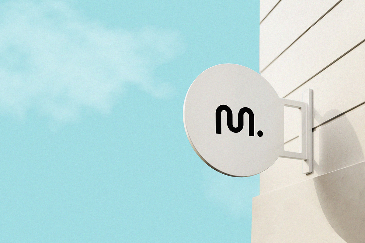
OVERVIEW
In this concept, we have used Light Blue – the color representation of hope, brightness and positivity amidst the gloomy COVID-19 situation. Light Blue is the color of nature but is also a reminiscence of the ever-changing digital age. All express our mission to connect humans with nature and technology; in hope of building a better world for all.
CREDITS
Branding House ECH Creative Agency
Creative Director: Roy Vu
Graphic Designer: Minh Tien, Dong Luong
Content Editor: Thao Ho, Lam Le
Motion Graphic: Minh Tien, Phuong Anh
3D Modeler: Long Pham
Photographer: C.Khoa, FER Concept


