kurzparkzone.at, a startup app developer, required a brand logo that was tight, sophisticated and contemporary.
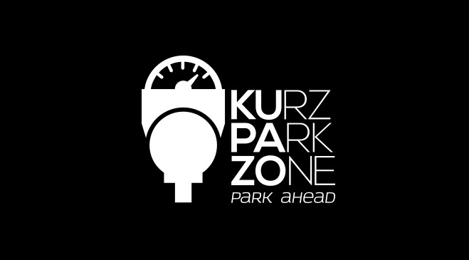
My initial vision was to make the brand name less convoluted. I therefore, proposed that the name be broken in half to "KUPAZO". This streamlined the brand, presenting the app as "fashionable" in a digital competitive market.
My initial vision was to make the brand name less convoluted. I therefore, proposed that the name be broken in half to "KUPAZO". This streamlined the brand, presenting the app as "fashionable" in a digital competitive market.
The business cards maintained the full brand name, yet using bold text I brought the new contemporary name into the consumers forefront.
When devising the icon that would represent the brand, I took inspiration from several incarnations of parking meters. This culminated in using a silhouette of the shared conventions that all of the parking meters embodied.
Thus adding a unified image that the app is able to work with many different systems.
/ LOGO DESIGN

/ INSPIRATION

/ LOGO DESIGN vertical version

/ LOGO DESIGN mood picture

/ COLOUR CODE

/ LOGO DESIGN coloured version

/ APP ICON DESIGN


