


Açougue Aniceto is a family business in the interior of the state of Espírito Santo, Brazil, and has been in the market for more than 30 years.
The company is preparing for a repositioning, which involves the sale of more noble products, with greater added value and also the performance in another business, still within the meat business.
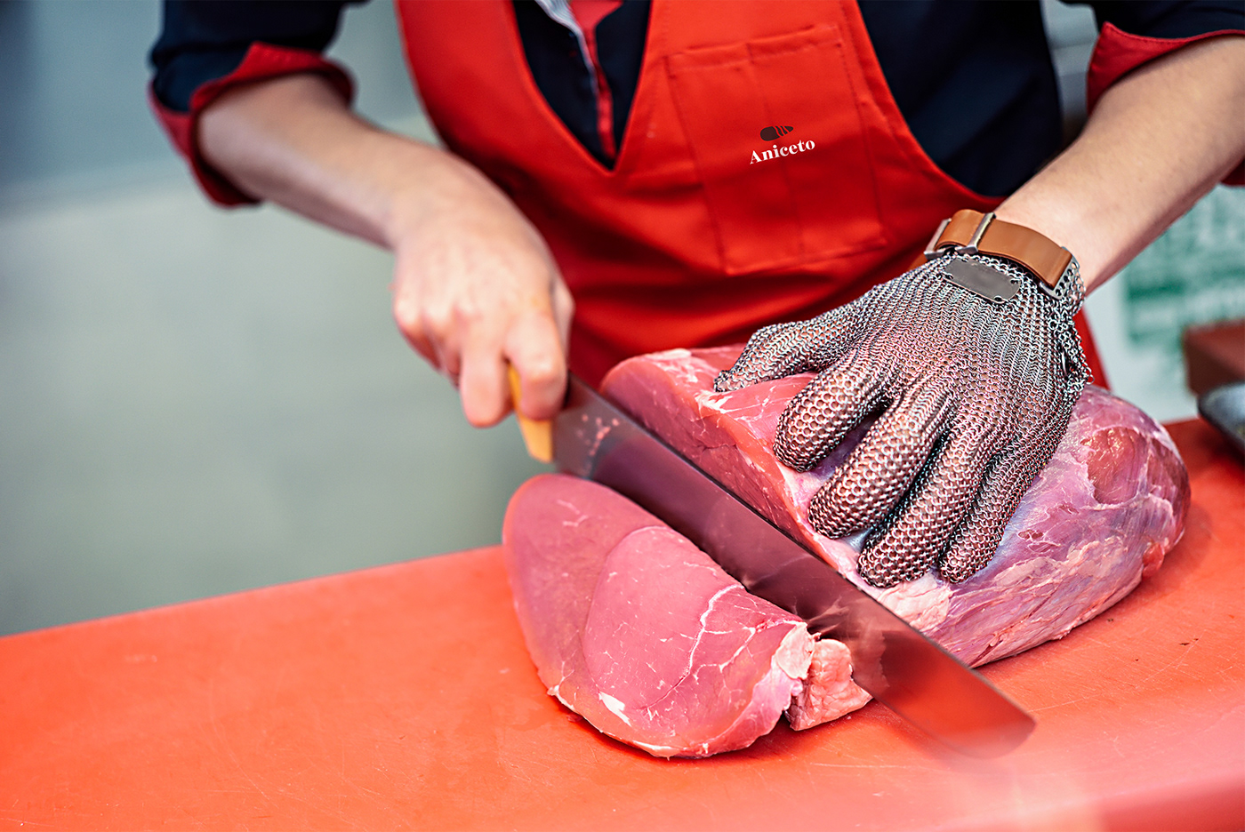
Currently its main service is for people who buy ordinary meats, for the day to day, and who are concerned with paying less. The company's desire is to reach people who have greater purchasing power and value a taste experience with selected cuts of meat, who value a differentiated shopping experience.
The main objective of this project was to create an identity that maintained the traditional side, after all, the company has existed since 1989. And, at the same time, it was necessary to eliminate associations with an outdated, outdated brand.
The idea is to make people, when in contact with the brand, feel a different company from the ordinary, different from what is seen in the city.

The visual identity must find a balance between the traditional, making reference to the company's history, and the new, the different, communicating with what is current, contemporary.
This should look like:
• Sober, without being serious
• Communicative, without being childish
• Bold yet friendly
• Elegant, yet affordable.
• Sober, without being serious
• Communicative, without being childish
• Bold yet friendly
• Elegant, yet affordable.

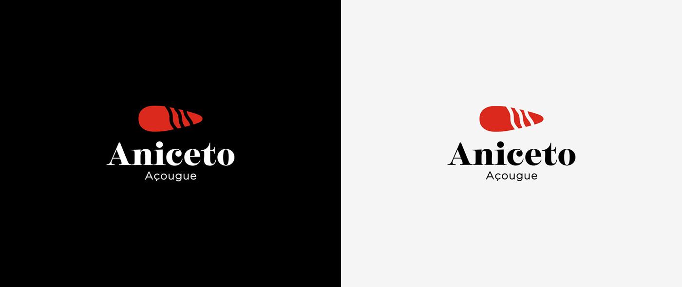
The inspiration for the Aniceto symbol came from the cleaver but in its primitive form and use. Archaeological records are showing the first “hand axes” used millions of years ago, in the Paleolithic period, the oldest period in prehistory. This inspiration in what is old makes indirect reference to the company's tradition. Something close to "going back to our origins, revisiting our history, how we started and got here".
There is also inspiration in the meat fibers, making a direct reference to the main product of the company.


To give more authenticity to the visual identity and to increase the versatility of the application of the brand, a graphic pattern was created that illustrates elements of the daily life of a butcher shop. The lines of the illustration give the elements a vintage look, which contributes to the perception of a refined and traditional brand.


Art direction and Designer: Paulo Nogarol
Illustration: Luisa Mollo
Client: Açougue Aniceto, Brazil
Client: Açougue Aniceto, Brazil
Project: Brand visual identity
Year: 2021


