The tradition of the Japanese tea ceremony as we know it today dates back as early as the 1500s in Kyoto, Japan, where it was practiced and perfected by Sen Rikyū, a Japanese Tea Master who is considered to have elevated the ritual to a fine art.
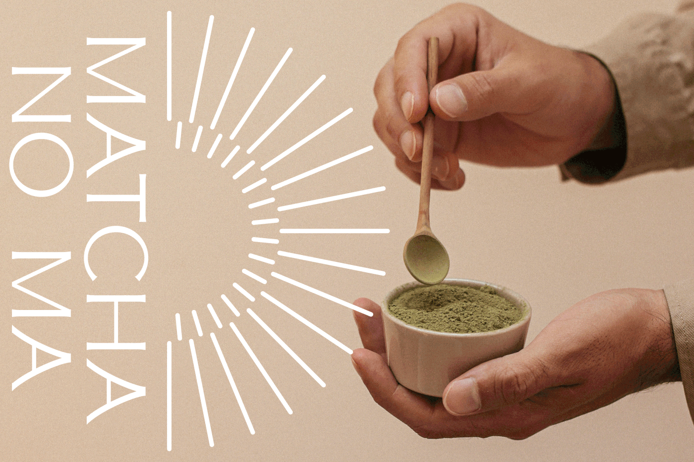
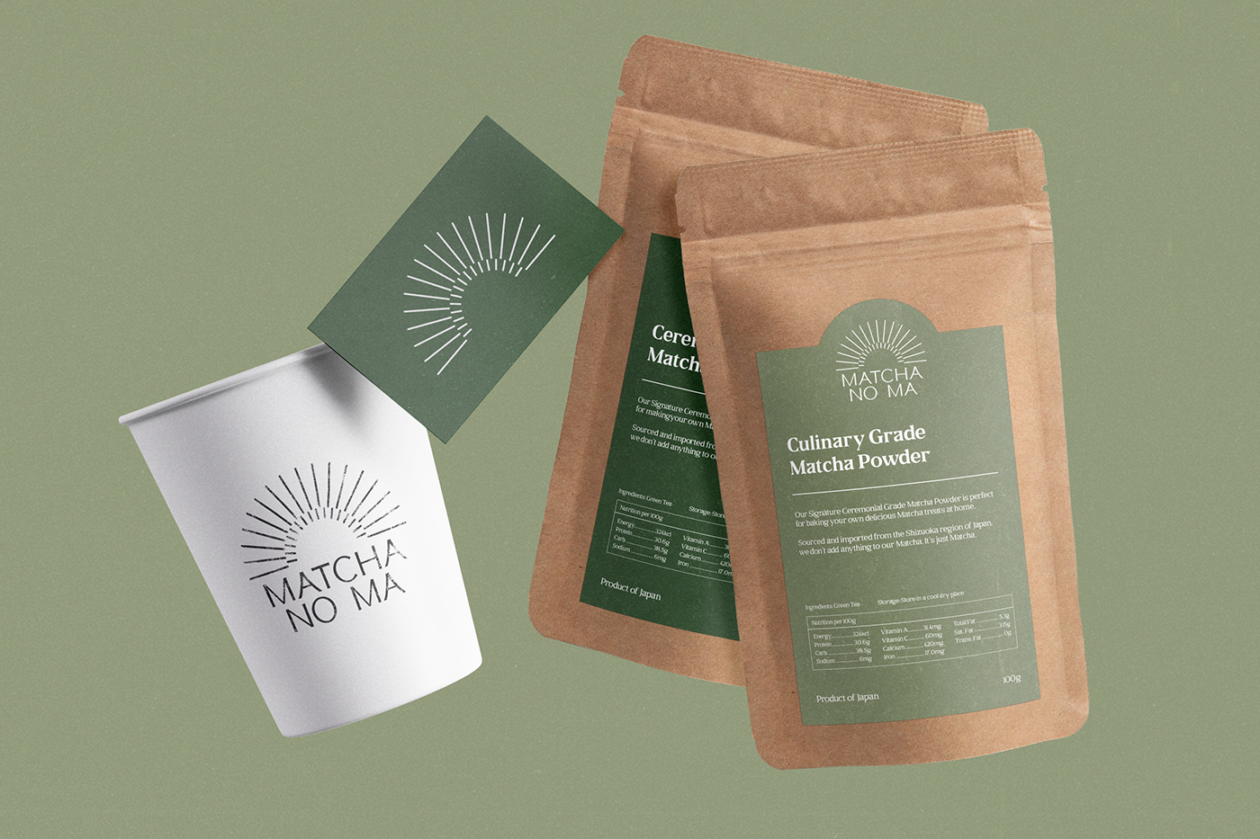
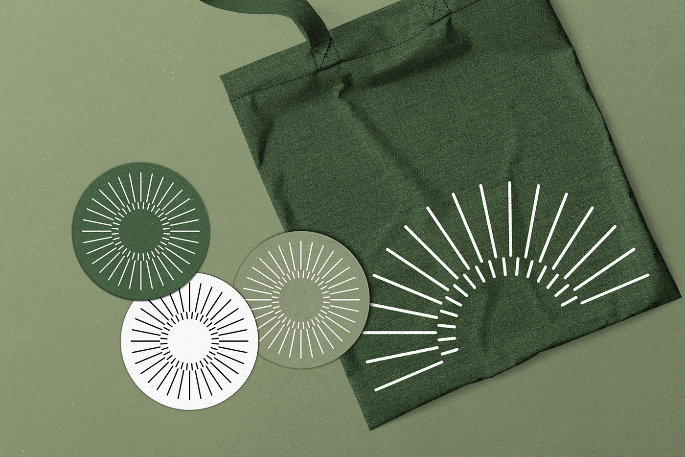
Paying homage to this tradition, the semi-circle motif in this identity designed for Matcha No Ma, a specialty matcha-based cafe and bakery, represents the pattern of the ‘Chasen’, a bamboo whisk handcrafted from a single piece of bamboo that is split into two concentric circles. In similar respects, the A’s in the logotype resemble the curved roofs of a traditional Japanese Tea House, where these matcha ceremonies take place.

‘Matcha No Ma’ can be roughly translated to ‘the matcha space’, namely ‘negative space’ — Conceptually, Matcha No Ma is designed to be a space for patrons to slow down from the hustle and bustle of everyday life and take a moment to appreciate the beauty and simplicity of Japanese tradition.