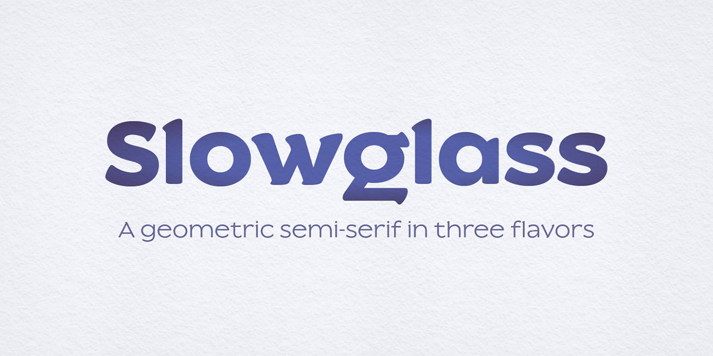
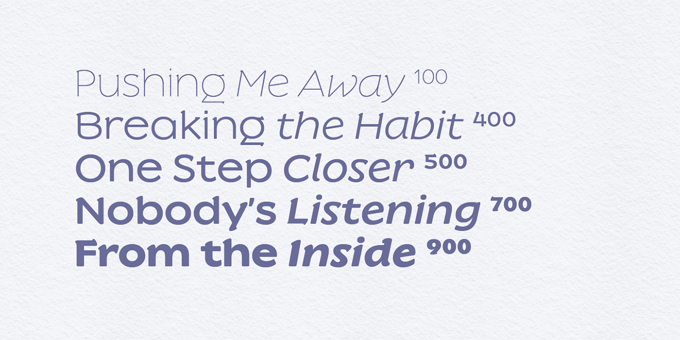
Slowglass is a quirky geometric display typeface in five weights with matching italics and additional Text and Alt cuts. It supports extended Latin, Cyrillic and Greek.
Slowglass is a typeface I started designing in 2017. It was meant as a bespoke font for a friend I met through DeviantArt. I sent him some of my drafts, asked what he liked best, and began a new design, taking some inspiration from the one he picked. This is how Slowglass v1 came to life. By that time, I somehow got out of touch with Mike, but I had a typeface that (I thought) was ready, so I released it “free for personal use” on DaFont. Then I took the plunge and published it as my first font on Creative Fabrica.
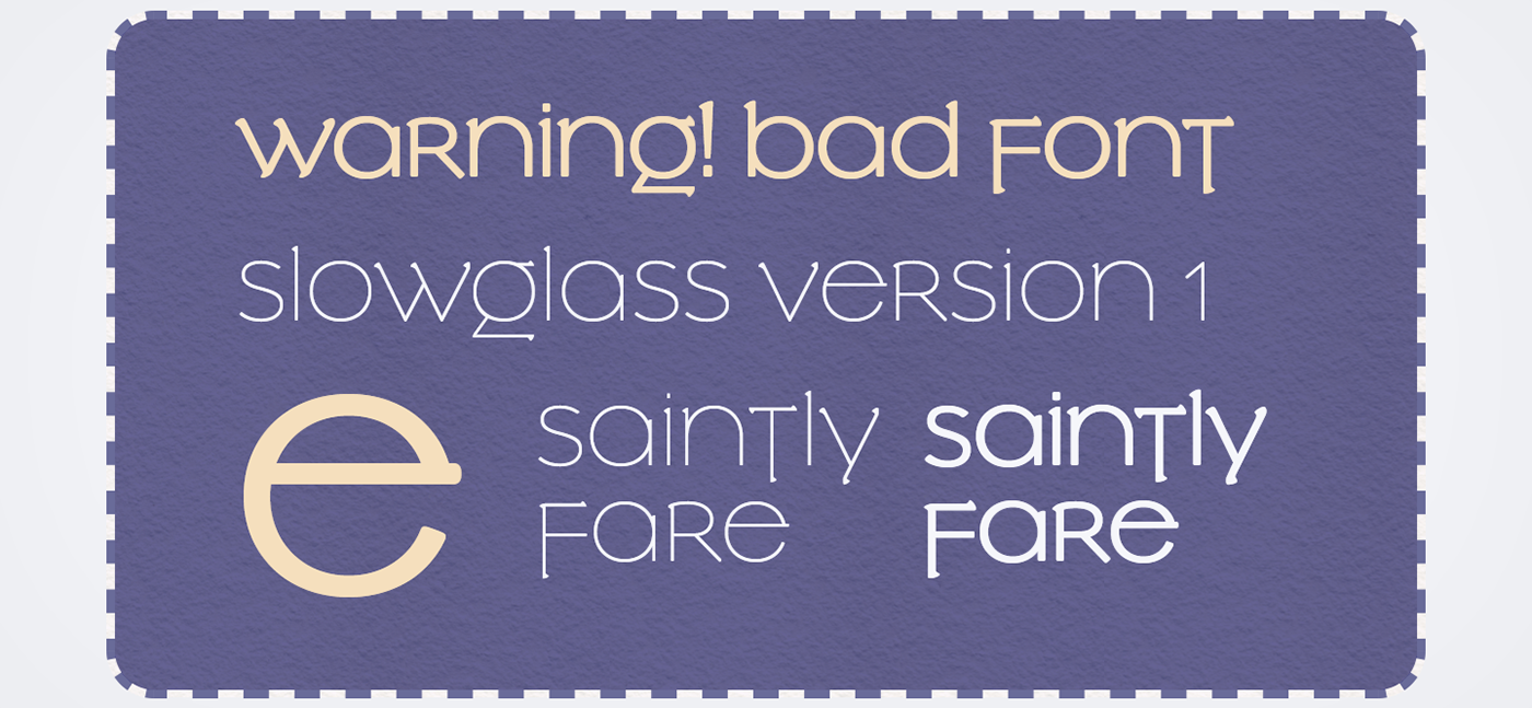
Some time later, I spotted my font in the wild! It was used for the logo and menu of the fictitious Saintly Fare restaurant in the movie Always Be My Maybe. I was thrilled to see the font in use, except… the logo didn’t look all that great.
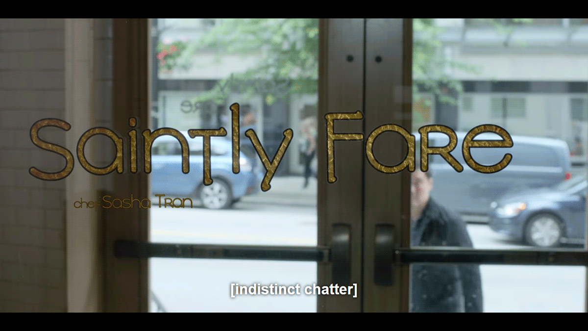
Slowglass v1 was a unicase design, but the movie people didn’t quite respect that and faked the uppercase. The half‑uncial–inspired spur on the e was chopped off too. A black stroke was added around the letters and the outlines somehow ended up weirdly distorted and more rounded than necessary.
It came out mediocre, but it got me thinking: someone liked the general idea of the font
and used it. (Or maybe they just looked for “Vietnamese fonts” and got this? I guess I’ll
never know). More importantly though, I came to a conclusion that apparently, uppercase
is a useful feature in a font!
and used it. (Or maybe they just looked for “Vietnamese fonts” and got this? I guess I’ll
never know). More importantly though, I came to a conclusion that apparently, uppercase
is a useful feature in a font!
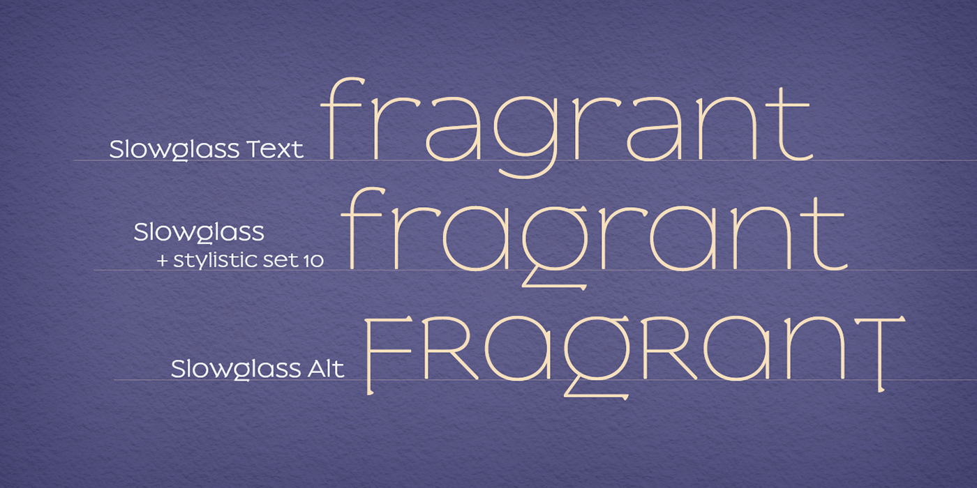
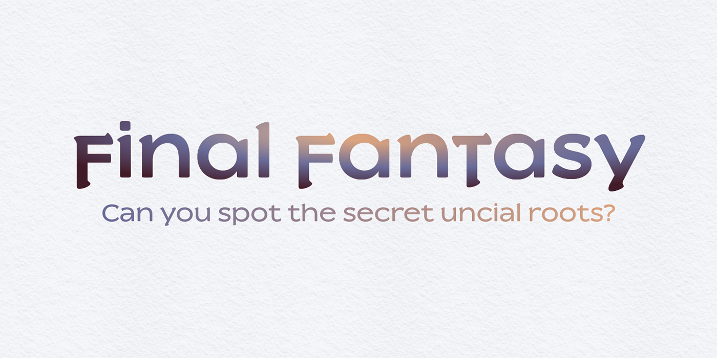
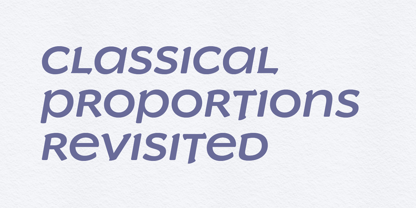
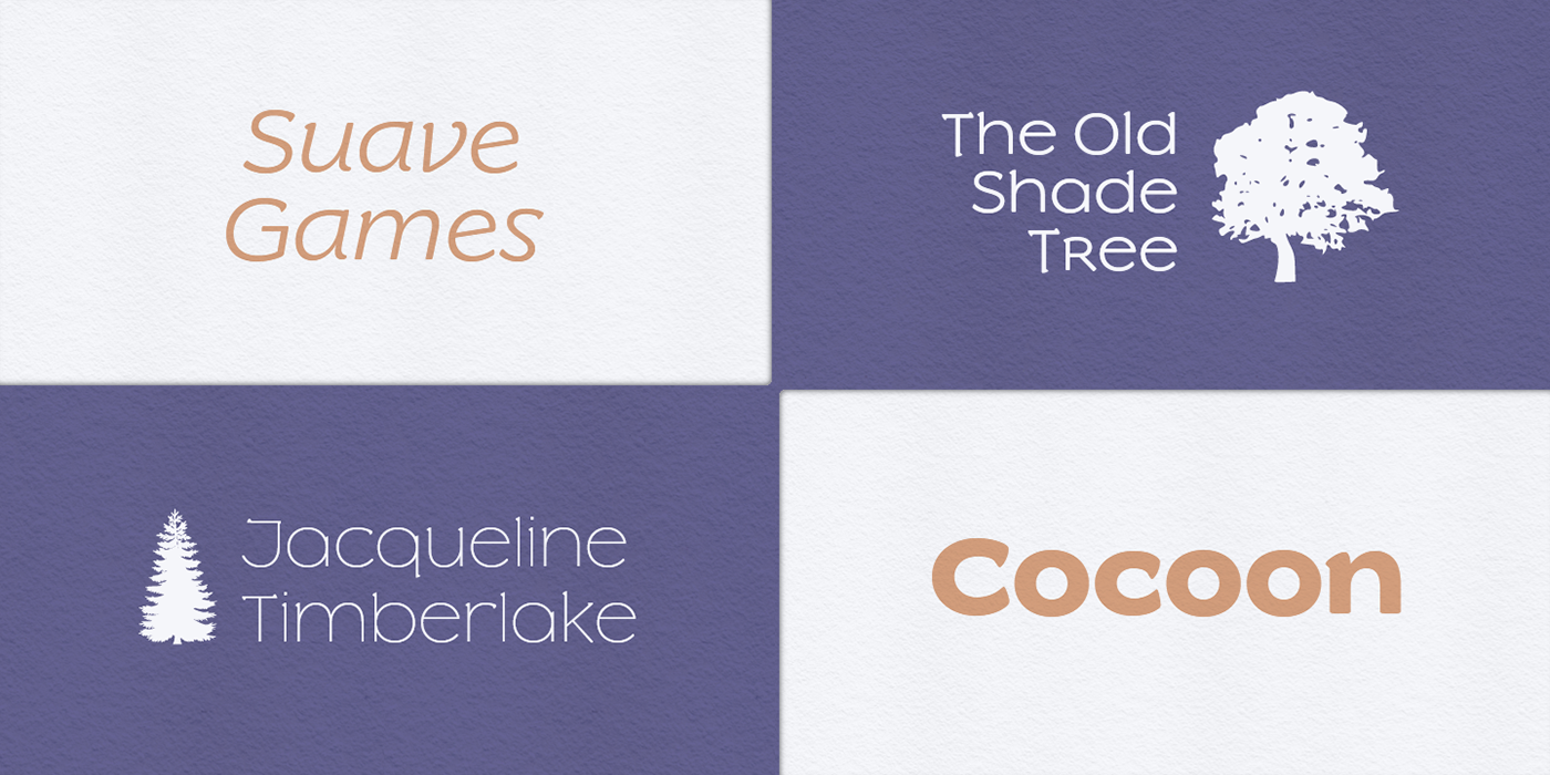
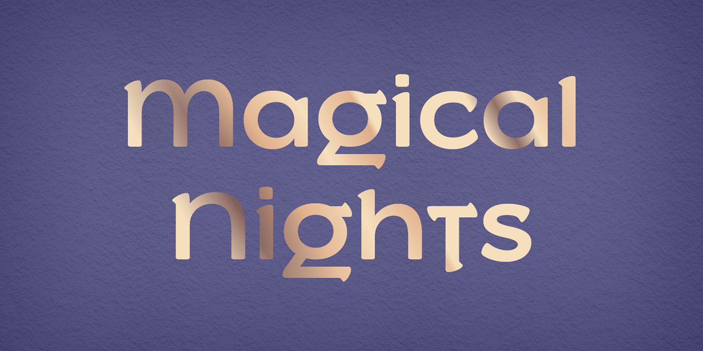
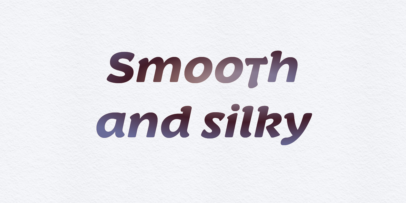
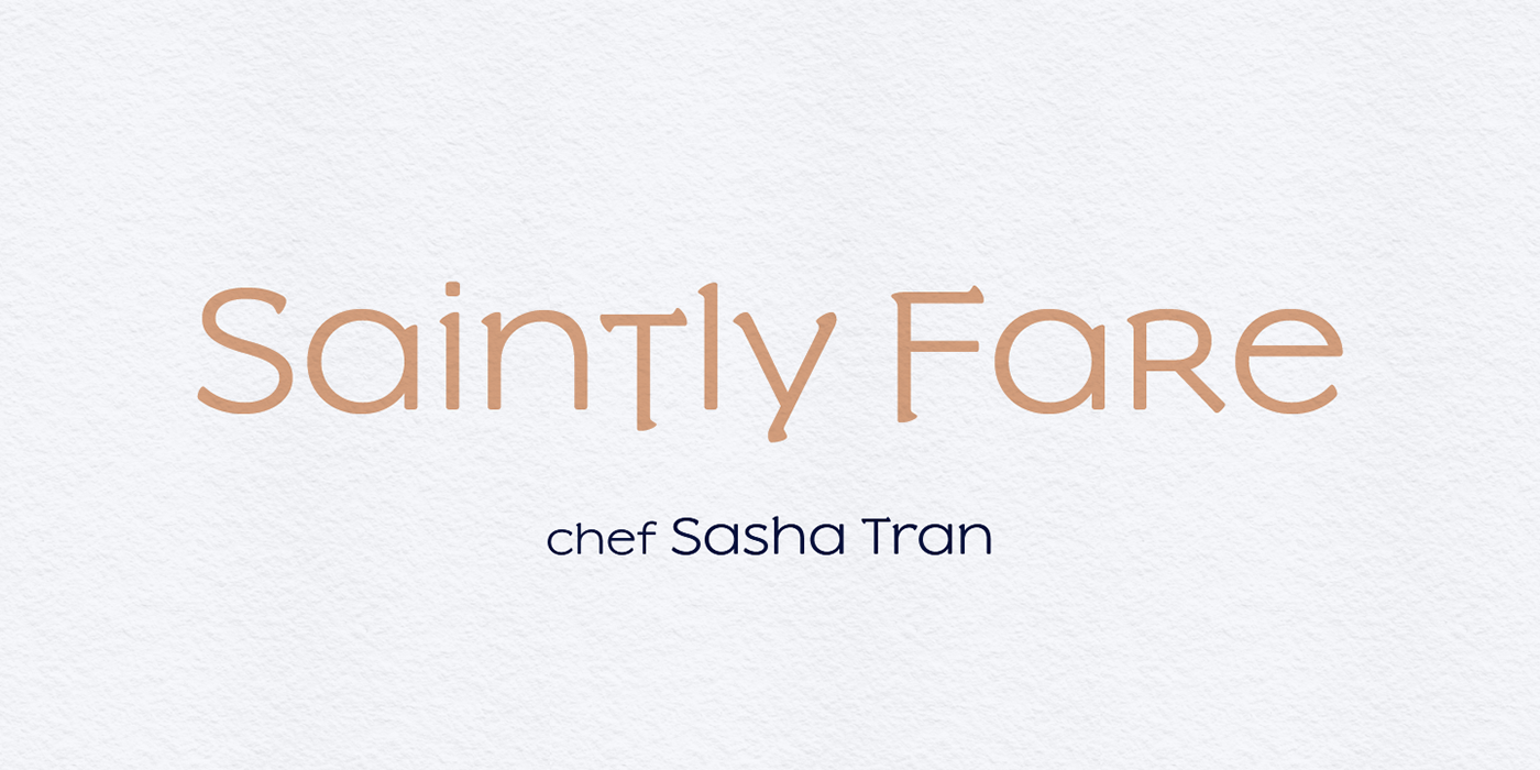
I was inspired enough to get back to the drawing board. All glyphs in the existing weights were redrawn, I added proper capitals, three new darker weights, and some brand new crazy-ass italics. And yes, the e lost its beak. This is how that logo might have looked if it was made with Slowglass version 2:
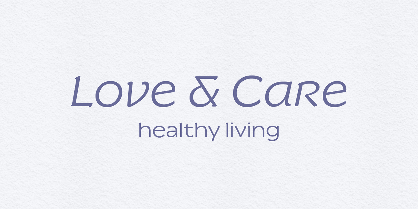
I delegated the unicase glyphs to a separate Slowglass Alt cut, and designed more conventional forms for the main cut and the Text cut. All alternates can be mixed and matched via OpenType stylistic sets as well.