
Identity
2013
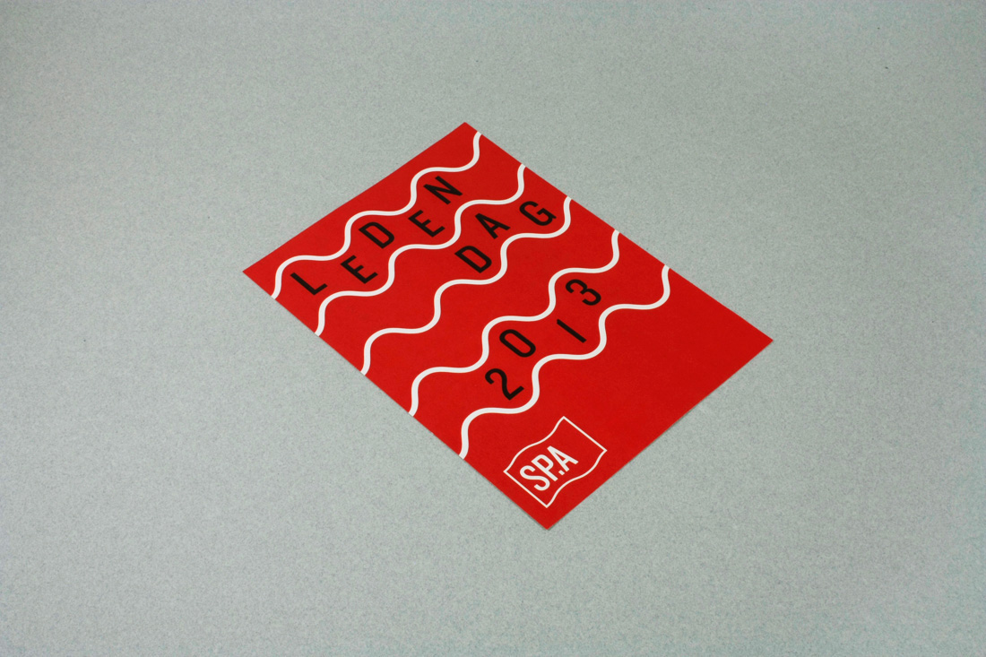
As a part of my masterthesis at Sint Lucas Antwerp about graphic design in politics I rebranded the Flemish social democratic party. The rebrand included a new logo and visual language, with posters, a new website, stationery, …
I chose to work with the SP.A because of the interesting collaboration between the socialist movement and artists/designers that has existed throughout history. Another reason was that the SP.A had just gone through an ideological modernisation, which provided a good base for a rebranding.

For the logo I chose to use a stylized version of the well-known socialist red flag. For a party that is trying to position itself as more leftist, it is a perfect icon.

Above is a small sample of the many, many drafts I went through.
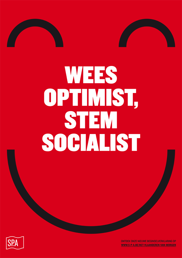
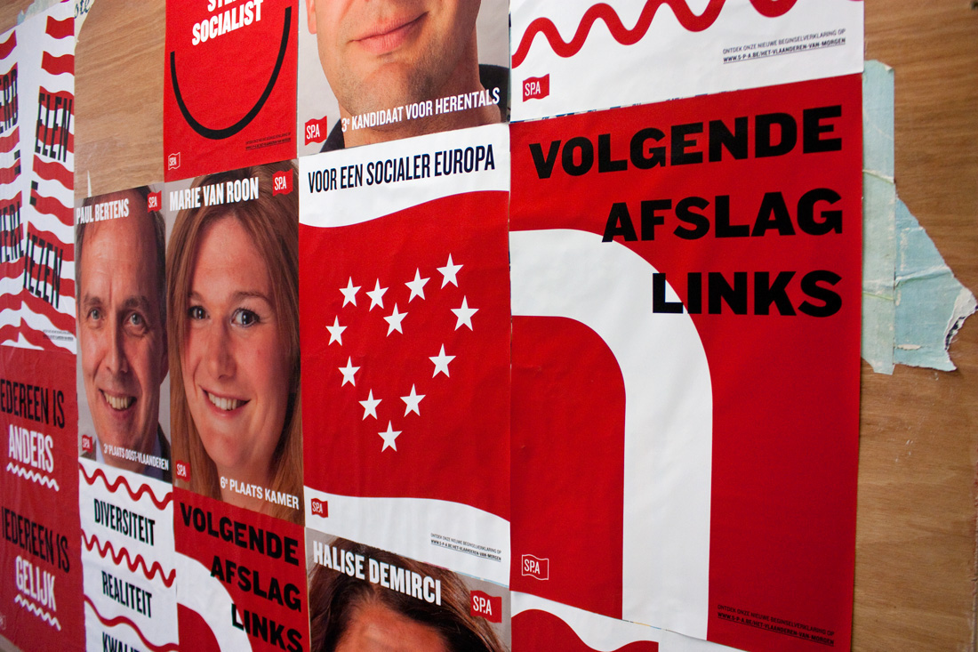
An important part of the rebrand was to put more emphasis on the message, and less on the politicians themselves. I created a series of posters with statements derived from the new ideological declaration (these are of course in dutch).
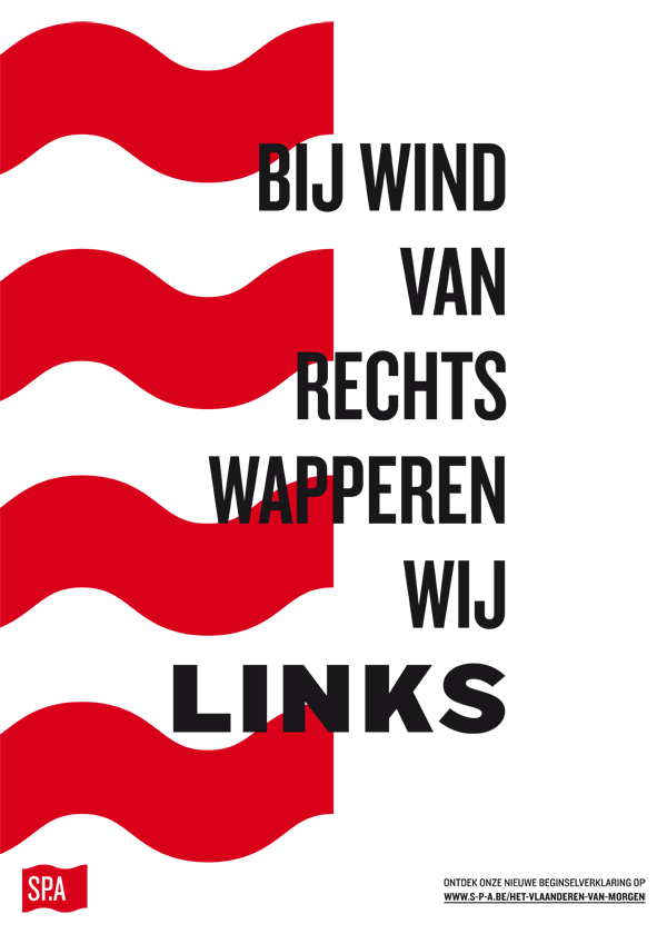
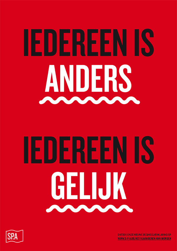
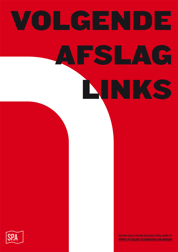
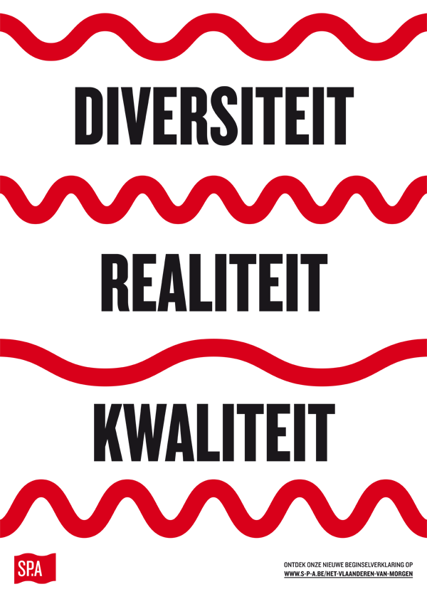


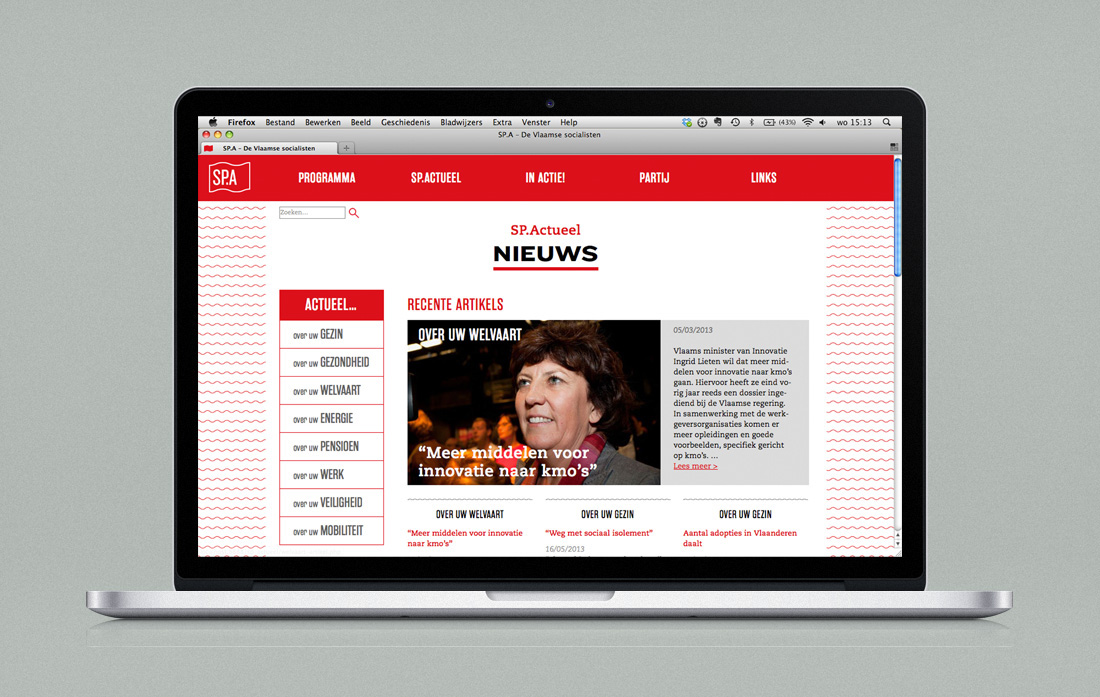
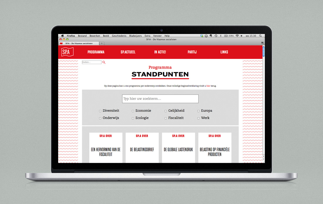
The idea of putting more emphasis on the political vision of the SP.A is further continued in the new website. For example, I created a searchable database of their views on different subjects, which makes it easy for the user to find exactly what s/he cares about.
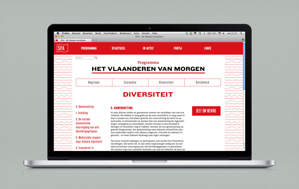
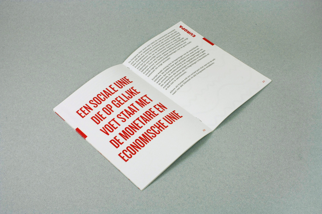
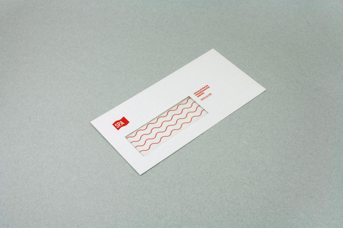
The rebrand also included a wide range of printed matter, including a booklet with the new ideological declaration and stationery.




(Please note that everything you see here is my interpretation, and does not necessarily represent the exact vision of the SP.A.)

