Primary logo
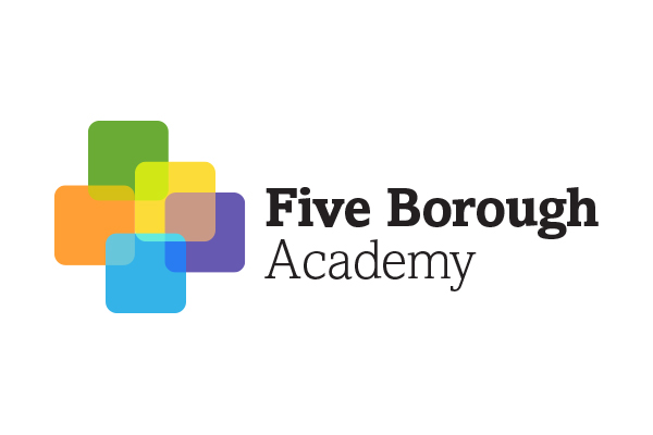
This is the primary logo for the academy, but thinking ahead for alternate cases when horizontal space may be at a premium, I also created a vertical aligning logo.

The other prevailing thought for this logo was for flexibility and modularity given how the academy is set up. While the notion of 'one-city' was paramount, each individual borough had control over running their programs to fit the individual needs of their constituents. I used the individual color and boxes as ways the boroughs could make it their own, and also gave them 'alternate' vertical aligning versions (like the logo) in case horizontal space became an issue.

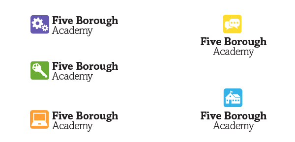
I also used the 'squares' to create an icon set. These were the initial versions, and the academy had the 'pieces' to make their own.