


An authentic slice of retro gaming brought to life.
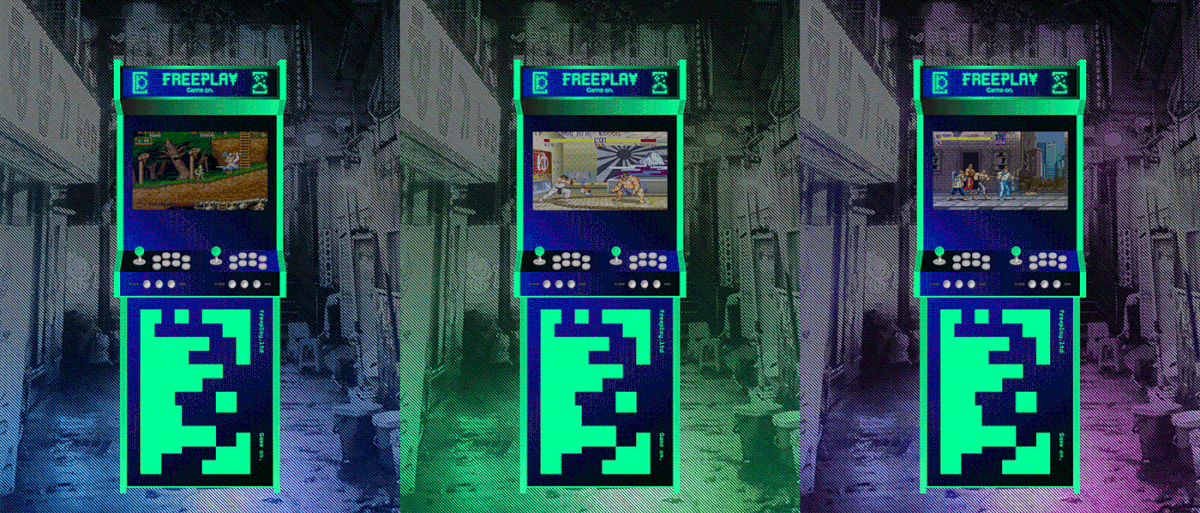
Inspired by Japanese video game arcades, Freeplay offers an authentic slice of retro gaming in a vibrant and engaging environment. An immersive experience, it required an identity that reflected the personable and playful nature of the setting. Fluorescent neon palettes, bespoke type and Japanese influenced iconography all helped to project an informed visual identity which was both relatable and eclectic.


A bespoke logotype and extensive set of pictograms were developed. With a direct reference to arcade machine 'attract modes' and 8-bit pixel art, these visual building blocks formed the foundations of the brand identity. Rolled out across OOH advertising, arcade cabinets, corporate stationery, interior spaces, promotional merchandise, social and wayfinding.


The colour palette was an eye-popping combination of bright neons, dynamic blues and intense, dark blacks.

Interior spaces combined atmospheric lighting with ‘easter eggs’ that referenced classic arcade games from the era.


Thanks


