Objective
Work with assigned typeface and to create a black and white double sided poster. One side is the fun, graphic side while the other is a type specimen.
Concept
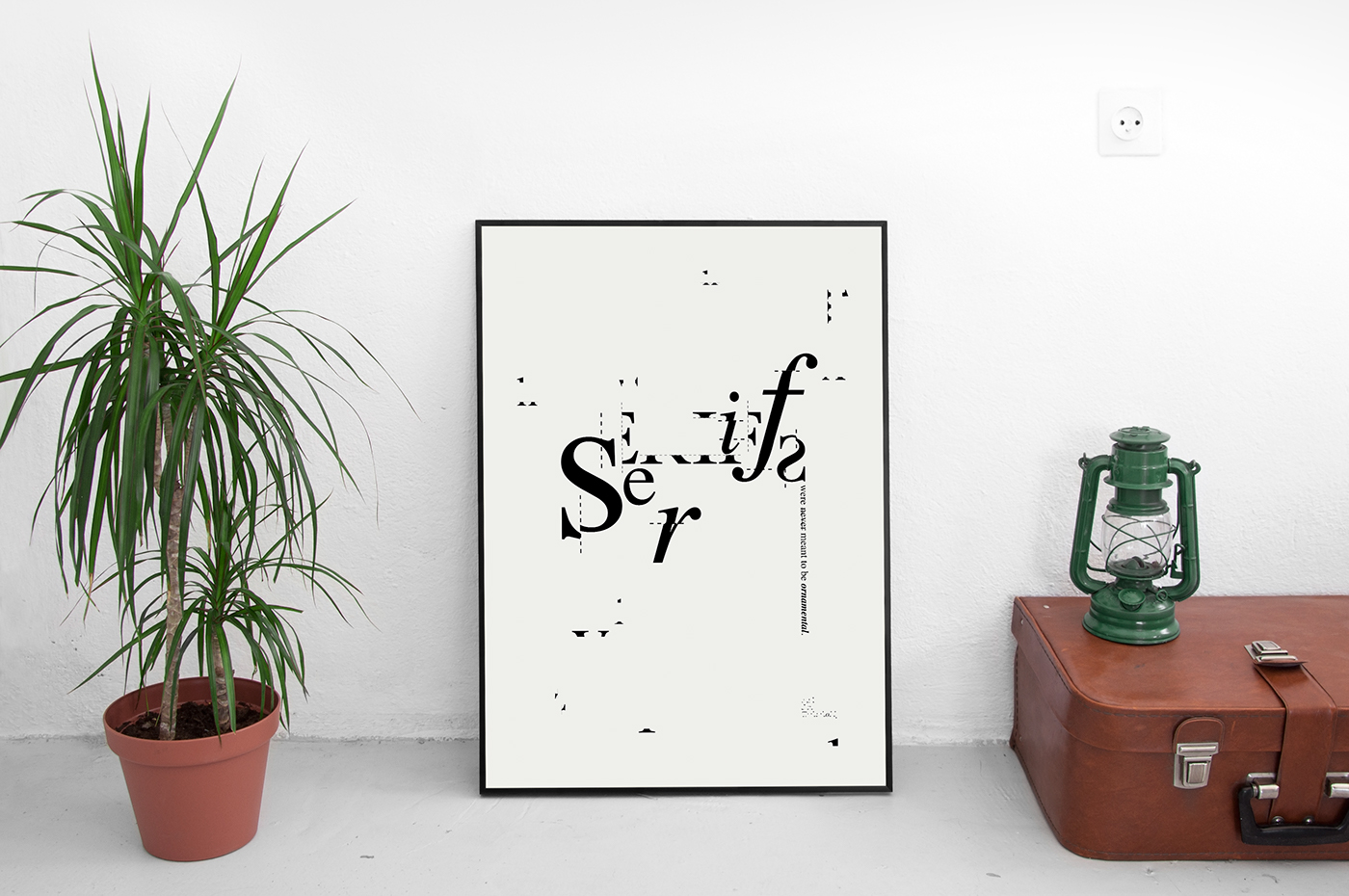
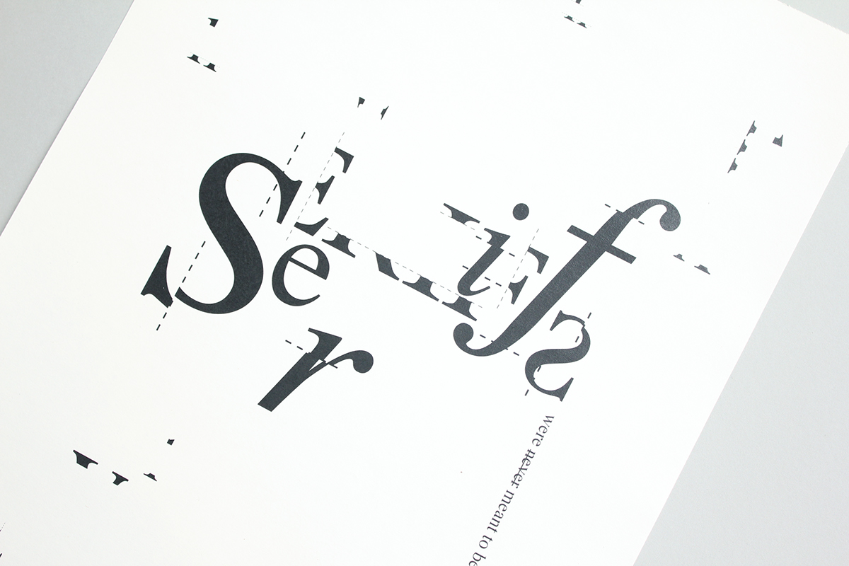
The concept behind this poster was inspired by the life of Jan Tschihold (1902-1974), a German typographer who designed his best well known font, Sabon. In Tschihold's early works, he was hugely influenced by modern avant-garde artists. However, he abandoned his modernist roots and moved back towards Classicism after being accused for creating "un-German" typography by the Nazis.
I designed this poster based on one of Tschihold's quote:
The sanserif only seems to be the simpler serif. It is a form that is reduced for little children. For adults it is more difficult to read than serifed roman type, whose serifs were never meant to be ornamental.
I came up with the idea of emphasising on the serifs of the letters by adding dotted lines, as if they were being cut.

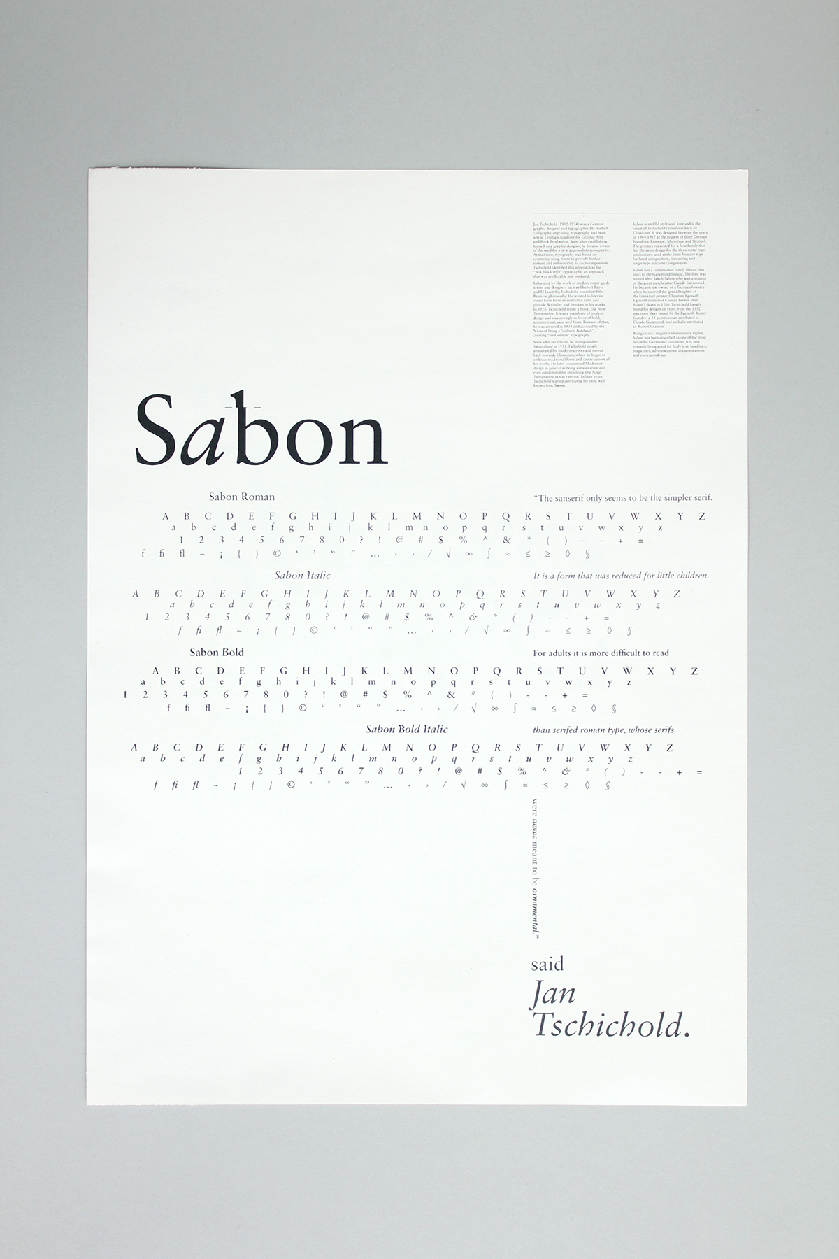


Sabon
Year 2012
Design Carol Chan
Photography Carol Chan
Year 2012
Design Carol Chan
Photography Carol Chan
