b e s t c o n
RUS
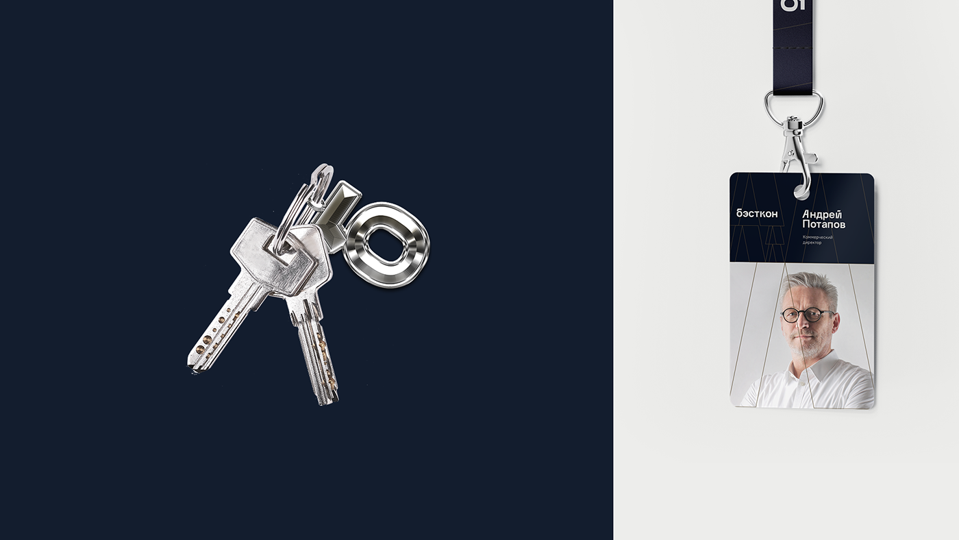
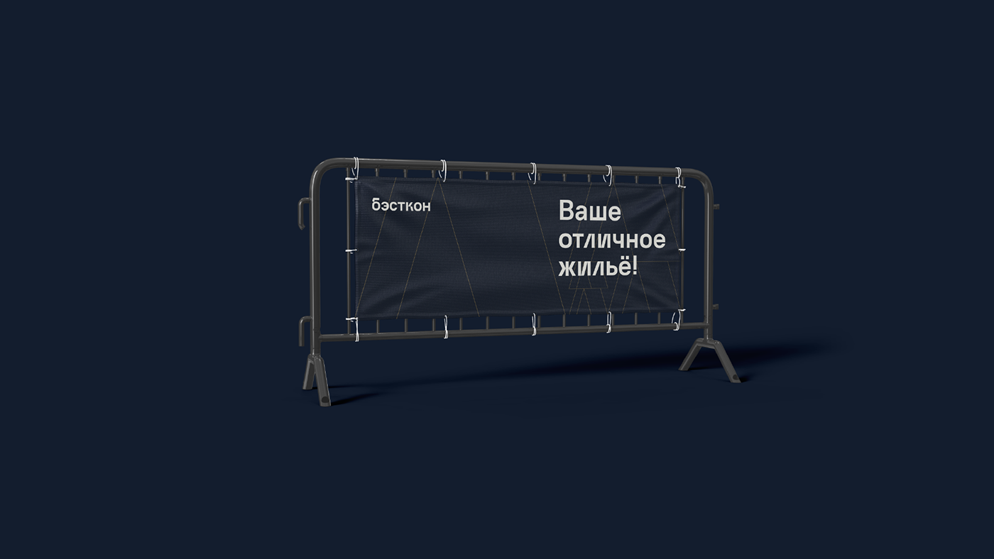
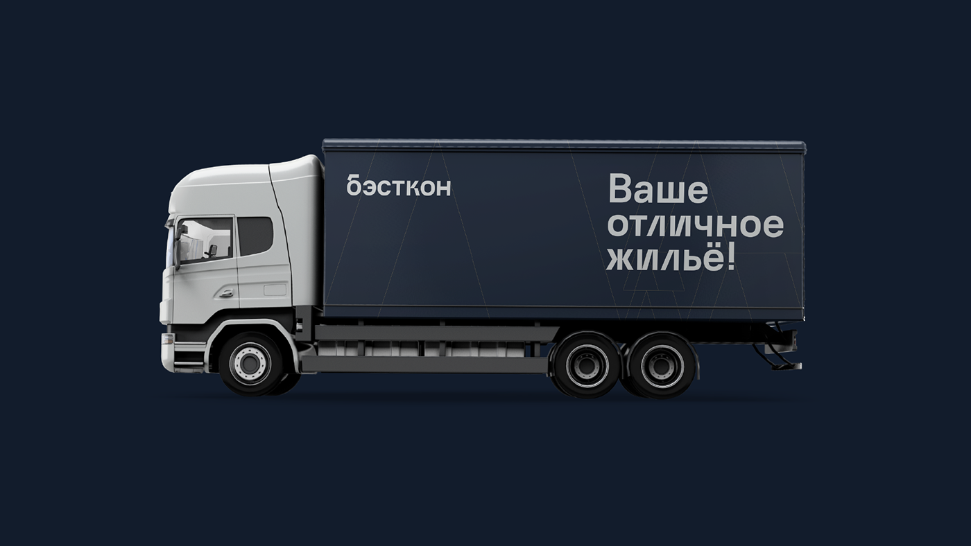
Редизайн логотипа и айдентики для строительно-инвестиционной компания Бэсткон, построенный на методе золотого сечения.
В строительстве особенно важны гармония и точная математическая форма. С помощью данного приема достигнуто идеальное графическое решение. Найден образ крыш зданий большого города различных форм и размеров, адаптивный для любых видов носителей. Уникальный шрифт, разработанный специально для бренда Бэсткон, удачно сочетается с новым логотипом.
ENG
A redesign of the logo and identity for Bestcon, a construction and investment company based on the Golden Ratio method.
Where as not in construction is important harmony and precise mathematical form. With the help of this method the perfect graphic solution was achieved. Found the image of the roofs of the buildings of the big city of different shapes and sizes. We also developed a unique font spelling, echoing the new logo.