PROJECT INFORMATION
Borland is a new bakery shop brand made by Randy Borland, whose name is also used as the bakery brand name. As an executive bakery chef, Borland knows very well how to create special signature products. Processed fresh and warm from creative hands, Borland wants to communicate itself as a simple, hand made, and luxurious bakery.
In this phase, Widarto Impact wants to bring the personality of Randy Borland as founder and executive chef to the personality of the Borland bakery brand. Since Randy Borland's personal brand is already strong as an executive bakery chef, we chose the Borland name as the bakery brand name to strengthen the relationship between the brand and its customers through the same name as the Borland bakery brand name.
TYPOGRAPHY IS AN ENERGY
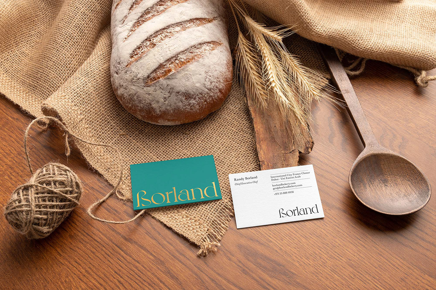
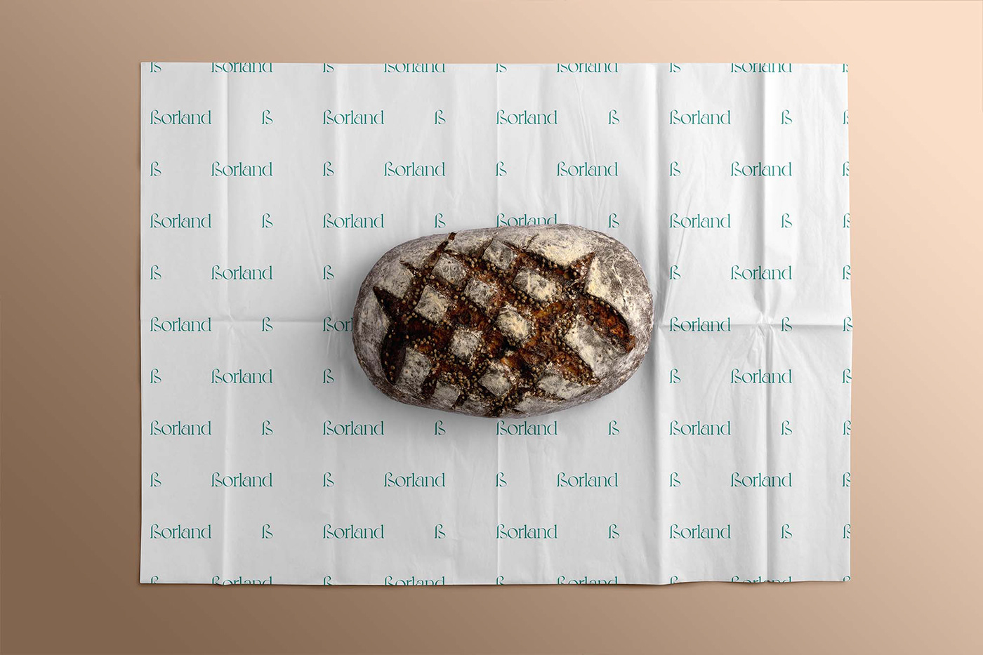
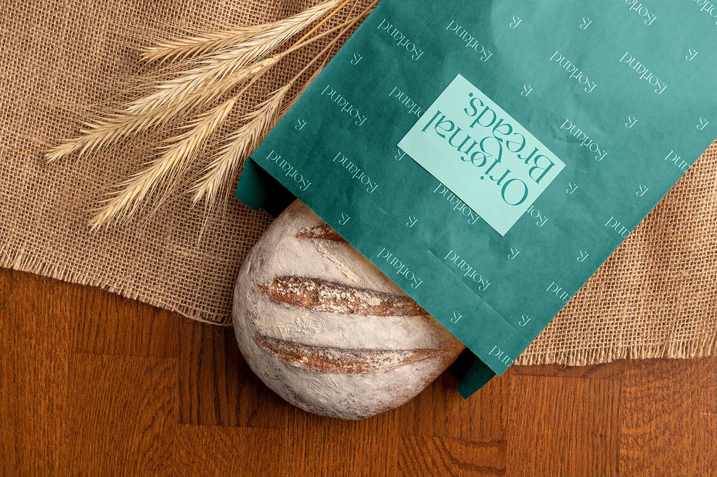
The Borland bakery logo is a logotype with a serif type that has a strong character in every curve, every line. This logo represents the goal that Borland wants to convey to customers for more expectations when customers visit and enjoy Borland bakery products. The Borland logo has a strong energy when standing alone and when combined with other graphic elements.
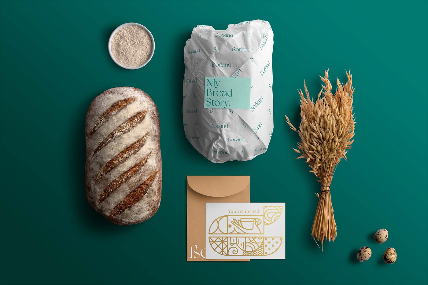
COLORS ARE THE WAY WE FEELS.
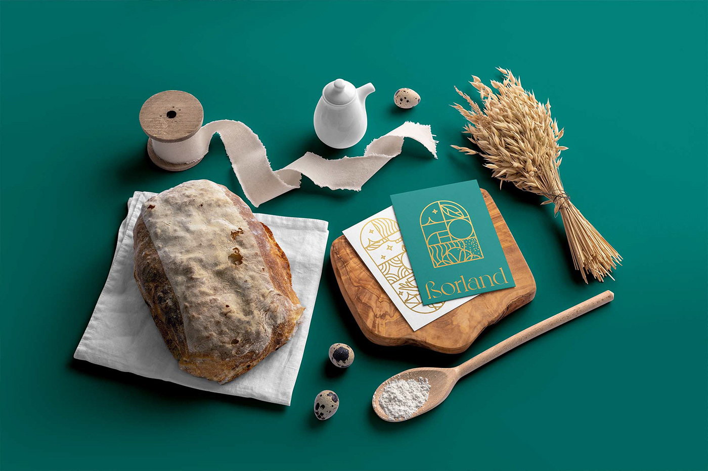
We chose medium turquoise green as the main color of the brand, which was combined with a gold foil execution to enhance the brand's visual luxury. It's a Royal, and pride.
GRAPHIC PATTERNS
We design both the line graphic elements that we take from the ingredients of the bread, as well as the nuances of the experience Borland wants to present, such as wheat, leisure time, sun, etc. This graphic element is used to beautify the appearance of the brand, especially in visual identity, including; greeting cards, menu flyers, packaging, interior spaces, etc.
DELIVERED
• Strategy
• Brand naming
• Brand identity