JLT Horse Racing
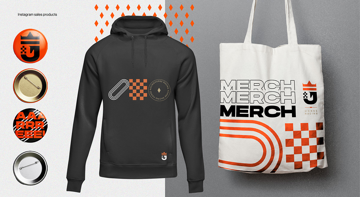
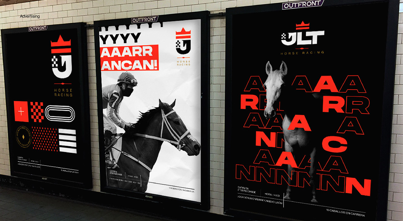
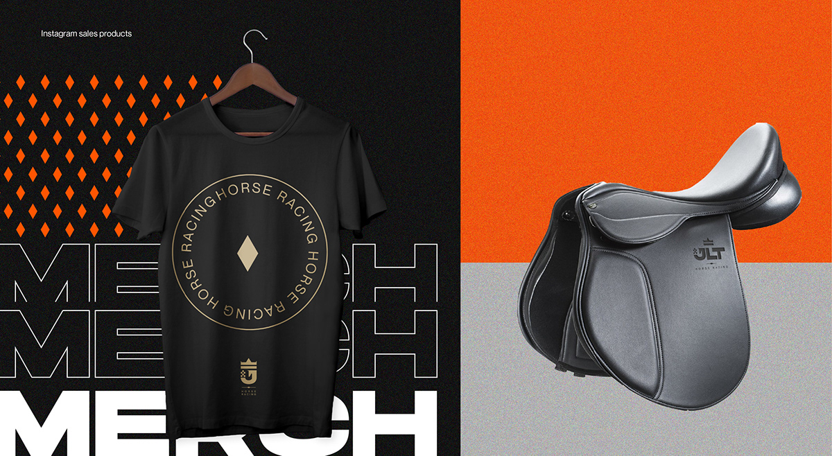
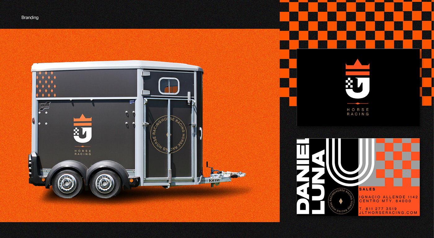
It was too much fun to be able to work for a young brand and with the creative freedom to study the different environments that exist in the horse racing habitat. The client's need was too clear, to be able to obtain a better brand image for a new public and fans of horse racing, that the initials were respected and that could graphically express 3 words, horses, races and leadership and that's how it was. how the goal was achieved.

Thanks to a good brief and excellent communication with the client, a great logo made up of the 3 most important characteristics for JLTHR could be successfully made, the logo shows dynamism, loyalty, seriousness and the most important thing for him was that it had that horse stamp on the initial letter.


Inspiration comes from the horse racing track, the flags, the shouts from the stands and the feeling of being able to compete hand in hand with your partner who guides you to victory.


