

STR Società del Travertino Romano SpA
Rome 2018
Project Rebranding
STRATEGY ART DIRECTION GRAPHIC DESIGN PHOTOGRAPHY PRINTING WEB DEVELOPMENT
C A S E S T U D Y
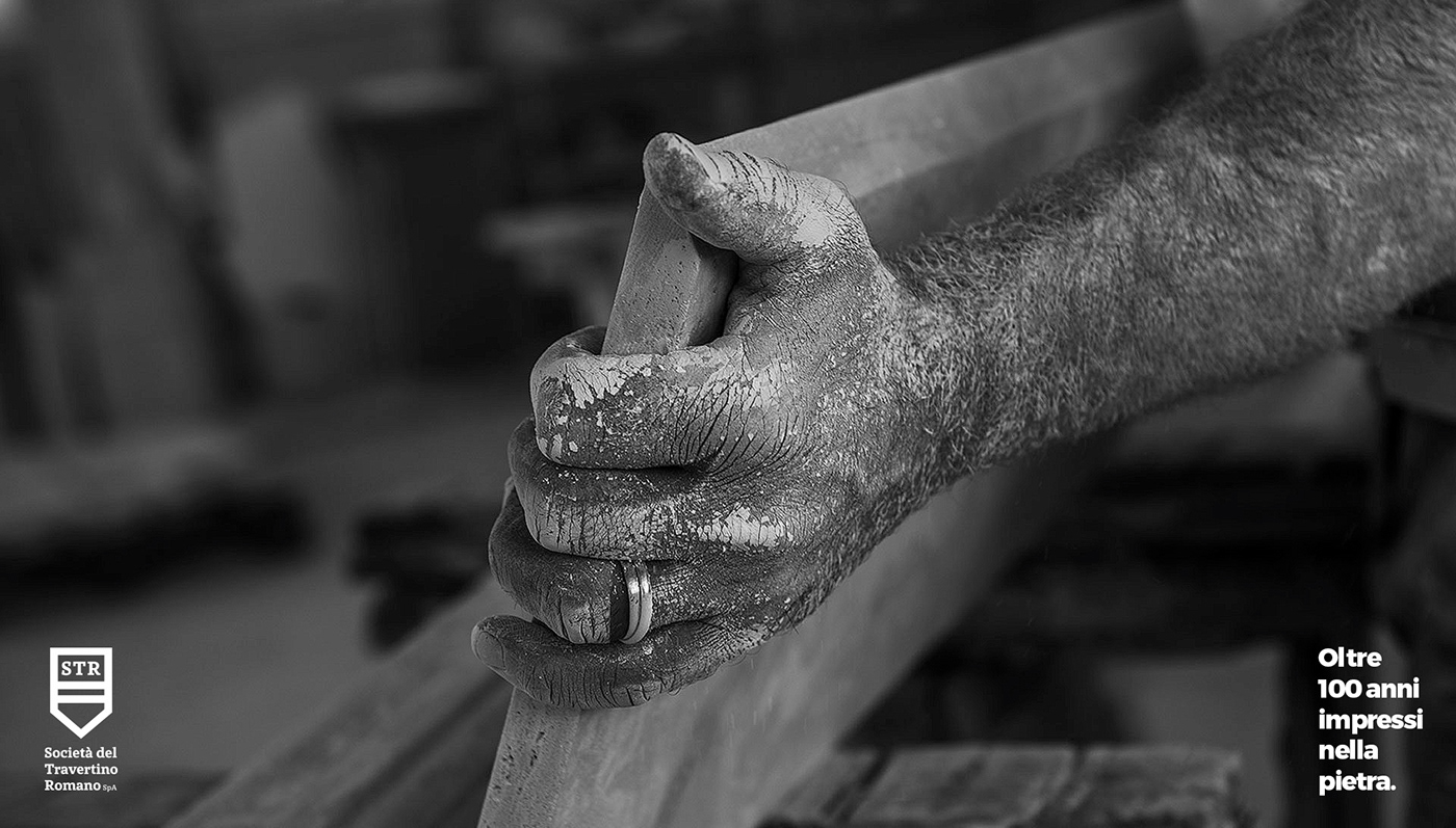
We were tasked with design a distinct identity system for STR Società del Travertino Romano, presenting their diverse portfolio and services within a simple unifying narrative.
C O N C E P T
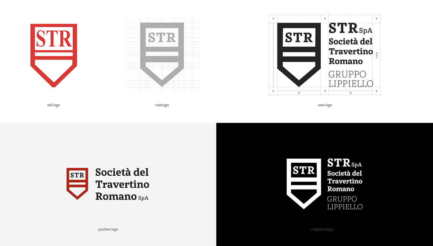
The logo is a combination of the symbol and the company name. The symbol represents the primary visual element that identifies the company. It is a geometric image that evokes the stone block, integrated with initial capital letters. The symbol was drawn according to a more coherent geometric grid. The relationship between the symbol and the company name has not been changed to maintain an aspect of continuity with the past.


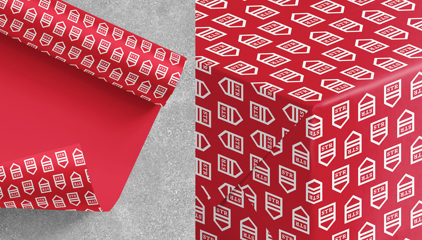
S T A T I O N E R Y
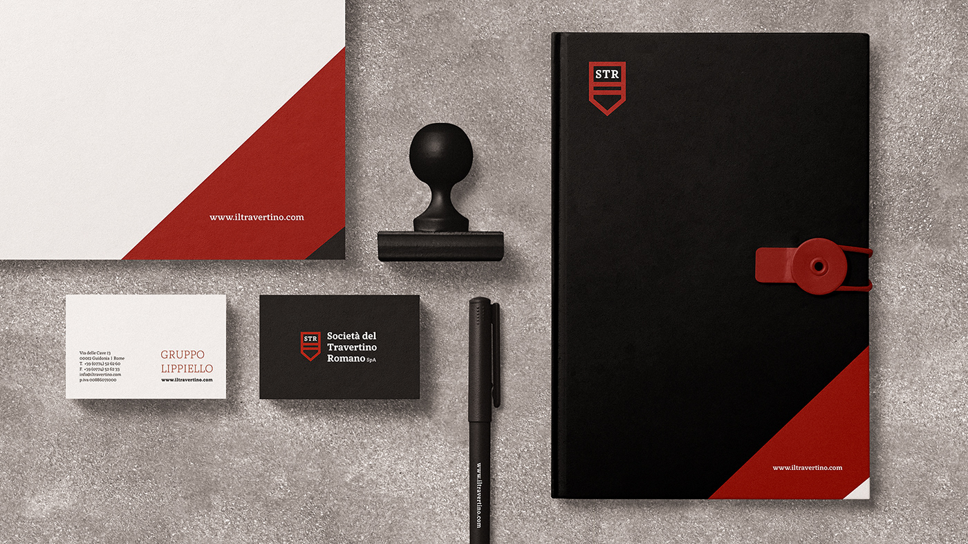
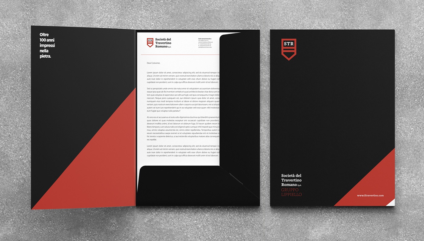
The various printed items build further on the clear and simplified communication style used for the identity, utilizing the colors contrast and space to create an interplay between the various elements. Red and black tones were mixed with white matte papers to create the right contrast. The communication materials were designed using basic shapes such as the circle, square, and triangle together with photos to convey the new brand identity.


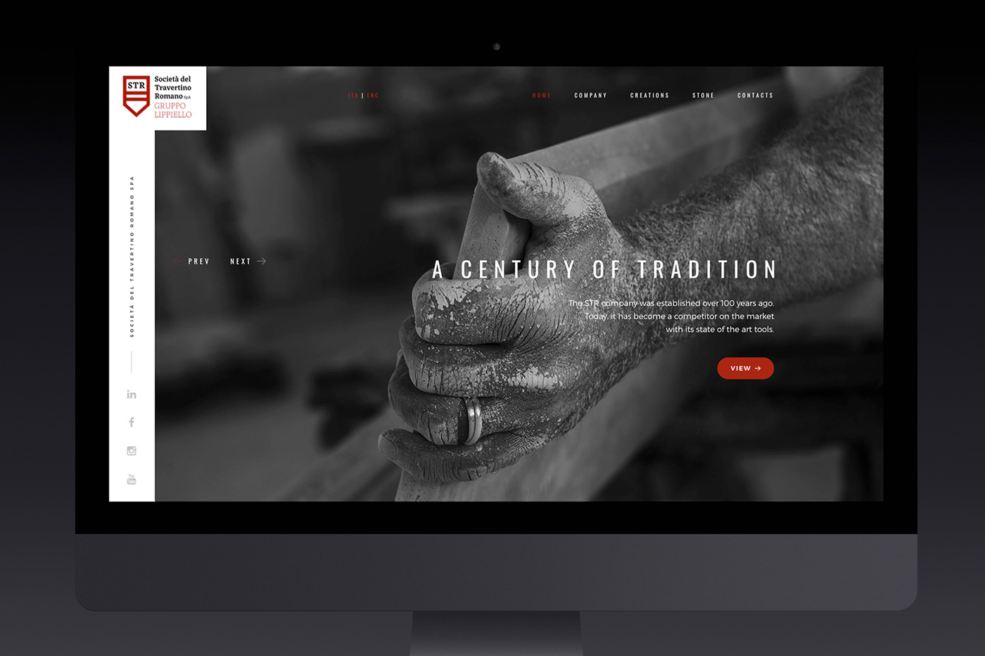
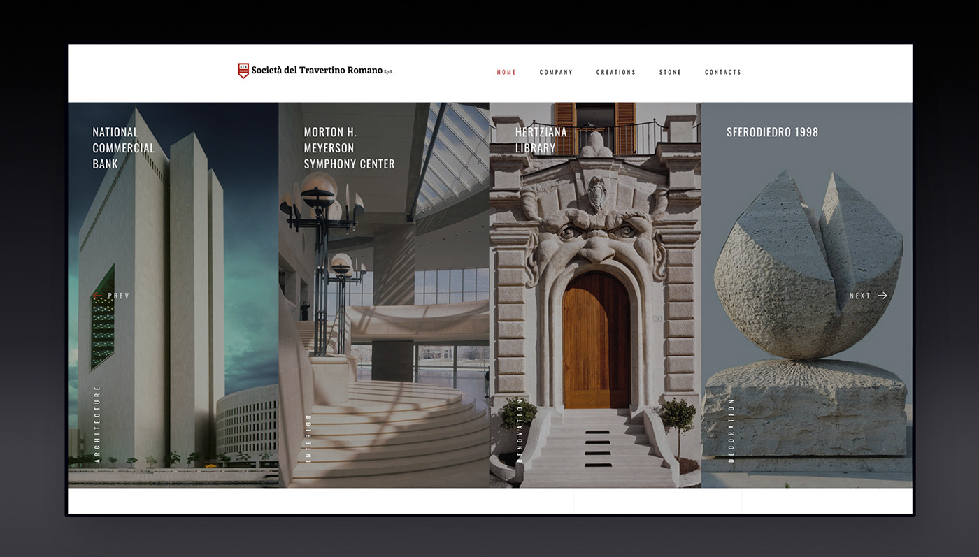
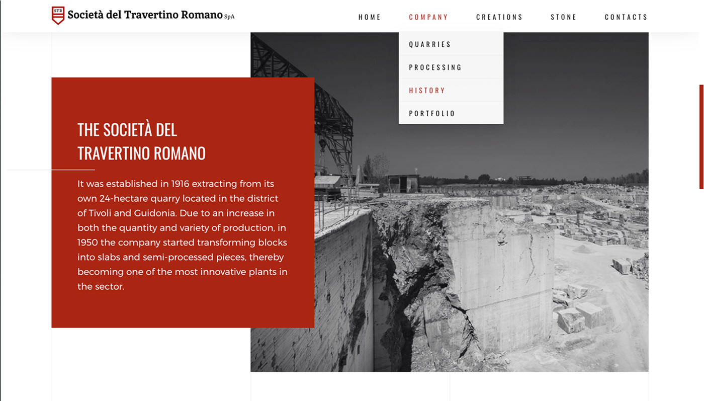
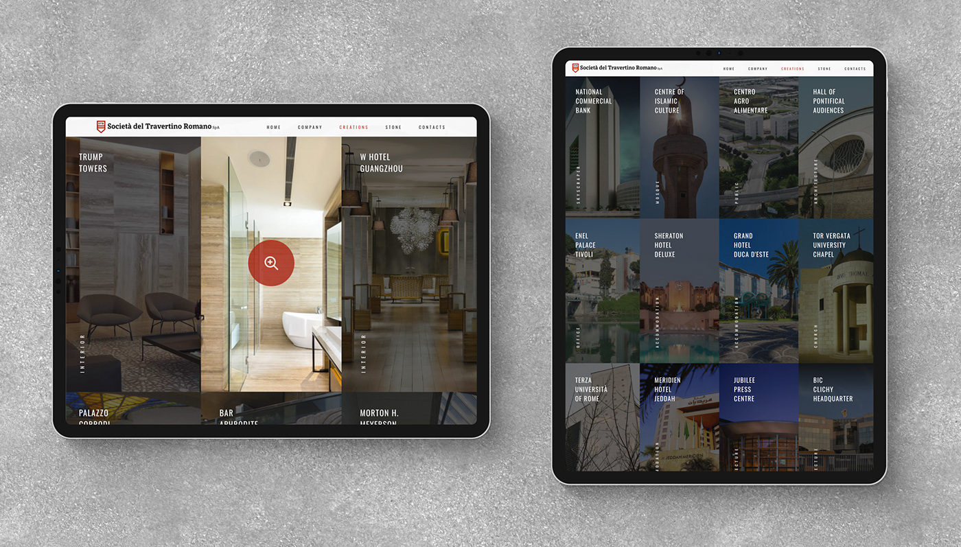
W E B D E V
As part of the development of the brand, we created the official website that embraces the essence of the brand and shows the portfolio through an innovative approach.

T H A N K Y O U F O R W A T C H I N G


