
Fragoma is an Angolan services company that needed a rebranding. They wanted to stress out the identity of their country in order to relate with their clients.
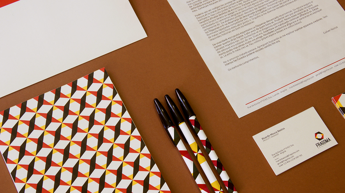
Our inspiration was Angola's flag: the colors red, yellow and black and the stae, symbol of progress. We did an deconstruction of the star, making it fit to Fragoma's multiple areas of action. Each vertice symbolizes an area of business. The best about this logo was that we were able to create different patterns, very similiar to the african cultural patterns. We used them in the stationary, and the result was a strong yet playfull communication.

Logo

Color Palette


Client: Fragoma - Grupo Super Class SA
Category: Branding & Communication
Project tasks: Identity and Stationary
Year: 2013
Category: Branding & Communication
Project tasks: Identity and Stationary
Year: 2013


